Your homepage copy is the first thing people see when they visit your site, and let’s be real—it’s got to convert. You have seconds to grab attention. If your copy isn’t clear, direct, and compelling, visitors will bounce.
Think about it: 38% of people stop engaging with a site if the layout or content is unattractive. You can’t afford to lose that traffic. The right homepage copy highlights your value proposition, solves problems, and hooks people to stick around.
Let’s break down how to do it right.
Why is Homepage Copy Important?
Your homepage copy is more important than you think. It’s your site’s front door—visitors either walk in or bounce in seconds. If your copy isn’t sharp and crystal clear, you’re losing potential customers. People form opinions within 0.05 seconds of landing on a site. That’s how fast you have to grab attention.

It’s not just about words; it’s about communicating your value proposition immediately. What do you do? How do you solve their problem? And why should they care? If those answers aren’t obvious in your homepage copy, visitors won’t stick around to find out.
Bounce rates are a killer. A poorly written homepage can send visitors away faster than you think. That reason is usually found in your copy.
So, what should your homepage copy actually do? First, it has to address the visitor’s main question: “What’s in it for me?” You can’t just list the features of your product or service. People don’t care about features; they care about benefits. How are you going to make their life easier, better, or more profitable? Your copy needs to communicate this instantly.
Think about your homepage as a pitch—only you’re pitching to a distracted audience that doesn’t have time for fluff. Your copy needs to get straight to the point. Avoid jargon and get rid of any words that don’t add value. Clarity trumps cleverness.
Also, don’t underestimate the power of social proof on your homepage. Most people trust user reviews as much as personal recommendations. So if you have testimonials, case studies, or big-name clients, make sure that’s integrated into the copy. It builds trust and reduces friction for potential customers who are on the fence.
Finally, your homepage copy needs to have a clear call to action. Whether it’s “buy now,” “get started,” or “learn more,” you’ve got to tell people what to do next. And don’t make them guess—spell it out. Every homepage should guide visitors toward taking the next step, whether that’s making a purchase, signing up, or contacting you for more information.
The takeaway? Your homepage copy needs to be benefit-driven, user-focused, and clear as day. You’ve only got seconds to make an impression—make sure it’s the right one.
Understanding Your Target Audience
Understanding your audience is everything when it comes to writing homepage copy that converts. You can’t write effective copy if you don’t know who you’re writing it for. Period.
It doesn’t matter how clever your writing is or how fancy your product might be—if it’s not speaking directly to the needs, desires, and pain points of your target audience, you’re just wasting space.
Watch my video on the copywriting research process to learn more:
Start by asking yourself: Who’s your ideal customer? Are they entrepreneurs? Busy parents? Tech-savvy millennials? Or maybe they’re small business owners looking for efficiency tools? Each of these groups will have vastly different priorities. Your copy needs to reflect that.
For example, if you’re targeting small business owners, your copy should focus on how your product saves time and increases productivity. They don’t have time to sift through fluff.
They want to know how you’re going to help them run their business better. On the other hand, if your audience is more consumer-focused, they might care more about features that make their life easier or more fun. You’ve got to tailor your message accordingly.
To really get into the mindset of your audience, start by researching their pain points. What’s keeping them up at night? What’s frustrating them? If you don’t know the answers to these questions, you’re guessing—and guessing is a dangerous game in copywriting.
Look for common complaints, challenges, or frustrations. Check out forums, social media groups, and product reviews in your niche. People will tell you exactly what they want if you just listen. Use their language.
One of the biggest mistakes businesses make is using jargon that doesn’t resonate with their audience. You’ve got to speak the way your audience speaks. If they use simple terms, you use simple terms. If they’re more technical, match that tone.
Next, you need to think about how your product or service solves their problems. What are the exact benefits your target audience is looking for? The key here is to focus on benefits, not features.
Features are what your product does, benefits are how those features improve your customer’s life. Your homepage copy should answer the question: “How does this product solve my problem?”
Once you’ve defined your audience and their problems, your copy should work to build empathy and trust. If you can clearly articulate their struggles better than they can, they’re going to trust that you have the solution.
This is where emotional connection comes into play. People don’t just buy products; they buy solutions to problems that stir up emotion—whether that’s frustration, fear, or a desire for status or convenience.
Another pro tip? Create audience personas. A persona is a semi-fictional representation of your ideal customer. Include demographics like age, job title, income level, and key pain points. This will help guide your copy and ensure that you’re speaking directly to the right people with the right message.
Let’s talk numbers. According to a Salesforce report, 90% of customers say the experience a company provides is just as important as its products or services. That’s Huge! It means it’s not enough to just offer a great product—you need to provide an experience that resonates with your audience from the moment they land on your homepage.
Creating a Unique Value Proposition
Your value proposition is the heart of your homepage. If people don’t immediately understand why they should care about your product or service, they’ll bounce—fast.
The value proposition explains the core benefits you offer. It’s not about what you sell; it’s about how you make your customers’ lives better. Think of it like this: Why should anyone choose you over your competitors? That’s your value proposition.
Your value proposition has to answer three key questions:
- What does your product do?
- Who is it for?
- How does it solve their problem better than the alternatives?
When it comes to writing a clear value proposition, less is more. You don’t want to overwhelm visitors with paragraphs of text. Keep it tight. Your value proposition should be one sentence—two at most. Remember, people are skimming, not reading.
Here’s how you craft one:
First, focus on benefits, not features. Too many companies make the mistake of leading with what their product is. No one cares if your app has 10 new features or your service includes more bandwidth.
They care about what those features do for them. Does it save them time? Make them money? Simplify their life? Your value proposition needs to be laser-focused on what’s in it for them.
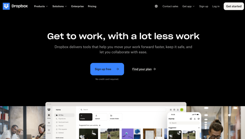
For example, take Dropbox’s value proposition: “Get to work, with a lot less work.” In just a few words, they communicate exactly what the service does and why you should care. They don’t talk about cloud storage or features—they talk about convenience. That’s what sells.
Next, differentiate yourself from the competition. What makes you unique? Are you faster, cheaper, more customizable? Find that unique selling point and make it a part of your value proposition. This is how you stand out in a crowded market. People have choices. Why should they choose you?
Here’s a pro tip: don’t be afraid to test your value proposition. Companies that experiment with their value propositions often see gains in conversion rates. A/B test different versions to see which resonates better with your audience.
If you’re struggling to condense your value proposition into a concise statement, start with a list of benefits. What’s the primary problem your product solves? Write down all the ways your product benefits the user, then boil it down to the most essential. Simplify it until you can explain it to a 10-year-old.
Your value proposition needs to reflect what matters most to your audience. If you’re targeting eco-conscious buyers, that should be baked into your copy. If your audience cares about saving time, that should be front and center.
To recap, your value proposition needs to:
- Focus on benefits, not features
- Differentiate yourself from the competition
- Be clear and concise
- Be specific, not vague
A clear, compelling value proposition is the first step in converting visitors into customers. If people land on your homepage and immediately get why your product is worth their time, you’re already winning.
Keep it Simple and Direct
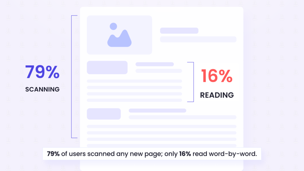
When it comes to homepage copy, simplicity wins. People don’t read—they skim. In fact, research from Nielsen Norman Group shows that 79% of users scan any new page they land on, while only 16% read word-for-word. If your homepage copy isn’t easy to digest, people will tune out.
Keeping it simple and skimmable isn’t just about short sentences (though that helps)—it’s about designing your copy so users can quickly understand your message. Your content needs to guide visitors toward the key information, even if they’re barely paying attention.
Start by breaking your copy into clear sections with strong headers. Each header should communicate a clear benefit or key takeaway. Make sure your headings are specific and provide value at a glance.
Vague headers like “What We Do” won’t cut it. Instead, go for something like, “Increase Your Sales with AI-Powered Solutions.” This kind of clarity helps skimmers understand the key points without having to dig through paragraphs.
Bullet points are your best friend. They make lists and benefits easy to read, and they naturally draw the eye. When outlining features or explaining benefits, bullet points allow readers to grab the information quickly without getting lost in a wall of text.
Short paragraphs are another essential. Aim for 2-3 sentences per paragraph. Dense blocks of text are overwhelming and cause people to abandon the page. Short paragraphs break things up visually and make it easier to keep moving down the page.
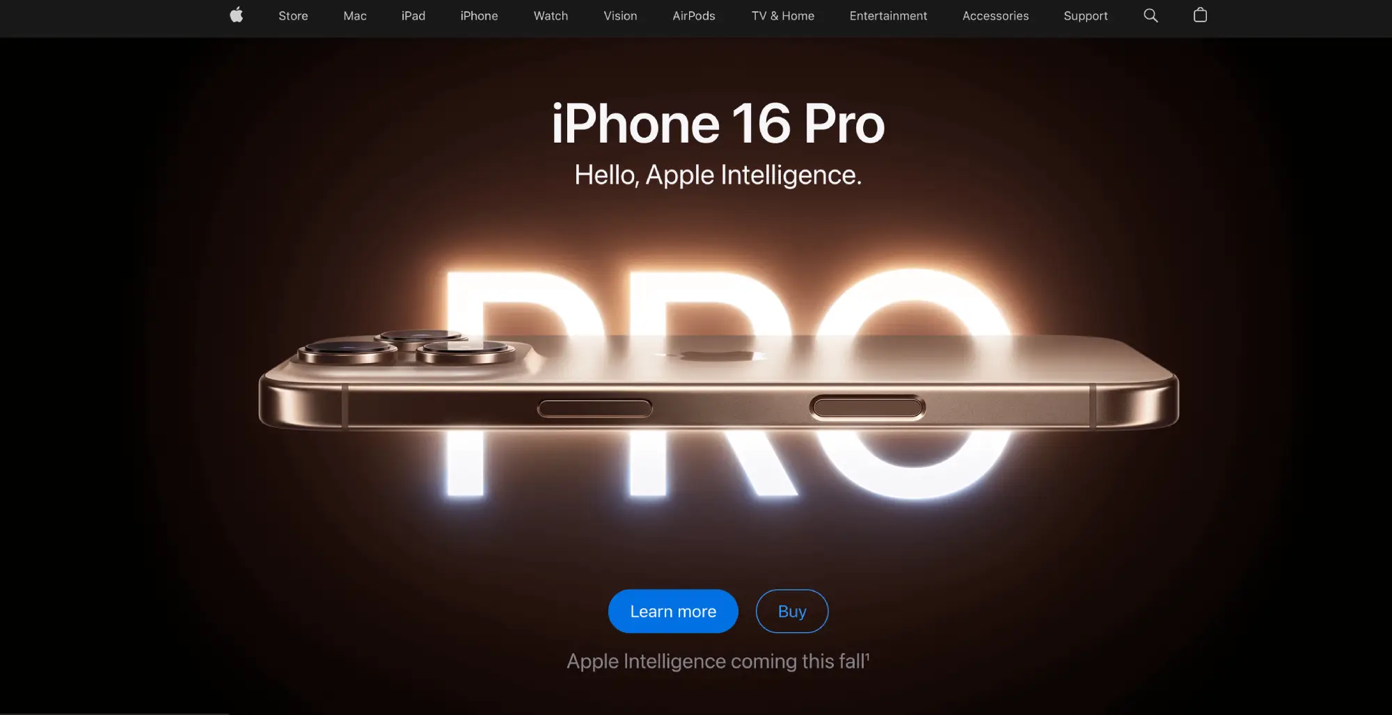
White space is another crucial factor. Let your design breathe. Cluttered copy will scare visitors away. Apple’s website is a perfect example of how white space can emphasize key points and make the page more digestible. The more breathing room you give your text, the more attention each element receives.
Finally, use bolding strategically to emphasize key phrases. If a reader is scanning your page and their eye catches a bolded benefit, that might be enough to convince them to stay. But don’t go overboard—too much bold text can dilute its impact.
Here’s the deal: simplicity isn’t about dumbing down your message—it’s about making sure the important points stand out. If your homepage is cluttered or hard to follow, it doesn’t matter how good your product is—people will leave.
Your job is to cut out the noise and make your message easy to grasp. Simplify your language, break things into bite-sized sections, and highlight the critical points.
Every word on your homepage should serve a purpose, and that purpose should be to guide the visitor toward the next step in your funnel—whether it’s signing up, clicking through, or making a purchase.
Create Compelling Headlines
Headlines are the first thing people see when they land on your homepage, and if they don’t grab attention, the rest of your copy doesn’t stand a chance. In fact, 8 out of 10 people will read your headline, but only 2 out of 10 will read the rest. That’s how important headlines are. They either make someone want to learn more or cause them to click away.
A great headline is about more than just being catchy—it needs to clearly communicate your value proposition while speaking directly to your target audience. It’s your hook, your promise, and your offer—all rolled into one. And you have only a few words to do it.
First, keep your headlines benefit-driven. Avoid the trap of focusing on features or vague descriptions. Instead of saying, “We provide digital marketing services,” you want to say, “Grow your business with data-driven digital marketing.” This headline speaks to the end result that your audience cares about: growth.
Next, keep it specific. Vague headlines don’t convert. If you’re offering a free trial or a 30-day money-back guarantee, say it in the headline. For example, “Get Your First 30 Days Free on Our All-in-One Marketing Platform” is a much more compelling headline than “Sign Up for Our Marketing Platform.”
Another critical element is emotional appeal. The best headlines tap into the emotions of your audience—whether it’s fear of missing out (FOMO), the desire to achieve something great, or frustration with their current situation.
Headlines like “Take Control of Your Time and Boost Productivity” work because they play on the frustration many people feel with time management. They immediately create a sense of urgency and offer a solution.
Use actionable language in your headlines. Words like “discover,” “boost,” “grow,” and “unlock” make your headline dynamic and inspire action. You’re giving your audience a clear call to action within the headline itself.
Compare “Our App Offers Great Features” with “Unlock Powerful Features That Transform How You Work.” The second headline feels more active and motivating.
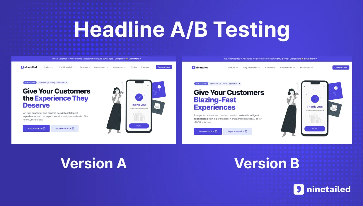
A/B testing is your best friend when it comes to headlines. Run tests with variations in your phrasing, tone, and structure to see what resonates best with your audience. Sometimes the smallest tweaks, like changing one word, can have a big impact on your results.
Here’s an example of an A/B test for a headline:
Here’s a quick formula for a compelling headline: [Benefit] + [Emotional Trigger] + [Specificity]. For example, “Double Your Sales in 30 Days with Proven Strategies” checks all three boxes. It highlights the benefit (doubling sales), includes an emotional appeal (everyone wants results fast), and is specific (30 days).
Let’s talk length. Short and punchy often works best. Aim for six to 12 words, which is optimal for keeping it concise while conveying enough information. Headlines that are too long risk losing attention, while those that are too short might not provide enough value.
Remember, your homepage headline is the doorway into your product or service. If it doesn’t grab attention, you’ve lost your audience before they’ve even had a chance to scroll down.
Use Social Proof and Testimonials
Social proof and testimonials are essential to building trust and converting visitors to your homepage. People need reassurance before they make a decision, and social proof provides exactly that.
According to Nielsen, 92% of consumers trust recommendations from others over branded content. If your homepage copy doesn’t include social proof, you’re leaving conversions on the table.
Social proof comes in many forms—customer testimonials, reviews, case studies, or even the logos of brands you’ve worked with. All of these serve as validation that your product or service works, and that real people or companies have benefited from it.
When a potential customer sees that others have had a good experience, they’re more likely to trust your brand and take action.
But here’s the trick: not all social proof is created equal. You need to be specific in how you present it. Instead of vague praise like “Great service,” opt for testimonials that highlight real results. For example, “Thanks to [your product], we increased our conversion rate by 35% in just three months” provides concrete evidence of value.
It’s also important to use recognizable sources. If you’ve worked with well-known brands, show their logos. If your product has been reviewed by an industry expert or influencer, feature that prominently. These names carry weight and can influence potential customers who may not have heard of your brand but trust the judgment of someone they respect.
Check out my home page for instance. I have a logo bar with brands I’ve worked with which creates authority.
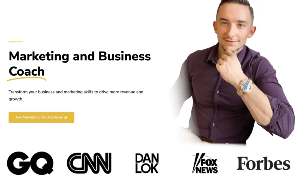
Positioning is key too. You don’t want testimonials hidden in a sub-page or buried in the footer. They need to be front and center—right where your audience can see them. A powerful testimonial placed near your call to action can give that final nudge a visitor needs to take the next step.
Numbers make testimonials more impactful. Saying, “We helped 500 companies streamline their sales process” sounds much more credible than just “We help companies.” Numbers add legitimacy, showing visitors you’ve delivered real, measurable results.
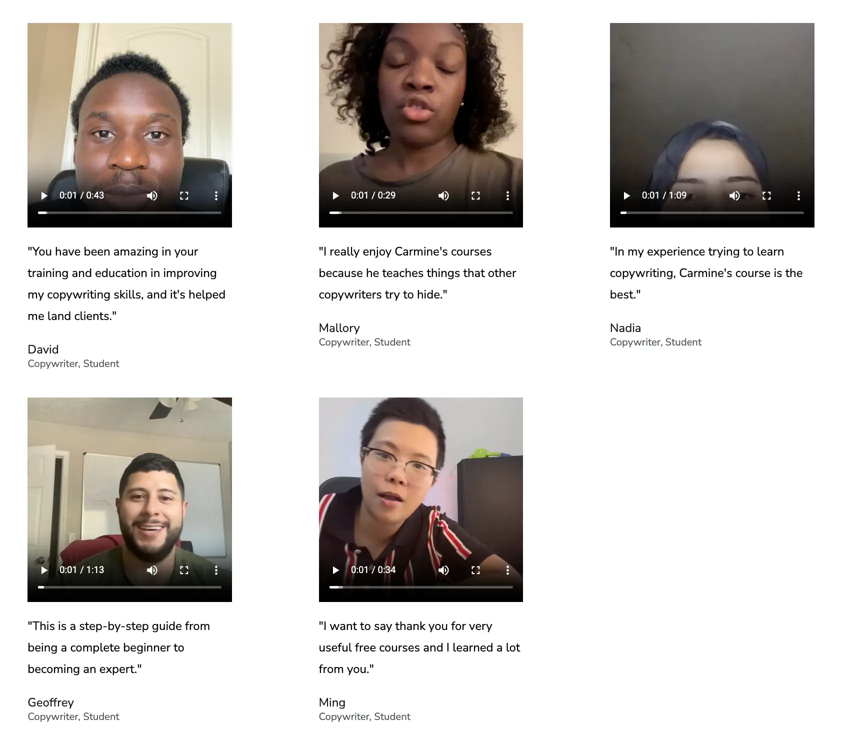
Also, don’t just rely on written testimonials. Use video testimonials where possible. Video adds an extra layer of authenticity—people can see and hear genuine customers talking about their experience. A video testimonial doesn’t just tell a story; it feels more personal and believable.
You can see how I use video testimonials on my Marketing Pro Academy sales page:
Lastly, consider using third-party review sites like Google Reviews, Trustpilot, or Yelp. Featuring ratings from these platforms can be even more powerful than hosting testimonials directly on your site, as they provide external verification that your product or service delivers.
Create a Clear Call to Action
A clear call to action (CTA) is essential for driving conversions. If visitors land on your homepage and aren’t told exactly what to do next, they’ll leave without taking any action. A strong CTA eliminates confusion and creates urgency, directing visitors toward the next step—whether that’s making a purchase, signing up, or contacting you.
Here’s where many websites fail: they either don’t use enough CTAs, or they make the CTAs too vague. Something like “Click Here” isn’t going to cut it.
Your CTA needs to be direct and tell users exactly what they’re getting when they click. For example, “Start Your Free Trial” or “Download Your Free Guide” clearly communicates what the action is and the benefit of taking that action.
CTAs also need to be visible. Don’t bury them at the bottom of the page. Instead, place your primary CTA above the fold—this is the section of the page visitors see without scrolling. You want it to be impossible to miss.
Color contrast plays a big role here, too. According to OptinMonster, using contrasting colors for your CTA buttons can increase conversions by up to 21%. The button should stand out from the rest of your page design, drawing the eye toward it. It doesn’t matter how good your CTA copy is if no one notices the button.
You should also repeat your CTA throughout your homepage. Ideally, you want at least three to four CTAs on a typical landing page. One above the fold, another midway through the content, and one at the very end. Not everyone will be ready to convert right away, so giving them multiple opportunities to take action is crucial.
Here’s a big one: don’t overwhelm your visitors with too many options. If you throw five different CTAs at them, they won’t know where to click, and that causes decision fatigue. Focus on your primary goal for the page, whether that’s getting email signups, driving purchases, or generating leads. Then, make your CTA singular and focused.
If possible, personalize your CTAs. This is a more advanced tactic, but if you’re using marketing automation tools, you can show different CTAs based on the visitor’s behavior or demographics.
For example, if someone has already downloaded a free ebook, show them a CTA for a demo instead. Dynamic CTAs based on user actions can dramatically improve engagement and conversion rates.
Optimize For Search Engines (SEO)
When it comes to writing homepage copy, SEO isn’t just an afterthought—it’s a necessity. Without optimizing your homepage for search engines, you’ll miss out on organic traffic that can drive serious conversions. Good SEO means better visibility, more traffic, and ultimately more leads.
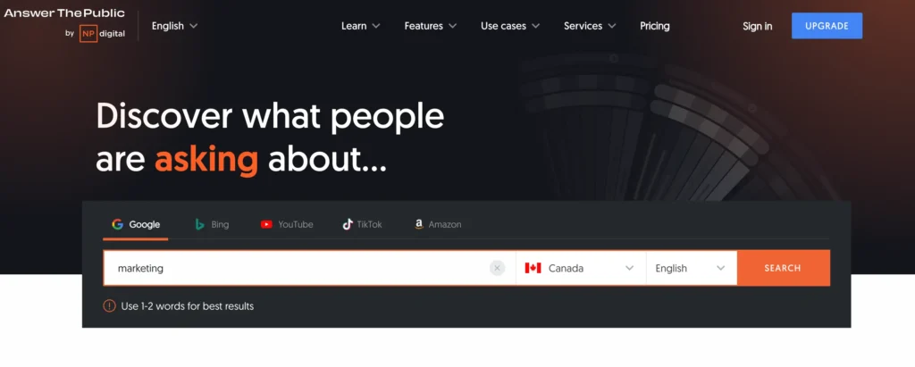
Start by focusing on your primary keyword. Your keyword needs to appear naturally throughout your homepage—especially in key areas like the headline, subheadings, meta description, and URL. You can use a tool like AnswerThePublic for keyword ideas.
But don’t overstuff it. Keyword stuffing is an outdated tactic that will actually hurt your rankings. Search engines are smarter than that now. Instead, aim for keyword density that’s natural and seamless. Google’s algorithm rewards content that is informative and written for users first, not bots.
Next, you want to structure your copy in a way that search engines can easily crawl and understand. That means using proper header tags. Your H1 tag should be reserved for your main headline—usually where your value proposition is located. This tells Google what your page is primarily about.
From there, use H2 and H3 tags to organize your subheadings, making your page more skimmable for both users and search engines. Clear, structured copy isn’t just good for readers—it’s essential for SEO.
Internal linking is another factor that boosts SEO. Make sure your homepage includes links to other important pages on your website—whether that’s a product page, a blog post, or your about page.
Internal links help search engines understand the structure of your site and distribute authority across your pages. It also keeps visitors on your site longer, which can lower your bounce rate—an important ranking factor for Google.
Another critical element? Mobile optimization. Most web traffic now comes from mobile devices, and if your homepage copy isn’t optimized for mobile, you’re losing potential customers.
Make sure your page is responsive, loads quickly, and that the copy is legible on smaller screens. Google’s mobile-first indexing means that if your site doesn’t perform well on mobile, your rankings will suffer.
Meta descriptions also play a big role in SEO, even though they don’t directly impact rankings. The meta description is the snippet of text that appears below your URL on search engine results pages (SERPs).
This is your chance to hook users before they even click. Your meta description should include your primary keyword and give a compelling reason for someone to visit your site. Keep it under 160 characters to avoid getting cut off in the search results.
Image optimization is often overlooked, but it’s crucial. Make sure all images on your homepage have alt text that includes relevant keywords. Alt text isn’t just for accessibility; it’s also another opportunity for search engines to understand what your page is about. Additionally, compress your images to reduce load times, as slower pages result in higher bounce rates, which hurts SEO.
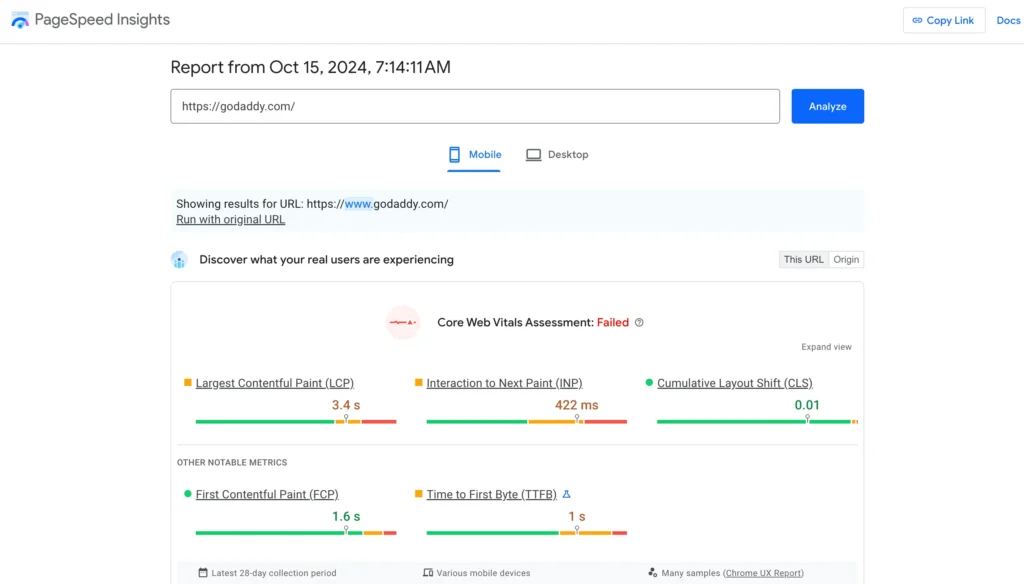
Finally, page speed is another critical factor. Google loves fast-loading sites, and visitors don’t have the patience to wait around for a slow page to load. Use tools like Google PageSpeed Insights to identify bottlenecks and optimize your page speed. This can involve compressing images, using browser caching, and minimizing the use of heavy scripts.
Constantly Test and Iterate
To create homepage copy that truly converts, you need to test and iterate. What works today may not work next month, and the only way to know what resonates with your audience is by testing different variations. Don’t assume you’ve nailed it on the first try—even the best copy can improve over time.
Start with A/B testing. This involves running two different versions of your homepage, with one key difference, and seeing which performs better. You can test headlines, CTAs, copy length, button colors—almost anything.
But the key is to test one variable at a time. If you change too many elements at once, you won’t know what caused the improvement.
Take your headlines, for example. You might think you have a killer headline, but data will tell you if your visitors agree. Try testing a benefit-focused headline against one that taps into emotions, like fear or excitement. For example, “Grow Your Business Fast” vs. “Stop Losing Leads with Our Proven System.” See which one leads to more engagement or conversions.
Next, track key metrics like bounce rates, conversion rates, and time on page. These metrics give you real insight into what’s working and what isn’t.
If your bounce rate is high, it could be a sign that your copy isn’t engaging enough, or maybe your call to action isn’t compelling. If your conversion rate is low, test different offers, like adding a limited-time discount or a free demo.
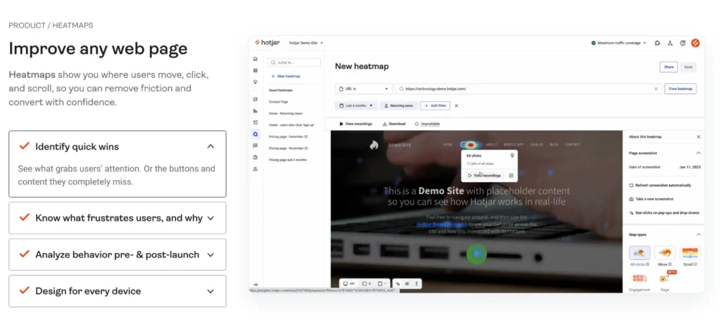
One pro tip: don’t just rely on quantitative data. Use qualitative feedback as well. Tools like Hotjar can show you how users are interacting with your page—where they click, where they scroll, and where they drop off. Combine this with direct feedback from customers through surveys or chatbots.
You should also keep an eye on your competitors. They’re testing, too, and if you notice them making changes to their homepage, it could be a signal that something is working. You don’t need to copy their approach, but paying attention to trends in your industry can give you ideas for your own tests.
Final Thoughts on Home Page Copywriting
Writing homepage copy that converts is all about strategy and precision. You need to understand your audience, craft a clear value proposition, and simplify your message so that it grabs attention quickly. Compelling headlines, strategic social proof, and well-placed calls to action guide your visitors toward the action you want them to take.
With the right balance of clarity, benefits, SEO optimization, and constant iteration, you’ll have homepage copy that not only resonates with your audience but drives real business growth.
Schedule a free consultation to learn more about my marketing services that will help your business drive more revenue.


