
Content isn’t a newspaper. (Unless you’re literally writing one!)
So, it shouldn’t read like one.
You know what I mean…
Blog posts that are black text on a white background with paragraphs big enough to scare every user away.
It’s more common than you think.
And a HUGE mistake.
Content readability will make or break the engagement and the ROI of blog posts.
Think about it.
If people can’t read it, they can’t enjoy it. They can’t get to the CTA and convert.
That’s why I’ll be teaching you how to make content more readable in this article.
Content readability meaning
Before we get into the nitty-gritty of making your content top-notch, let’s step back for a moment.
What the heck does content readability even mean?
For beginners, it’s how easy content—whether it’s a blog post, case study, or whitepaper—can be consumed and understood.
If people have a lot of hiccups and interruptions, it could probably use fine-tuning.
Poor quality content is plagued by high bounce rates … low average time on page … and disastrous conversion rates.
However, there are mountains of things that play into how readable content is or isn’t.
That brings me to my next point.
How to improve content readability
These are some of the daily practices I and other professional writers use every day to improve content writing readability. You can also learn the secrets to great copywriting in my course Sell Like Hell.
Short sentences and paragraphs are a lifesaver
If you’ve read my content, you’ll notice that I seldom go past one or two-sentence paragraphs.
I chop up sentences. I break a grammar rule or two. It makes the content sound more natural.
It also makes content less intimidating.
Don’t believe me?
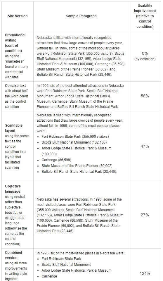
Check out this famous study done by NN Group.
They concluded that 79% of users scanned new web pages and only 16% read word-by-word.
Hence why having easily scannable text is crucial to content readability.
You’ll be learning other strategies to achieve this today, too.
The study also discovered that:
- Concise text with about half the word count as the control improved usability by 58%.
- A scannable layout (more on that later) improved usability by 47%.
- Objective and neutral language improved usability by 27%.
- Using all three of the above practices resulted in a 125% increase in content usability.
How crazy is that?
It makes sense, though.
Make content concise, scannable, and objective. It’s a guaranteed formula for useful content.
Don’t just take this and run with it though.
I wouldn’t suggest having an overly casual writing style for something more professional like a whitepaper or case study.
There are certain pieces of content that call for a more academic and serious format. Blog posts? Not usually one of them.
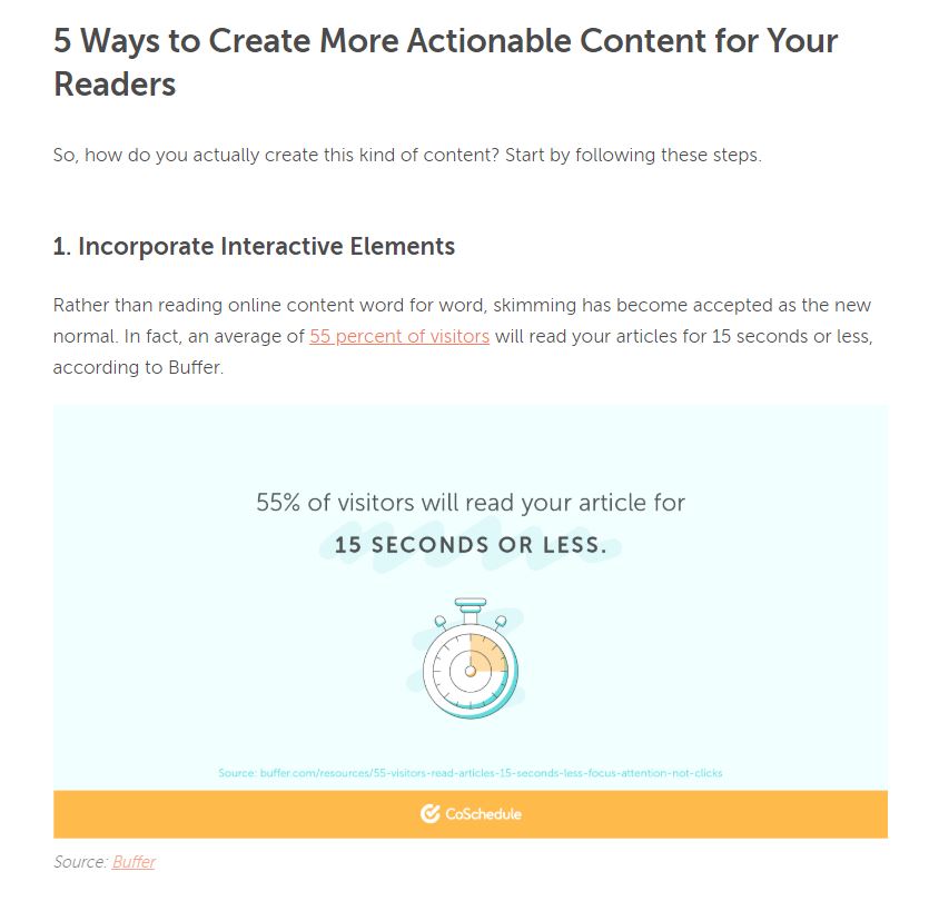
The average reader scans.
Think about yourself.
How often do you read every single word of a blog post?
I’d wager it’s not very often.
Instead, you probably scroll through looking for headings, sub-headings, bolded words, and visuals to guide you to the most useful nuggets.
I know I do this all of the time.
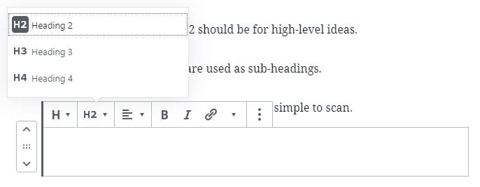
Add header tags to align with this common user behavior.
These are the large bolded headings you can find on platforms like WordPress, Wix, Weebly, and other content management systems.
They look like this on a page:
Larger tags like H1 and H2 should be for high-level ideas.
H3, H4, and smaller tags are used as sub-headings.
This neatly organizes content. It makes it simple to scan.
For instance, you can click the new block button on WordPress and the header button.
Then, choose between the different header tag options.
Enter text and you’re good to go!
This also plays a role in SEO as Google loves formatted web pages.
I recommend adding search terms you’re targeting into header tags as its an important area that search engine crawlers scan.
This can help improve your rankings for target keywords.
Use visuals to aid text and give relief
I used the newspaper analogy earlier.
And, nothing is worse than a blog post without images.
It’s like chicken without seasoning.
Blah!
Who wants that?
I’ll give you a hint: nobody.
Visuals add more ideas, information, and resources for readers.
Here are some ideas to try today:
Graphs and charts
Data is a massive part of credibility.
Never make a claim without having statistics or examples to back It up.
Otherwise, you lose authority.
You can improve credibility and readability by using graphs, charts, and similar data-driven visuals.
Create these on your own with the use of a free tool like Canva.
Sign up for an account and click “Create New.”
Then, choose custom dimensions or a template like “Blog Graphic.”
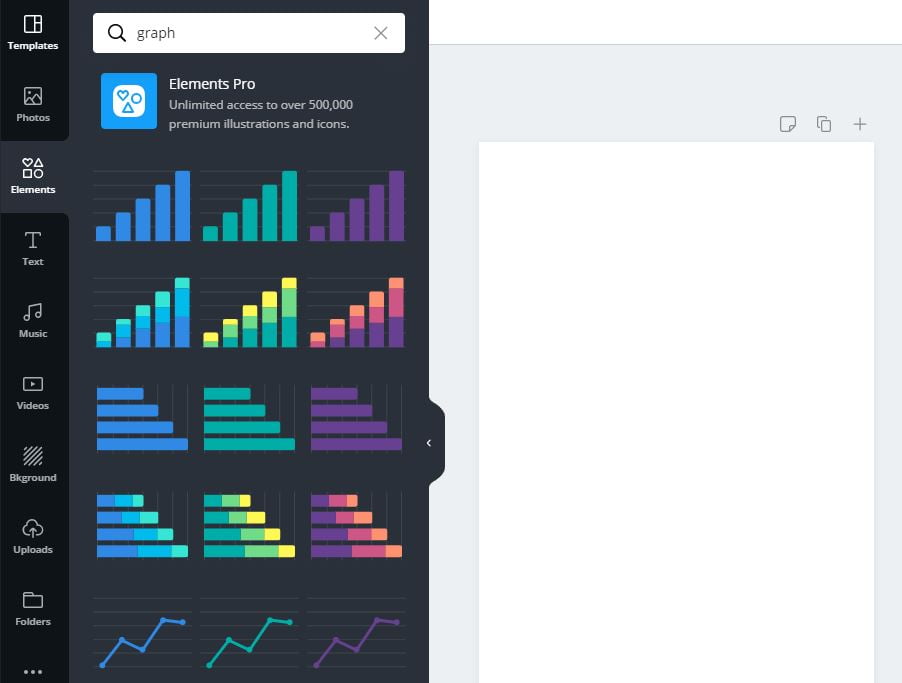
Click “Elements” and search for “Graph.”
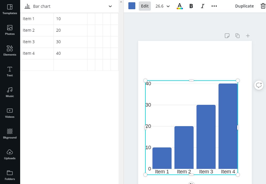
Choose one and edit the data according to your blog post.
Download the image from the top right and add it to your article!
Alternatively, writers source these types of visuals from studies and other publications.
Gifs
Whether you’re on Instagram or Facebook Messenger, what’s built into most social networks these days?
Gifs!
These are animated images that sum up an idea or add emphasis to a point.
Think of it like an emoji or meme. They’re used the same way.
Thus, they make for excellent images within content.
Everyone and their grandma knows what a GIF is, too.
However, let’s not get into whether or not it’s pronounced “gif” or “jif.”
I like using the free website Giphy.
Search for something and it will give you hundreds of gifs to choose from.
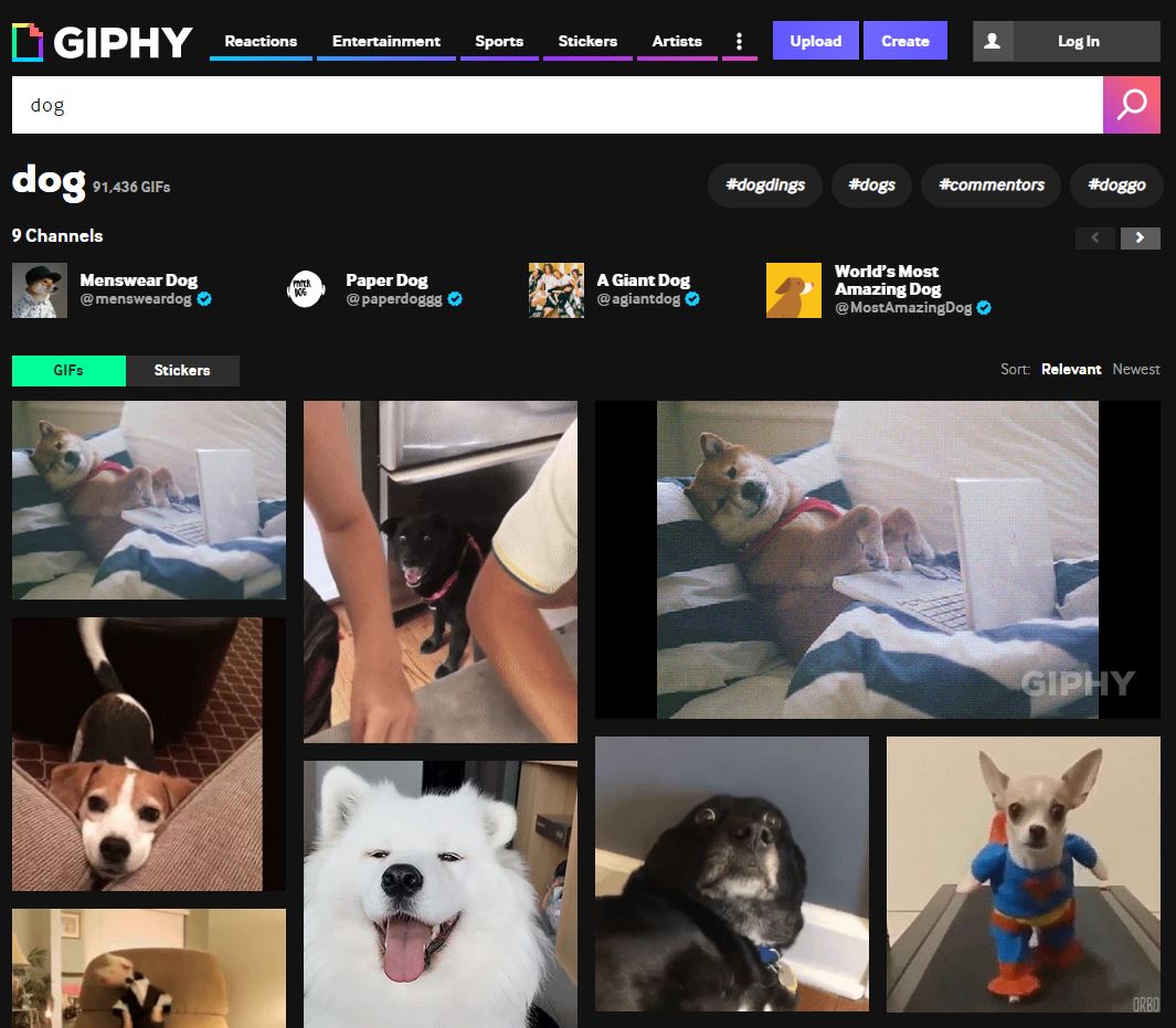
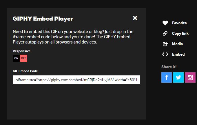
Click the one you like and directly embed it into the content.
Use them tastefully to add humor or context.
Screenshots
Last but not least, screenshots.
I love these.
It teaches readers how to do anything step-by-step and instantly sets your articles apart.
Because, here’s the reality…
Most content is fluff. It’s impractical.
Posts will say to do X, Y, and Z but offer no instructions on how to do so.
Posting screenshots help you guide users through using tools or completing specific steps.
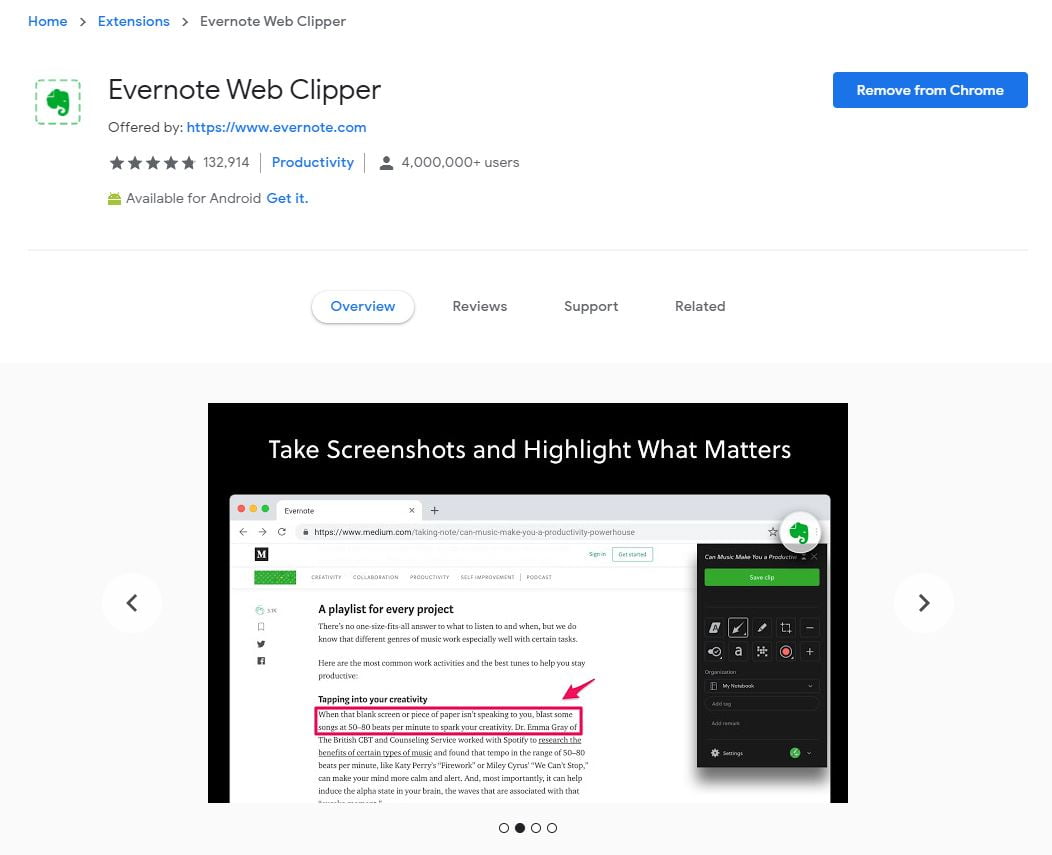
Evernote is a cool Google Chrome extension for this.
Install it and click the green elephant icon on the top right of the browser.
This will prompt a sidebar where you can screenshot and add neat effects like this:
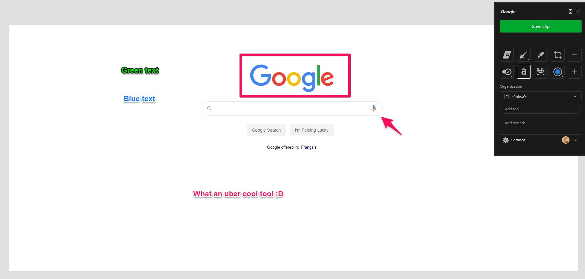
Save the image and add it to the content.
Bonus tip: Save images with your target keyword in the file name if it sounds natural.
Be scientific with font size and typography
Comic Sans.
Saying those words is enough to send a shiver down my spine.
It’s universally known as one of the most annoying typefaces.
Similarly, if the text of this article was 10px, you’d need a magnifying glass to see it.
Get my point?
The choice of typography and font size plays a huge role in how easy (or not) content is to digest.
First I recommend considering using a flat font. You’re reading one called Nunito right now. It’s my favorite.
Flat fonts are minimal and simplistic.
They don’t have the fancy curls or effects on letters you commonly see with regular typefaces.
Secondly, bump up that font size.
I personally enjoy 16-18px. It’s not too big but still pops from the page.
Replace passive voice with active voice
Passive voice = indirect.
Active = direct.
This is a simplified way of thinking about it.
Here’s an example:
- Passive voice: A show is going to be watched by us tonight.
- Active voice: We are going to watch a show tonight.
See the difference?
The subject is acted upon by the verb in the first.
Flip that around and you have an active voice!
It’s much more straightforward.
That’s why I highly recommend auditing content for passive voice.
Use a free tool like Datayze to detect passive voice automatically.
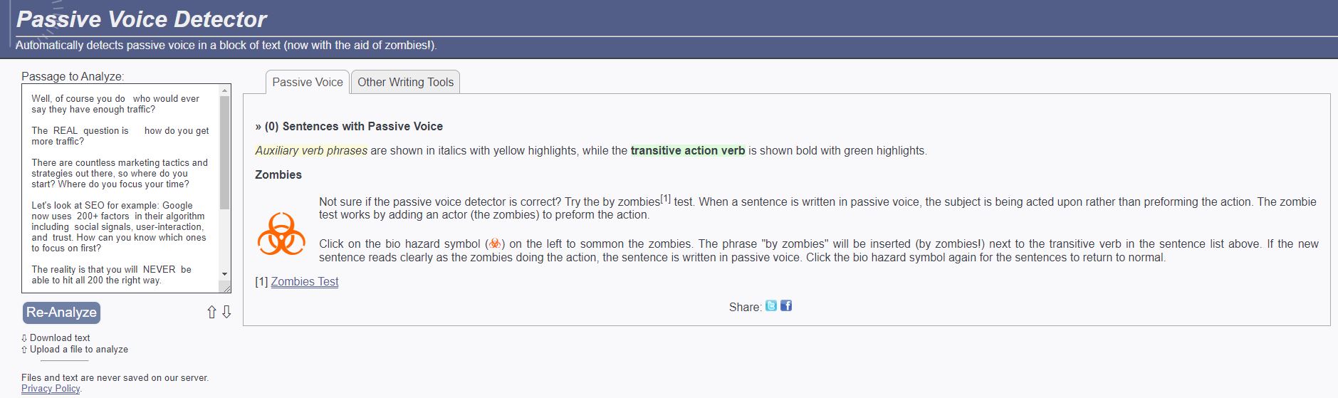
Paste in the content and it will highlight anything that needs improvement.
Like most linguistic rules, you don’t have to follow them down to a science.
It’s okay to have some passive speak here and there.
Tone down the technical jargon and complex terms
Here’s what I believe and what has worked great for me over my many years of writing…
You can use technical jargon and complex vocabulary to reach a very small audience.
Or, you keep it simple and reach the largest possible readership.
The latter is better, right?
Imagine you were speaking to Harvard graduates and the layman explaining something technical like SEO.
Sure, you could talk about algorithms and maybe the first group might catch on but the second might not.
Instead, if you use simple language, examples, and analogies, the whole group gets it!
That’s why content needs the same approach. Nobody is impressed by big words.
Please the largest possible audience by keeping content easy to read.
If they have to take out a dictionary or call their lawyer to figure out what something means in a blog post, that’s a red flag.
Use WebFX’s free readability test tool to receive a grading score.
Enter the URL of the published content to begin.
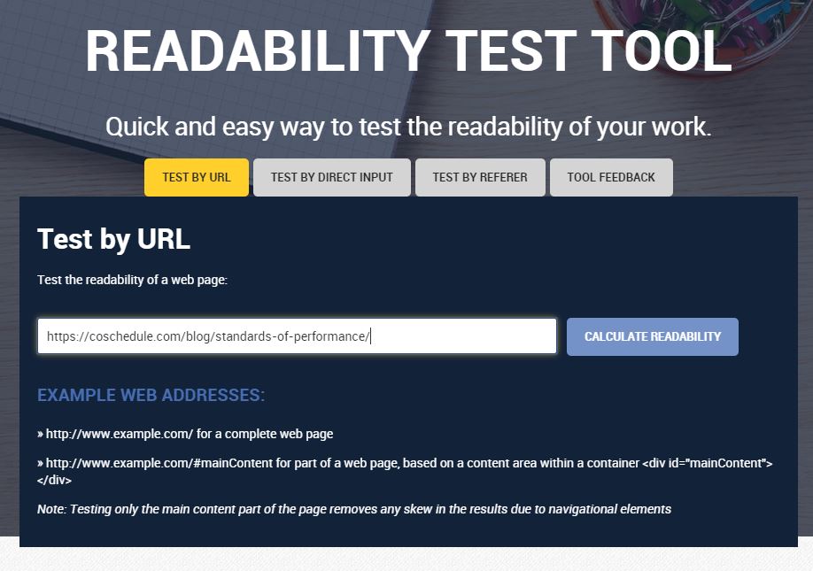
Click “Calculate Readability” and it will give you the following results:
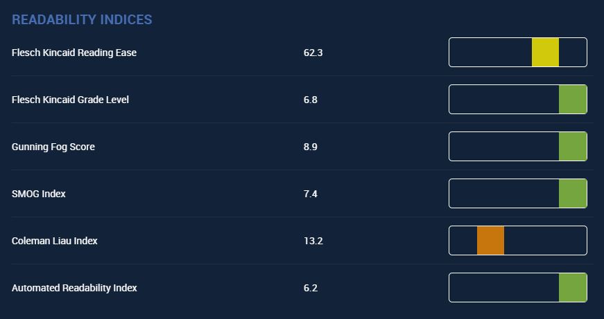
Scroll down to the level and use that as a benchmark.
If I told you that businesses with well-formatted content generate an extra $1 million in revenue every hour, you’d probably think, “Prove it.”
That’s exactly why you should never make any claims without providing data, statistics, case studies, or other proof to back them up.
This achieves a few different things.
One, it makes content more authoritative and credible. Something most content misses and lacks.
Not only can you help the reader and provide interesting insight, you can prove it works.
Secondly (and because of the first reason), it’s easier to get through content without objections.
Instead of thinking, “Hmm, I have to research into that,” the reader glides through like a Slip ‘N Slide.

Use bullet points and lists to quickly summarize information
If there’s one main takeaway from today’s blog post, it’s all about writing content to be convenient.
This manifests in many different forms.
One of them is through the use of bullet points and lists. They can help you:
Take advantage of bullets and lists any time you want to neatly recap information or points.
Remove adjectives and adverbs (but not all of them)
Adjectives and adverbs (also known as modifiers) alter the meaning of a verb or noun.
For example, here are two sentences. One uses an adverb and the other does not:
- I wrote some incredible sales copy. (The adjective is “incredible.”)
- I write some sales copy.
Adverbs, on the other hand, modify verbs and normally—but not always–end with “ly.”
Here are two sentences with the first using an adverb.
- Zach wrote the sales letter quickly. (Adverb is “quickly.”)
- Zach wrote the sales letter.
I like using adjectives and adverbs. Don’t get me wrong.
Mix them in to spice things up.
Using them too often can cause run-on sentences. Or, it might take longer to get your point across.
Wrapping up how to improve content readability
While everybody is worried about the Coronavirus, there’s another thing plaguing the world…
Bad content.
One way to guarantee content is easy to digest and more usable is by enhancing its readability.
This can be done by first breaking up paragraphs into short sentences.
Try not to get beyond one to two sentences.
This makes content easier to read and less intimidating than big blocks.
Next, use header tags to break up major and minor points.
Visuals like screenshots, gifs, graphs, and charts also make content more resourceful.
It breaks up the text and adds visual relief.
A flat font and larger font size are instant wins content marketers can take to boost usability, as well.
From there, focus on reducing passive voice and technical jargon.
Apply what you learned today and thank me later.
You can also check out my free and paid courses to learn more about marketing and get coaching from me.