Did you know that 48% of marketers build a new landing page for every marketing campaign?
It makes sense.
Each unique offer requires its own page, copy, and funnel.
However, it’s not just the offer and the backend that matters.
The sales copy does too. If not the most.
74% of web readers pay close attention to the quality of spelling and grammar as well.
That means high-quality copy on squeeze pages will collect more subscribers which translates into cash for your business!
Want to learn the secrets of great squeeze page copywriting?
Keep reading to find out.
What is a Squeeze Page?
So, first of all, what is a squeeze page?
Is it a place where you squeeze oranges?
Not really.
A squeeze page is a form of a landing page that is designed specifically to capture opt-in email addresses and other information.
This data can then be placed into email marketing software or a CRM to follow up with leads, schedule demos, and drive sales.
What is The Purpose of a Squeeze Page?
You see, a lot of marketers make a huge mistake…
They drive traffic straight to a product or sales page without warming up visitors.
It’s like asking someone to marry you on the first day. Not gonna happen!
Instead, you send traffic to a squeeze page where they receive a free offer (also called a lead magnet) in exchange for their email or other information.
It’s a win-win. They get a valuable resource and you get them on your list.
That brings me to my next point.
What Is a Good Squeeze Page Conversion Rate?
Should you get a 3% conversion rate? 5%? How about 15%?
Slow your horses.
This depends on a lot of different factors including:
- Traffic quality
- The offer
- Sales copy
- User experience and layout
- Etc.
A typical web page conversion rate is 2.35%. The top 10% of companies can achieve 3–5x that, however!
The key is experimenting.
Pretend you’re a mad scientist in a lab.
Test the copy, offer, traffic, and everything under the sun.
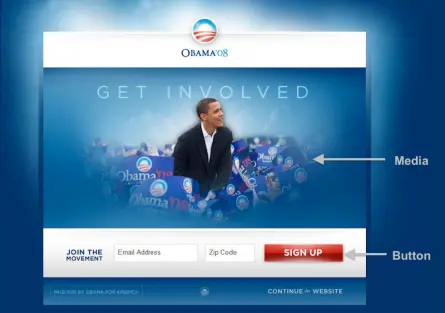
For instance, President Obama raised an additional $60 million by A/B split testing subject lines for his campaign.
That brings me to my next point.
What Is the Difference Between a Landing Page and a Squeeze Page?
So, here’s the deal: while both of these bad boys are designed to convert visitors into leads, they’ve got a few key differences that set them apart.
Think of a landing page like a catch-all – it’s a standalone page on your website where visitors land after clicking on a link from an ad, email, or social media post.
Its main goal? To guide visitors toward a specific action, whether it’s signing up for a webinar, downloading an ebook, or making a purchase.
Now, squeeze pages, on the other hand, are a bit more focused. These are laser-focused on capturing email addresses – hence the name “squeeze.”
They typically have minimal distractions, a single call-to-action (CTA), and a compelling offer that’s too good to resist.
Is a Squeeze Page the Same as an Opt-in Page?
While these two terms are often used interchangeably, they’re not exactly cut from the same cloth. A squeeze page is a specific type of opt-in page – one that’s laser-focused on capturing email addresses and building your list.
Opt-in pages, on the other hand, can take many forms. They could be pop-up forms, sidebar widgets, or even embedded forms on your website.
The key difference? While squeeze pages have just one goal – to squeeze those email addresses out of your visitors – opt-in pages can serve a variety of purposes, from promoting a webinar to offering a free trial of your product.
What Are the Advantages of Squeeze Pages?
The beauty of squeeze pages lies in their simplicity and focus. Unlike other types of landing pages, which can be cluttered with distractions and competing calls-to-action, squeeze pages cut straight to the chase.
They’re like a one-way ticket to getting email addresses and building your list. And here’s the kicker: because squeeze pages are so focused on capturing email addresses, they tend to convert like crazy.
If you’re serious about capturing leads and driving conversions, squeeze pages are where it’s at.
Squeeze Page Examples
These are cases of squeeze pages and what makes their copy stand out.
AdEspresso’s Facebook ad templates
I love AdEspresso.
Mostly because I drink enough coffee every day to get an entire Olympic team banned.
Jokes aside, this is a squeeze page for their Facebook Ads templates:
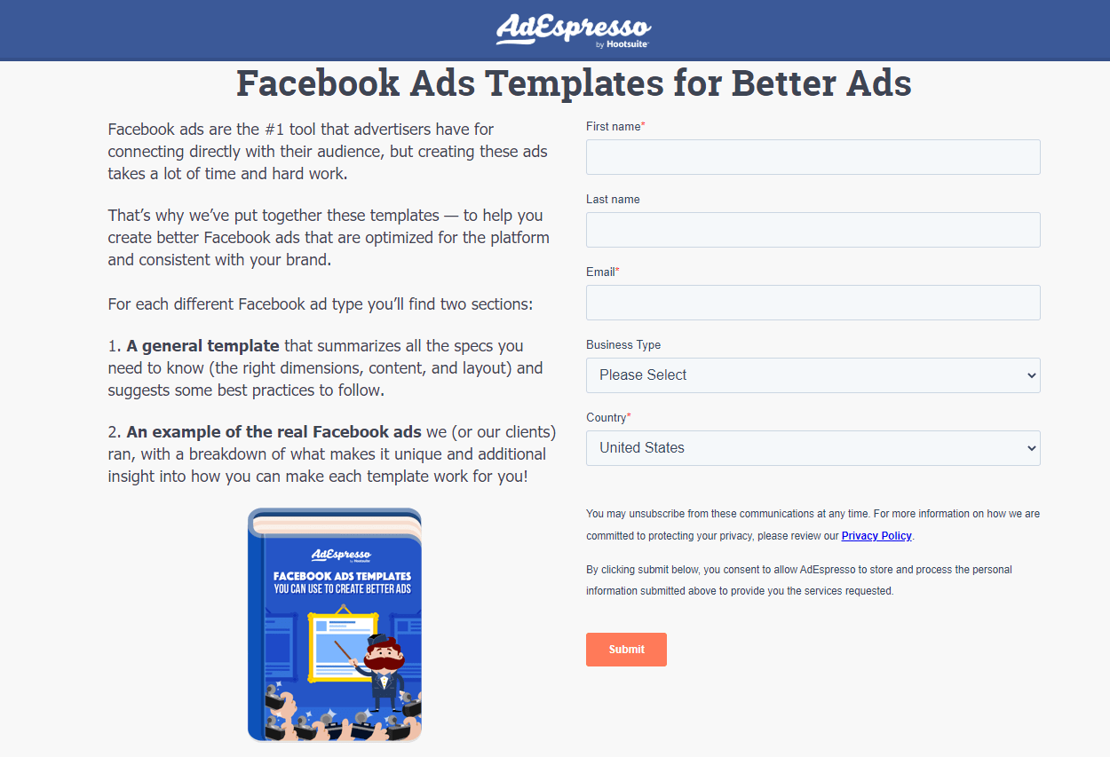
It’s simple. Straight to the point.
There’s no fluff and it’s all contained above the fold.
The headline is benefit-oriented. The reader will make better ads with the templates which means more revenue.
The copy begins by addressing a pain point: creating ads taking a lot of time and hard work.
The templates are presented as a solution to help readers create better ads that are optimized and consistent with their brand.
The different types of templates are explained and the form is found on the right.
AdEspresso uses a “Submit” call to action as well.
Marketo’s lead nurturing guide
Marketo is one of the leading AI marketing platforms.
This is the squeeze page for a lead nurturing guide they offer:
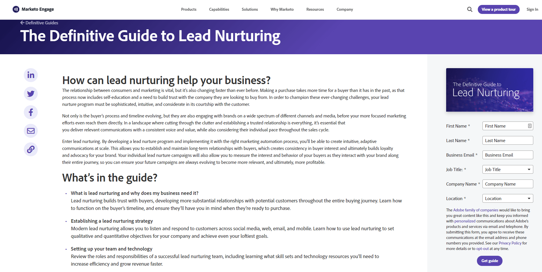
The headline gets your attention by positioning the offer as a “definitive guide” meaning you won’t need anything else to learn about this topic.
The first headline reads “How can lead nurturing help your business?” The sales copy below elaborates on how customer behaviour and the business landscape is changing. You can’t fall behind.
Marketo then explains how lead nurturing creates automation, builds loyalty, and helps customers along the buyer journey to increase profits.
They clearly depict everything that’s included in the guide so readers don’t have any questions or objections.
The form has six fields to fill out and the button uses a “Get guide” call to action that is tailored to the page.
Backlinko’s newsletter
Backlinko.com is one of the—if not the—most popular SEO blogs on the internet. It is run by Brian Dean.
Visiting the newsletter section of their website, you are greeted with a small squeeze page that says “Proven SEO Tips Straight to Your Inbox.”
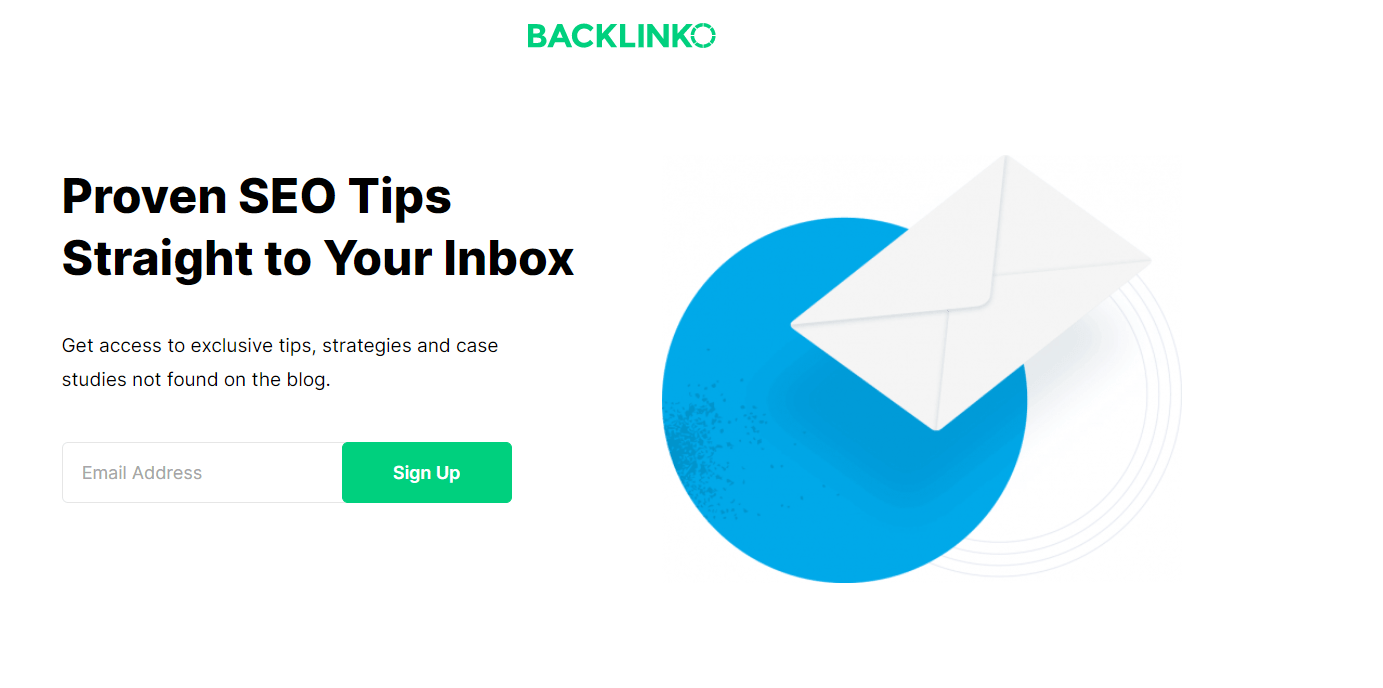
The sub-headline reads “Get access to exclusive tips, strategies, and case studies not found on the blog.”
There are two components that make this copy work so well.
Firstly, the headline provides the benefits of improving your SEO in a convenient way.
The sub-headline uses the aura of exclusivity and urgency as the subscriber is getting the information they can’t get anywhere else.
Backlinko only asks for an email and the “Sign Up” CTA is straightforward.
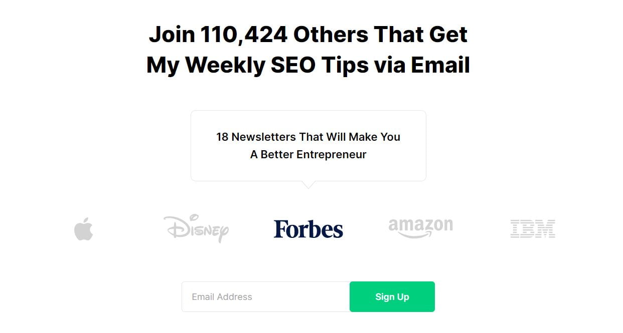
Below this, Brian uses social proof of how many subscribers he has and publications he’s been featured in.
Read my guide to email newsletter writing.
How To Write a Squeeze Page
Okay. Time for the nuts and bolts of today’s blog post.
I’m going to teach you how to write squeeze page copy that drives conversions through the roof.
I’m talking home runs. Out of the ballpark kind of swings.
After you’re done reading this guide, go take my free copywriting course to further sharpen your skills.
Let’s get into it.
Make an offer they can’t refuse
The first step before you piece together any squeeze is to have an offer.
Or else, uh… you can’t write any copy.
The offer will depend on your individual business and campaign goal.
Remember that squeeze pages are for collecting emails and subscriber information.
That means you want to offer a lead magnet—a free resource such as a:
- Checklist
- Cheatsheet
- Course
- Template
- Spreadsheet
- Calculator
- Tool
- E-book
- Gated content
- Infographic
- Report
- Guide
As a rule of thumb, make it so good that people would pay money for it
That way giving it for free is irresistible.
Additionally, a lead magnet needs to be aligned with your ideal customer profile, or ICP for short.
This is a fancy way to say a buyer persona.
It is a detailed description of the type of customer or company you are targeting.
Here’s a template you can use:
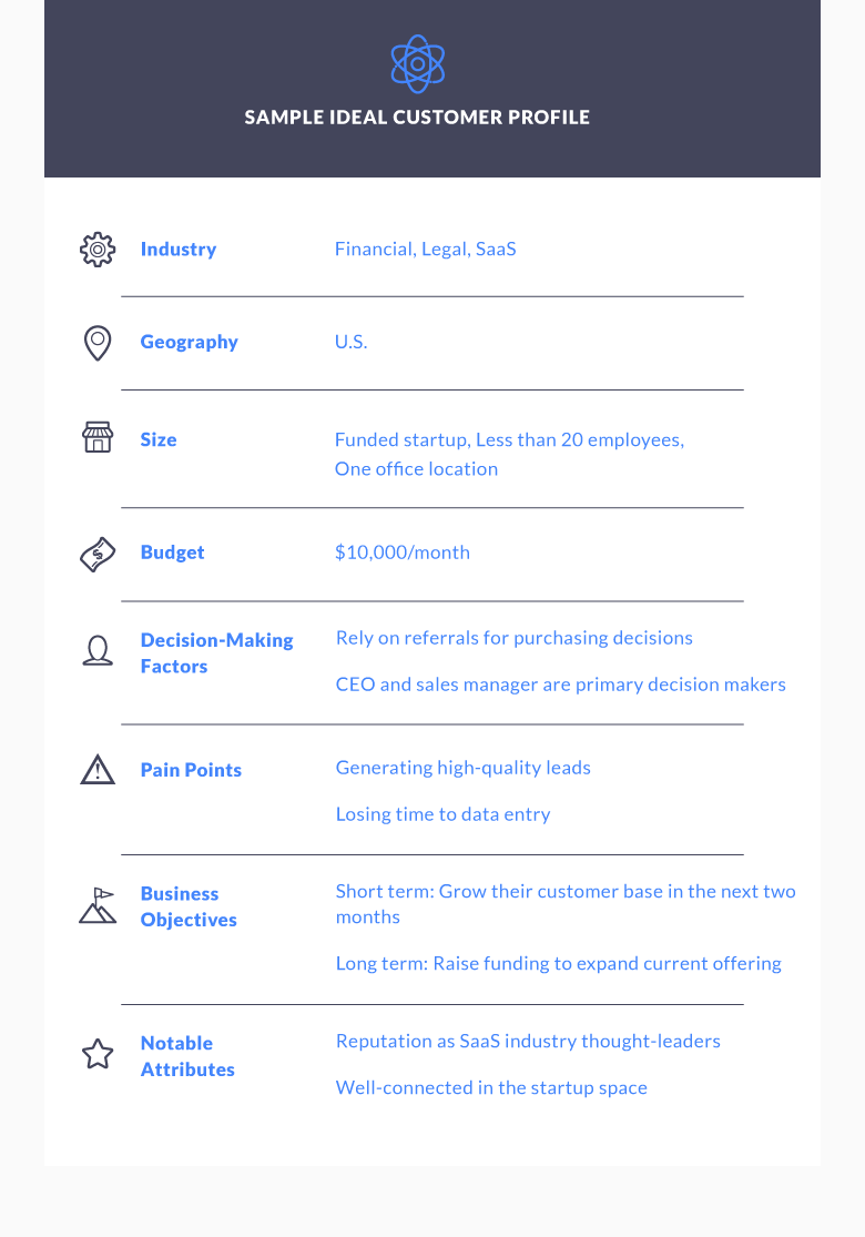
Filling this out and keeping it documented for you and your team allows you to write copy and create offers that attract a hyper-segment of visitors and delight them.
Don’t make the mistake of doing marketing with a blindfold on and not having a clear target audience.
Every time you’re writing copy, imagine speaking and explaining the topic to this person.
HubSpot is one of the best examples of using customized offers.
Go to any blog post and I guarantee that there will be a different lead magnet in each article.
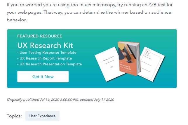
This is because companies increase leads by 55% when they use more landing pages.
If you don’t have any squeeze pages, focus on building a few staple ones first.
Once you get a good system down, keep launching more for individual topics and buyer personas.
Contact me if you need a squeeze page copywriter to help you with this.
Make a drool-worthy headline
“When you have written your headline, you have spent eighty cents out of your dollar.” – David Ogilvy.
The headline is the first thing a reader sees.
If it is great, it will draw them into reading the body.
Otherwise, if the headline stinks, people will click the back button faster than you can say “Wait!”
Headlines should be primarily benefit-driven.
They need to communicate to the reader exactly what they are going to gain by taking action.
But not just that.
The headline also explains the financial, emotional, or deeper upside of taking the offer.
WyseBox uses a how-to style and benefit-driven headline on its homepage for illustration:
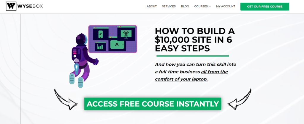
Let’s break down why it’s so effective:
- “How to” communicates students will learn something new and be taught how to do it.
- “Build a $10,00 Site” means students will have the potential to generate amazing income.
- “6 Easy Steps” makes the process seem less intimidating.
The sub-headline explains this further by telling readers they can turn the skill into a full-time business working from their laptop. It sounds like a dream, right?
Make sure to read my articles on how to write headlines and headline copywriting templates for more ideas too.
After you’ve written the headline, there’s one more step. (Optional in certain cases.)
And that’s writing the sub-headline like I just covered with WyseBox.
This text supports the headline with more proof, benefits, or an attention-grabbing statement.
Pair Visuals and Copy Like Wine and Cheese
Wine experts will tell you that every wine can be paired with a certain type of cheese.
Texture … flavour … zing … that kind of thing.
Your sales copy and visuals have the same relationship.
Images need to create emotion and support the copy.
They’re not just there to take up space and make a page longer. (We’ve all been guilty of it.)
Firstly, avoid stock images at all costs. They’re bland and scream low quality.
In rare circumstances, they can support the copy if it delivers a relevant emotion and makes sense.
In 90% of cases, they should be avoided like the plague.
Instead, use screenshots of the offer itself so readers get a glimpse of what they can get and create anticipation.
Use graphics and charts to cite statistics. Back up the squeeze page with authority and data.
Or, alternatively, don’t use images at all!
Simple and ugly sells. Never forget that.
Removing unnecessary elements, which sometimes include images, can reduce distraction and help increase conversions.
Build Trust With Testimonials
What’s one of the first things you do when buying a product?
You probably ask a friend.
…Or family.
…Or go on social media.
…Or watch YouTube reviews.
We have all of the power of the internet at our fingertips to research brands and products.
This means that you need to build trust on a squeeze page.
Testimonials and reviews are the best way to do so.
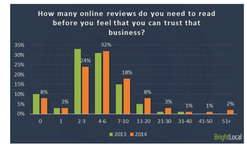
In fact, 32% of customers read 4–6 reviews of a business before trusting them.
On the homepage of the ad agency ProfitableAds.com (which acts as a squeeze page), there are several testimonials.
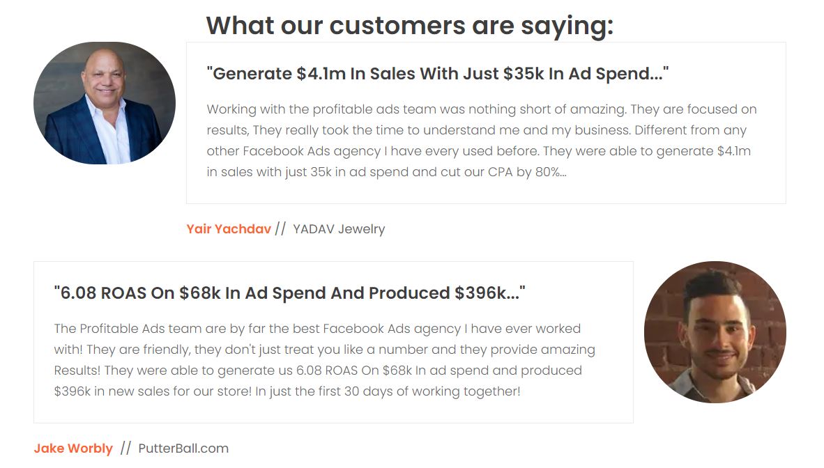
This clearly shows that the agency is capable of driving insane ROI such as $4.1m in sales with $35k in ad spend.
These increase conversions as they act as social proof. Potential customers can see you really walk the walk.
Have a Strong Call to Action
Don’t be shy.
At the end of the squeeze page and throughout it, you need to tell the reader what to do.
This makes what to do more obvious and increases conversion rates.
It can also be that tiny push they need to get over the finish line.
Calls to action, or CTAs for short, are words and phrases that tell and instruct. These are CTAs you place on your squeeze page:
- Register today/now
- Sign up today/now
- Don’t wait/miss out
- Enter email/phone number
- Give me my free X
- Click here
- Start
- Watch
- Try
- Discover
- Unlock
Continuing with the previous ProfitableAds example, you can see there are two CTAs for a free guide they offer:
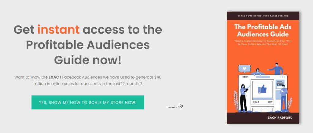
The first tells the reader to “Get instant access” and the other speaks in the first person saying “Yes, Show Me How to Scale My Store Now!”
Final Thoughts on Writing Squeeze Pages
Phew, that was a lot to take in.
Squeeze pages are a necessary tool in your toolbox for generating leads and turning them into paying customers.
However, don’t just throw together a squeeze page that looks like a five-year old’s finger painting project.
Craft an irresistible offer. Something so good people would pay for it.
Then, write a headline that grabs attention and creates desires. Reel them in like a fish.
The body of the squeeze needs to explain the offer, who it’s for, and what they will get out of it.
Feel free to include or exclude images. Split-test this if you choose.
Build loyalty with readers by showcasing positive comments from past customers through testimonials.
Finally, fill the page with calls to action. Tell the reader the next best step to maximize conversions.
Explore my online courses to learn more about copywriting and get coaching from me.


