The world needs to be able to see your work.
No website = no clients.
Okay. Maybe not 100% literally.
But not having a website definitely limits your branding, awareness, and the number of writing opportunities that come your way.
Take me, for example.
All of my content writing and copywriting clients come through this website and blog.
It powers my business!
I show off my portfolio, offer resources, collect emails, the whole shebang.
That’s why today I’m going to show you how to create a freelance writer portfolio website and examples for inspiration.
Let’s dive in!
How do I create a freelance writing portfolio?
First things first.
How do you create a freelance writing portfolio website?
There are many options.
If you don’t mind investing a bit of coin, I recommend setting up a WordPress website with Elementor and Bluehost.
This will offer the most customization, speed, and design.
However, if you want to keep it lean and simple for now. Follow these steps:
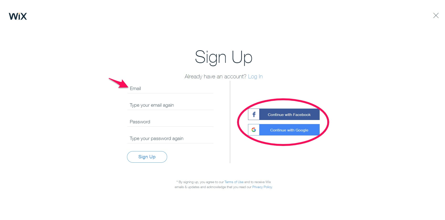
Step 1: sign up for a free Wix account
Wix is a free website builder tool that you can use to create a freelance portfolio site in 30 minutes or less.
Begin by clicking “Get Started” on the homepage.

Continue with email, Facebook, or Google.
That brings me to the second step.
Step 2: choose a portfolio template
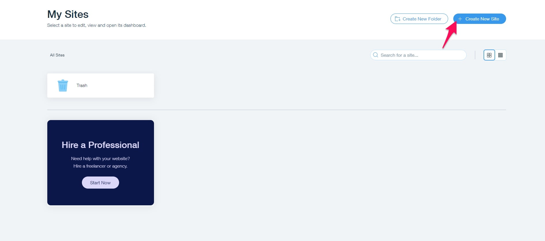
Create a new website from the top right of the dashboard.
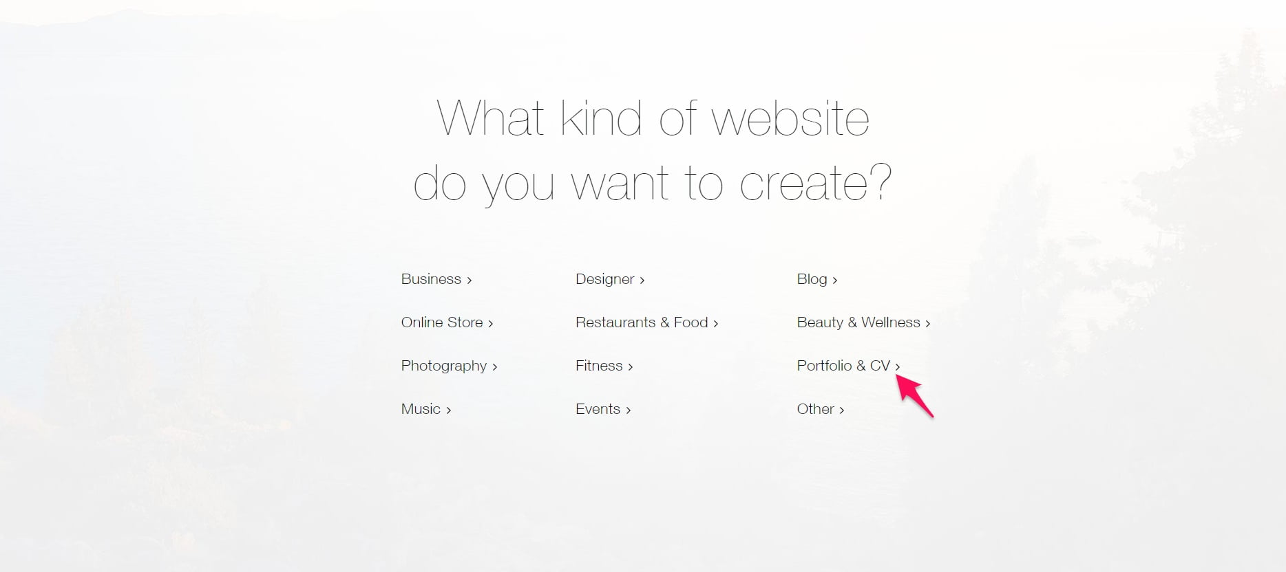
It will ask you to choose a website type next. Pick “Portfolio & CV.”
Choose the template option after the “View” button on any template that looks interesting.
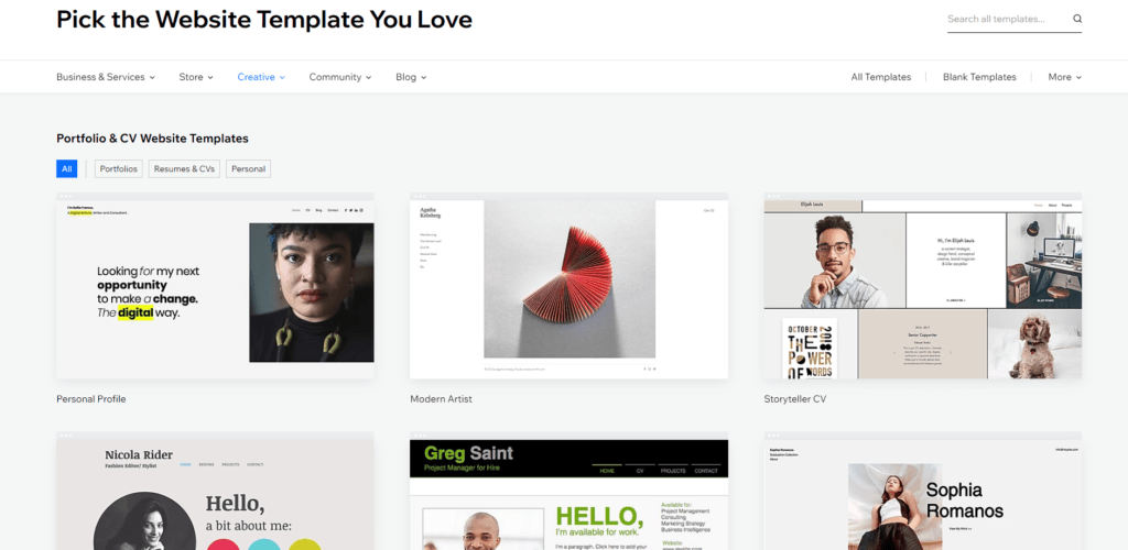
Matches your style? Cool. Click “Edit.”
Select pages from the top left navigation.
Click “+Add Page” and give it a name like “Portfolio.” It will automatically switch to editing the new page.
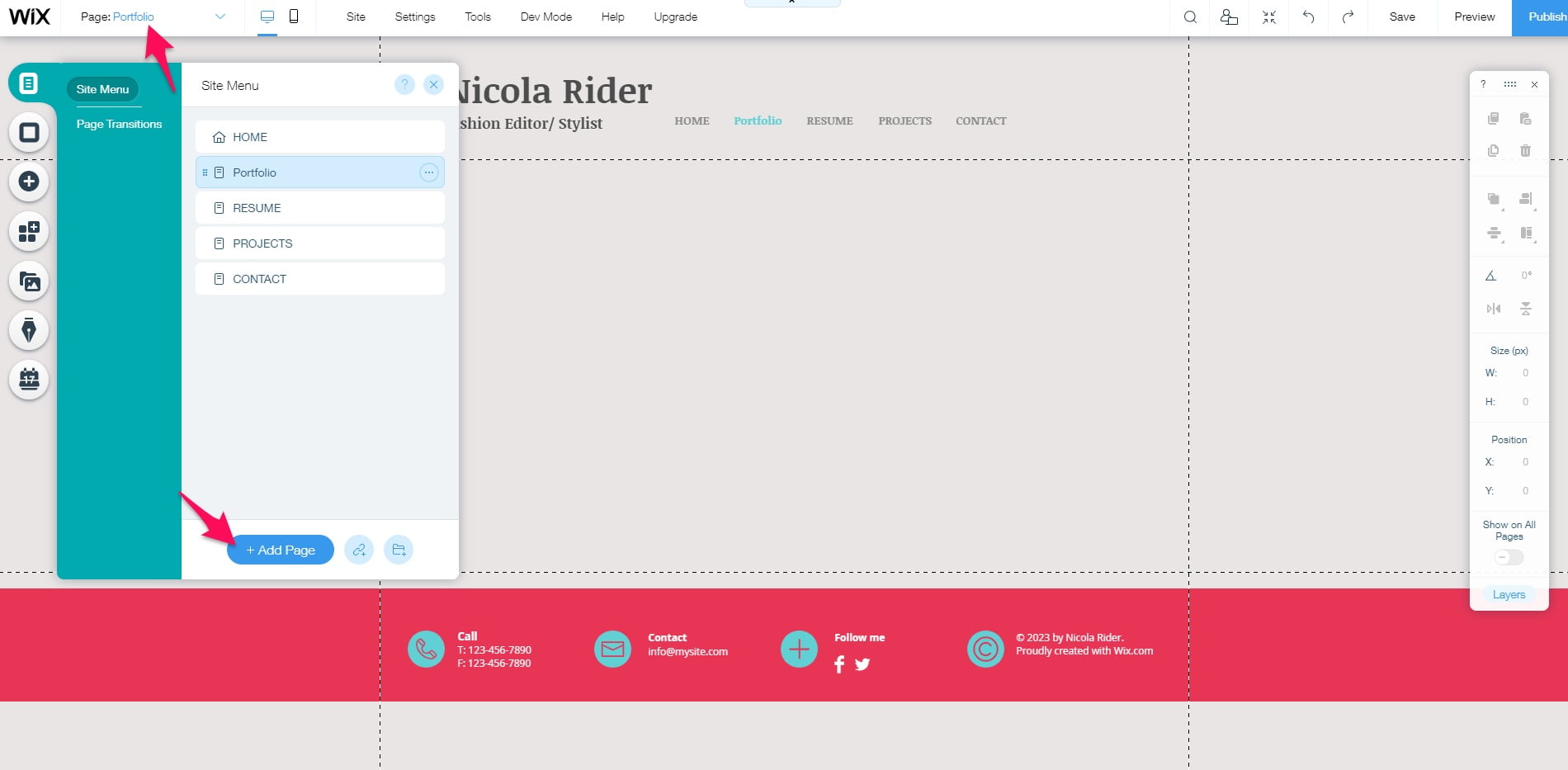
Change the headline of the website to your name followed by “Writer” or “Freelance writer,” for example.
Then, click the plus button on the left to add elements to the page.
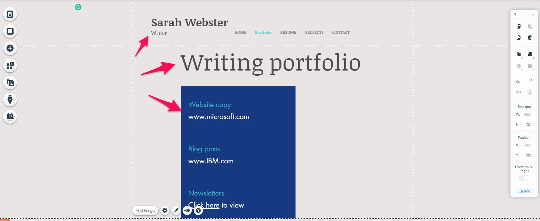
Begin with a header tag that reads “Portfolio” or similar.
Then, add a bullet list or one of Wix’s grids to list your portfolio.
You should add a headline, a link to the work, and a summary.
The homepage should include a summary of your services, a call to action to contact you, and more about who you are.
The about page can dive further into your experience, credentials, and personality.
The contact page is straightforward: a page with a form to reach you.
I’ll be going over freelance writer portfolio websites with takeaways later for inspiration, so don’t get too hung up on making the Monalisa of sites just yet. That comes later.
That brings me to the last step.
Step 3: fill out the website and publish it
Click the “Publish” button on the top right of the Wix editor when you are satisfied with the changes you’ve made to the website.
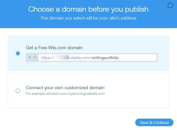
It will ask you to choose a domain name.
Use your name, brand, or something descriptive about writing.
Publish it after this.
Congrats! You now have a freelance portfolio site.
Continue to grow the portfolio and website to share with prospects.
Keep in mind that Wix is a great place to start, but I suggest moving over to WordPress at some point for more customization and SEO capabilities.
Check out Bluehost to get your website up and Elementor for designing it.
Next, let’s look at some examples of design and marketing inspiration.
Freelance writer portfolio website examples
These are some of the best freelance writer websites. Let’s put them under the microscope to see why they’re so awesome. 🔍
Jacob McMillen
Jacob McMillen is a freelance SaaS writer who has worked with HubSpot, ConversionXL, and many other jaw-dropping names.
He also has a popular freelance writing blog.
As soon as you land on his website, you’re greeted by a hero section promoting his new free writing course.
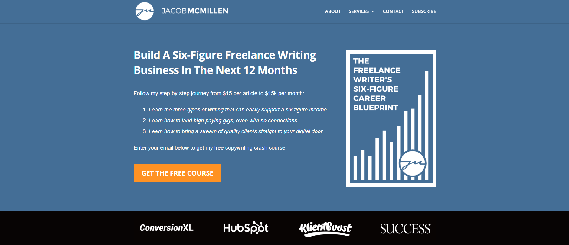
It lures you in with benefit-oriented bullets, and, of course, it is free.
This is followed by a testimonial by a student of his that acts as social proof, increases conversions, and builds authority.
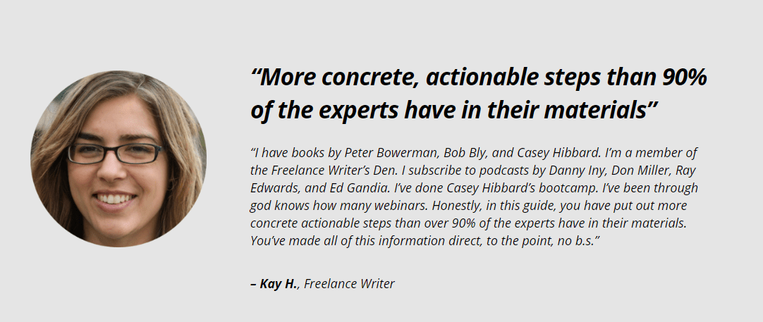
Lastly, Jacob has a section on how he went from $15/article to $15k/month with a call to action to pick up his free course.
The rest of his website is very bare-bones.
There are two service pages for copywriting and content strategy, a contact page and a newsletter subscription.
You essentially can only get into his funnel, read his content, or reach out for services.
Keeping it simple limits people’s options and prevents what’s known as the paradox of choice.
Researchers have found that the more options someone has, the less likely they are to take action at all.
Follow the KISS model: keep it simple, stupid.
Aaron Orendorff
Facebook, Intuit, and Shopify Plus are just a few of the incredible companies that Aaron Orendorff has “saved from bad content.”
He has increased his client’s email list by 194% YoY, traffic by 823% YoY, and MQLs by 164% YoY.
He has testimonials from people like Ann Handley and charges $10,000/month to work with him.
Not too shabby.
Want to be like him?
Let’s analyze his site.
Above the fold, we see a picture of him which adds transparency and a personal touch to the site. He has a tagline, “Saving the world from bad content,” with a sub-header reading, “B2B content strategy that’s built for humans, generates qualified leads, and scales over time.”

This clearly explains what Aaron does and why it matters to potential clients. There is a call to action button for a free resource below this to build his email list and convert users.
He builds social proof and trust by listing his clients and the results he’s driven for them. He walks the walk.

A testimonial from legendary writer Ann Handley (the founder of MarketingProfs, no biggie) is below this.

It just keeps getting better!
Aaron explains his content strategy process along with displaying more testimonials to finish the homepage.
Next, he has a blog. Here he writes about interesting topics that attract his buyer persona and educates them. He proves that he’s an expert.
The contact page summarizes his approach to producing content that saves users from their problems and has a button to email him directly.
Susan Greene
Susan Greene is a persuasive copywriter that helps her clients with websites, landing pages, brochures, sales letters, and other material.
I’ve read her blog for a while and have gotten a lot of inspiration from her, which has helped me build my own writing business.
The top of her homepage has a call to action stating, “Grow Your Business with Persuasive Copy.” This is followed by “The right words generate leads. They convert prospects into customers and build brands with staying power. If all that sounds appealing, we should talk.“

Users instantly know what she specializes in and how it will help them. There is a CTA button below this.
Have you noticed the trend so far?
…That writers have taken a very similar approach to all their homepages.
You know why?
Because it works.
Susan lists her specialties below this, with a summary of each service. Clicking any of them brings you to a specific landing page.
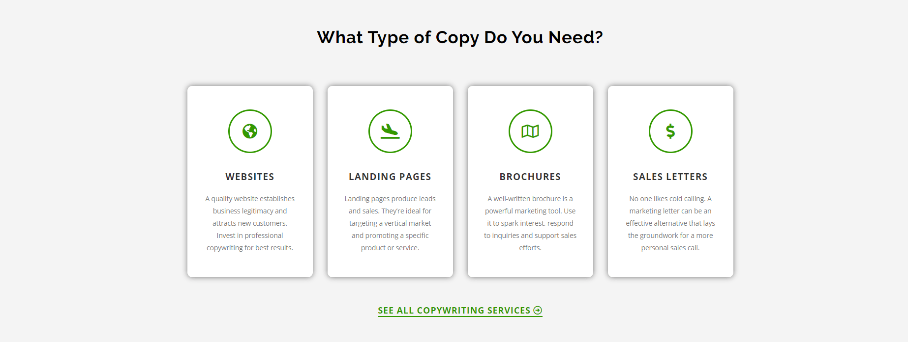
You can browse her clients based on industry, size, and location.

Testimonials follow this to build rapport.
Susan then has a short blurb about herself with a photo so you can see the person behind the website.
That’s very important.
She has one of the most in-depth portfolio pages I’ve ever seen too.
Every portfolio piece is organized by project types like websites, direct mail, and brochures.
You can click any project to view more details about how it was completed and the results in it generated.
This helps potential clients gauge their skill level, thinking, and process.
I also want to point out that Susan has individual pages for every service she offers. This is excellent from an SEO perspective.
It allows her to rank for target keywords like “landing page copywriter” or “case study copywriter.“
Each page is tailored to that service, how it works, and the benefits of using it.
You can take this approach by using a keyword research tool to find local or national-based service keywords and placing them in the title, URL, meta description, and page content.
Yours truly!
I’m going to give you the inside scoop on how my marketing and copywriting website works.
Let’s begin with the new homepage:

I have a target keyword and a sub-headline that clearly communicates what I do: helping others level up their income and personal growth.
There’s social proof in the form of a logo bar and a call to action button to generate course enrolments.
Scrolling down, I have another photo of myself and a quick background. This creates a personal connection with the reader and helps them understand more about who I am.

I then have three blocks that lead to my blog, YouTube channel, and podcast where I talk about marketing and self-growth.

Lastly, there are testimonials from my course students and a final call to action to view my programs.

The portfolio page is minimal. I wanted it to be easy to navigate and understand. I only include some of my proudest work, or I’d list hundreds upon hundreds of projects. It makes it more meaningful.
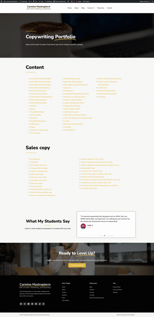
Overall, I’ve made my website to be simple, clean, professional, and it converts like crazy.
Michal Eisikowitz
B2B and SaaS copywriter Michael Eisikowitz easily has one of the most impressive writing websites on the internet.
As soon as you land on it, you think, “Wow. This is something special.”

The hero section has a picture of Michael with copy that resonates with the audience, saying they want leads, sales, and authority. This is followed by a CTA for scheduling a call.
Michael targets her buyers personas and their main pain point individually.

Clicking one brings up a popup that tailors the messaging to that ICP (ideal client profile).
She introduces herself, her list of clients, and her services after this. Not how she continually addresses the pain points of clients to create an emotional response.

Then, like most of the websites I’ve researched today, she lists some testimonials for social proof of her skill.
The portfolio page lists some of Michal’s recent projects, and they can be clicked on for more information.

Everything from the design to colours and layout feels high-end.
It gives her a luxurious and professional branding.
Remember that clients are going to judge you based on branding and how that reflect your skills and services.
Make a great website. Show that you care.
Final thoughts on freelance writing portfolio websites
If you’re a freelance writer, you’re seriously limiting yourself if you don’t have a personal website.
You don’t have to be a super-active blogger or tech wizard either.
A portfolio, services, and contact page are all you need to begin generating inbound leads.
It makes you stand out. It gets clients knocking at your door.
I suggest using WordPress, Weebly, Wix, or SquareSpace to get your site up and running in a day.
Study the portfolio websites I covered today for design and marketing inspiration.
Take notes on their style, writing, and layout to apply to your own.
What are you waiting for? Start building your portfolio site and send it to me so I can give you feedback. 🙂
You can also take my free courses to learn more about copywriting and marketing.


