The devil is in the details.
Very small components of sales copy and marketing can often make the biggest difference in performance.
One such detail is a call to action.
Learning what a call to action is and how to effectively use them will give a boost to any landing page, advertisement, or marketing strategy.
Follow along as I teach you what a call to action is, how to use them, and analyze real-life examples.
What is a call to action in copywriting?
Call to action definition: A statement that tells users the next logical step in a sales funnel or sequence.
This may be to purchase a product, add an item to cart, sign up, or any other step.
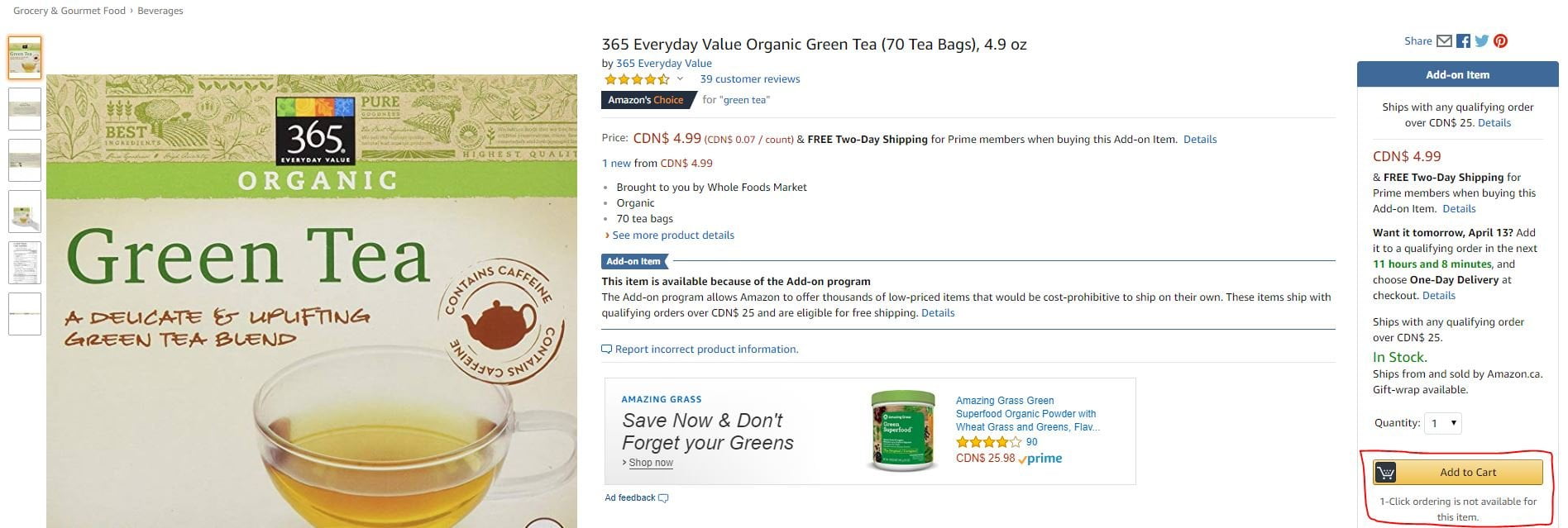
The call to action, or CTA for short, is one of the most fundamental components of great marketing material.
I come across way too many advertisements and websites that have literally no CTAs. That means they’re missing out on customers and revenue.
Users may not know what to do next when there isn’t a clear call to action to guide them. This increases the chance of them leaving without purchasing a product, contacting you, or taking the next crucial step in a funnel.
I once read an awesome book on user experience called Don’t Make Me Think. The main premise of the book was learning how to make web pages as effortless to navigate as possible.
That’s exactly what CTAs help achieve.
The user doesn’t have to think “Hmm, I wonder what I should do next.” because you’ve laid it out in front of them.
If that doesn’t motivate you, it’s been found that adding calls to action to an email can increase clicks by 371% and sales by 1617%!
Is a call to action important?
Beyond doubt!
There are many reasons why calls to action are important for businesses.
Mainly, they can drastically improve metrics like click-through rate and conversion rates.
This is because you are helping the customer take the next step within a sales funnel, even if it seems very obvious.
You’re essentially doing the thinking for them.
That will ultimately lead to driving more sales, acquiring clients, and similar results.
When to use a call to action
A call to action button should be used when the user needs to take the next step in a funnel.
Additionally, I recommend adding and optimizing a CTA on any page related to products, lead magnets, services, or similar.
These include:
- Product pages
- Cart pages
- Checkout
- Download pages
- Home pages
- Service pages
- Contact forms
- Blog posts
- Whitepapers
- Case studies
- Landing pages
- Sales letters
- Etc
Technically you can and should implement a CTA to any business material presuming it leads somewhere productive.
Now that you’re no longer wondering what does call to action mean, let’s jump into real examples of calls to action.
Call to action examples
Here are some examples of calls to action used by real world businesses to promote customer action.
Take notes from these successful companies to improve the performance of your own CTAs.
Nordstrom’s product categories
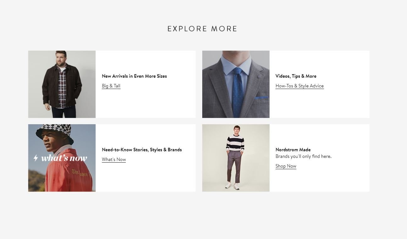
This is an example of a good call to action that is simple and straightforward.
Nordstrom is a fashion retail company that sells both men’s, women’s, and kid’s clothing.
The call to action “Explore More” is perfect in the fashion industry because many users are browsing and casually shopping.
It entices them to check out more of Nordstrom’s collections, new releases, and their style advice section.
This is a very wise move from an SEO perspective, as well. Google looks at factors like average time spent on page and bounce rate, both of which will be improved by having users visiting more pages on a site.
Quicksprout’s home page
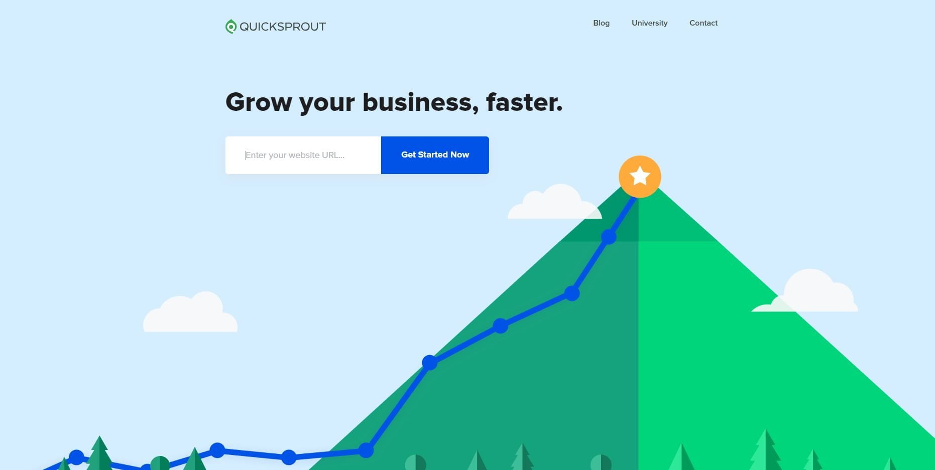
Quicksprout is a digital marketing agency founded by the legendary digital marketer Neil Patel.
Their homepage is one of the cleanest landing pages I’ve ever seen.
And what stands out the most on this page?
The call to action.
It’s also an excellent call to action button example, as the size and color make it stand out.
The text “Get Started Now” is an effective prompt, too. It entices users to start the journey of growing their business fast but leaves some mystery as of what’s next.
Well done 🙂
Shopify Plus Facebook ad
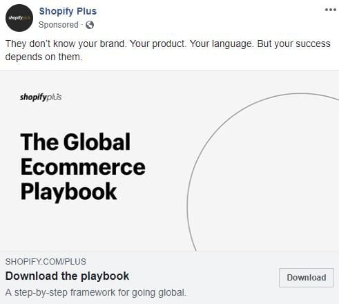
Shopify Plus is an e-commerce platform that helps businesses generate more sales, sell globally, wholesale, and more.
I just came across one of their Facebook ads and thought it would make a nice addition to this article.
They are offering a free e-book titled “The Global Ecommerce Playbook” that guides users through growing a global company.
Shopify uses the call to action “Download the playbook” accompanied by a button titled “Download.”
This is an uncomplicated call to action that is ideal for marketers offering lead magnets which can be downloaded.
Neil Patel’s website
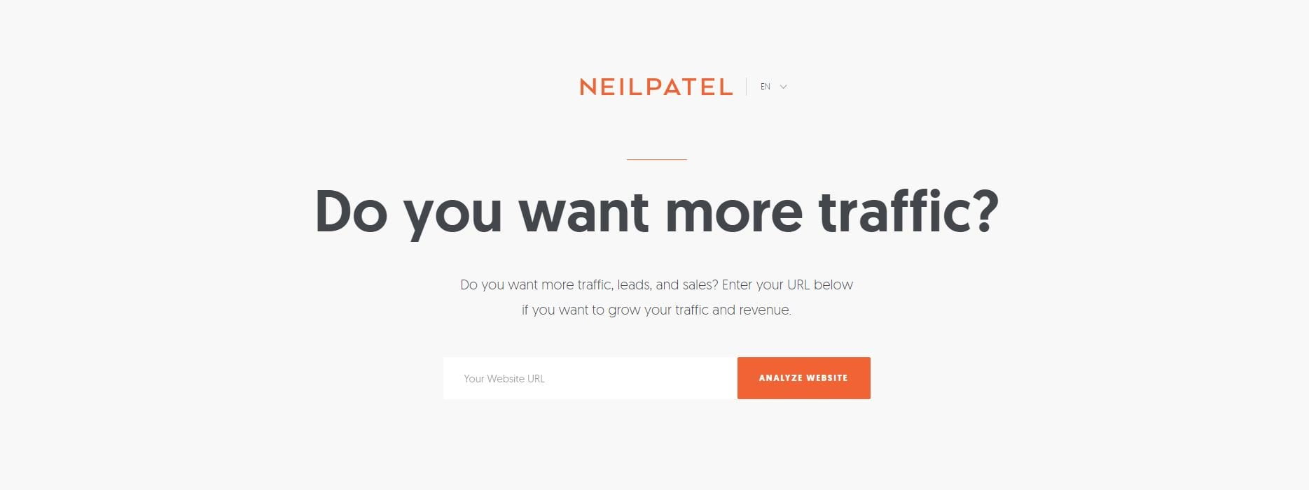
When you first land on Neil Patel’s website you are greeted by the question “Do you want more traffic?”
Who would say no to that?
Nobody!
Hence why the call to action “Analyze Website” is used directly after with the URL field.
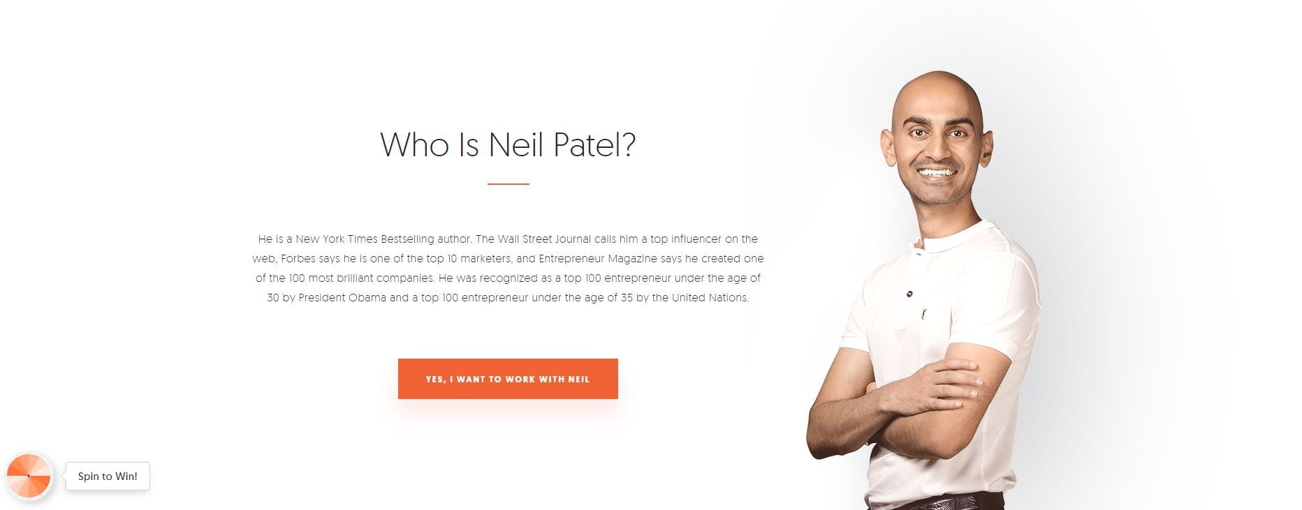
Scrolling further down there is a small background history of Neil along with a call to action to work with him.
The first call to action is a solid example of one that clearly defines what the user is getting out of the interaction by stating “Enter your URL below if you want to grow your traffic and revenue.”
The second targets users whom are interested in consulting with Neil Patel.
You may also notice the “Spin to Win!” call to action on the bottom left. This is a recent addition to the site that exchanges an email subscription for the chance to win different prizes.
Marketers can learn from Neil by using several different calls to action on a single page.
Armani’s newsletter
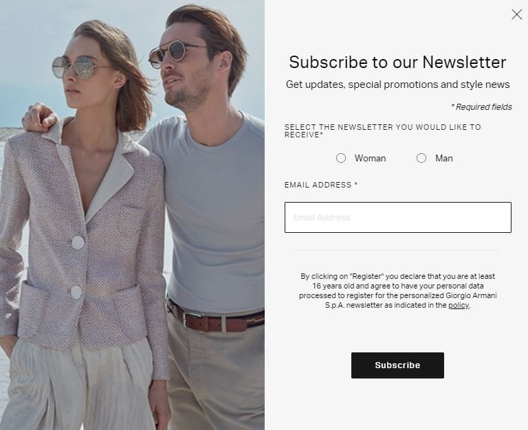
Armani is a famous Italian fashion brand that’s been dominating the industry since day one.
As soon as you land on their website, a popup appears that promotes the user to sign up for their newsletter to get updates, promotions, and news.
Note that the title isn’t “Would you like to subscribe to our Newsletter?”
It’s “Subscribe to our Newsletter.”
A.K.A Armani is telling the user to signup, not asking.
The black button on the button is also simply labelled “Subscribe”.
They made the form require as little information as possible, which is another takeaway for any email marketers reading this.
Make sure to read my guide on how to write newsletters on that note.
Rolex’s configuration
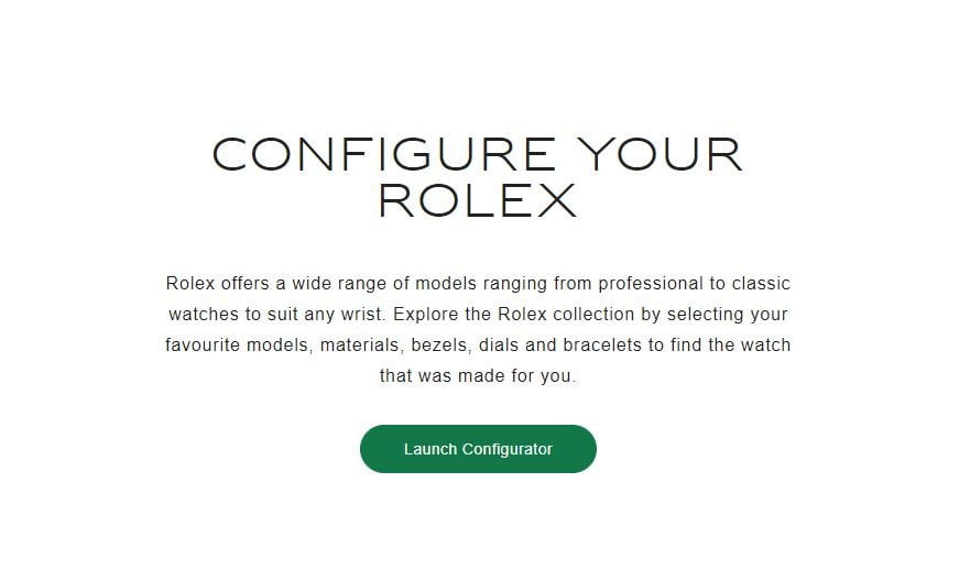
The official Rolex website has a configuration tool that allows users to select models of Rolex, and customize the design.
It’s a fun feature that also serves as an inbound marketing strategy, getting potential customers invested in the brand.
Rolex uses the large call to action “Configure Your Rolex” with their signature green used for the “Launch Configurator” button.
Similar to Quicksprout or Neil Patel’s buttons, I’d recommend using button colors that naturally go with the flow of your website.
It wouldn’t look very fitting if Rolex used purple for example because there isn’t any other purple on the page.
While some times contrasting colors make calls to action stand out, it’s wise to begin with a color that makes sense and split test later.
Feel free to check out my article on luxury marketing strategies if you’re in this type of industry, as well.
Walmart promotion
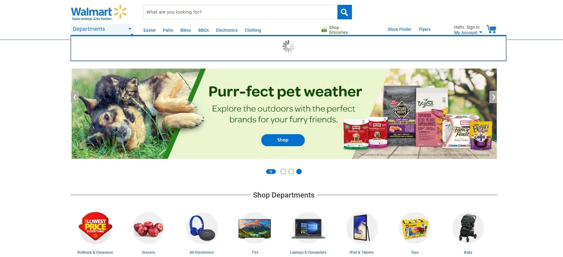
This is the homepage of Walmart. At the time of this screenshot, they had a promotion for pet products.
The banner image showed a cat and dog playing with a humorous pun, and most importantly a call to action to “Shop.”
When you’re promoting a sale or production collection, basic CTAs can be very effective.
Shopping is already on the mind of consumers, so statements like “Shop now” or “Browse” are also good call to action button ideas.
Marketo’s solutions
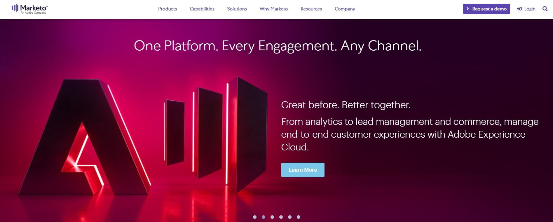
Marketo is a digital marketing company that offers solutions like lead generation, analytics, customer experience management, and more.
I had the pleasure of writing for their blog in the past, so I stopped by the Marketo site to see how things were going.
I instantly noticed the call to action above the fold.
The light blue box with the CTA “Learn More” beautifully contrasts against the dark purple and red gradient background.
This design also takes advantage of what is known as the F pattern layout.
It has been found in user experience studies by Nielsen Norman Group that the eyes tend to wonder webpages in the shape of the letter F, as such.
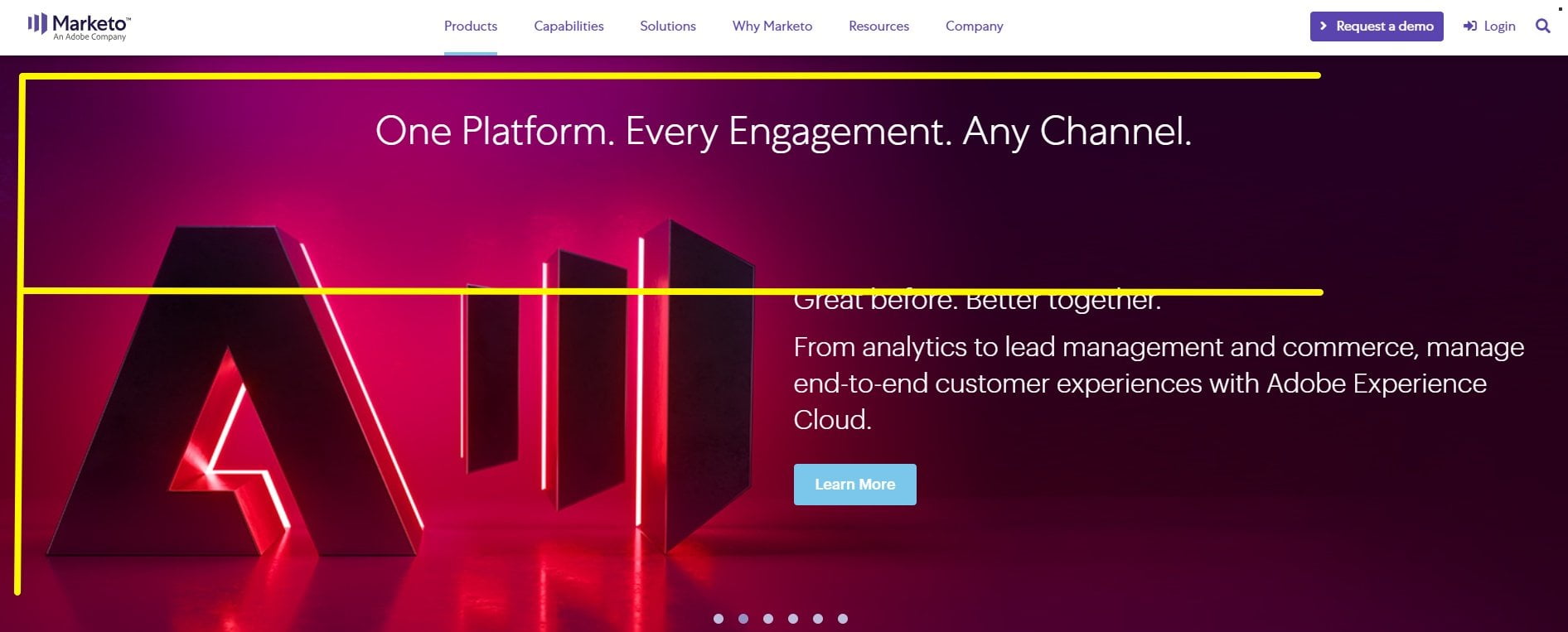
Notice how the call to action and important information that Marketo placed on their slider aligns perfectly with this behavior.
The F pattern works in the following way:
- Users read in a horizontal line on the top of the page where navigation is typically placed.
- They look further down and once again read in a horizontal line.
- Finally, users scan the left side of the page vertically, creating the shape of an F.
The main takeaway from this data is to place CTAs where statistically users always tend to look, which is along the two horizontal lines.
HelloBar’s account registration
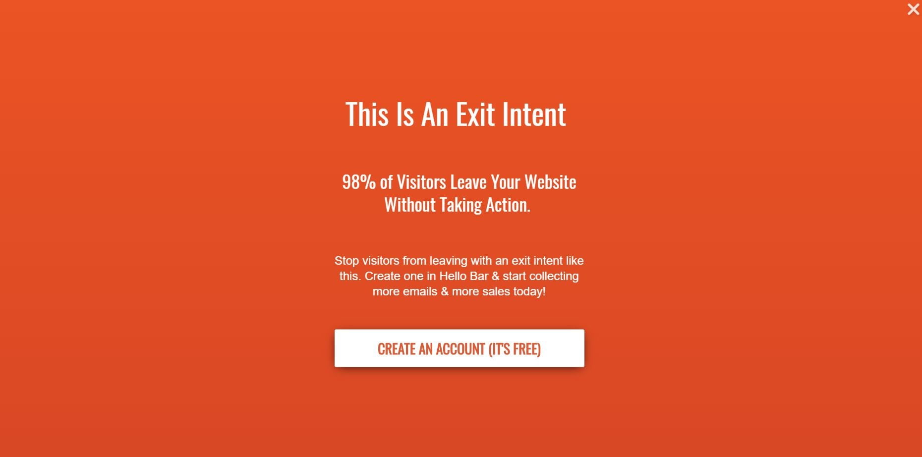
This call to action hits you harder than a dodgeball to the face.
The bold background and white text contrast, which makes it easy to read.
Also, note that HelloBar didn’t include any fluff on this page. Every word is strategically placed to promote users to create a free account.
Ironically they state that 98% of users take no action before leaving a website, but use an exit-intent window to capture your information.
Nice inside joke 🙂
BeemDigital and Unbounce
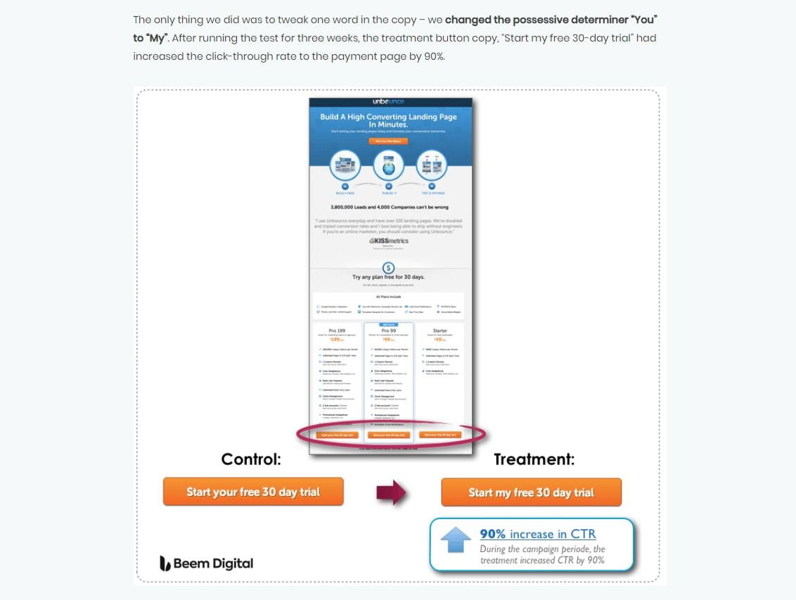
I found a wicked call to action button example by Beem Digital and Unbounce.
Unbounce was offering a free day trial and the two companies teamed up to optimize the landing page.
The original text for the CTA button was “Start your free 30 day trial” and they changed it to “Start my free 30 day trial.”
Do you know what results changing that single word brought?
A 90% increase in click-through rate!
Think about that… they changed one word and it made that drastic of a performance boost.
When you’re creating a CTA or split testing one, don’t think that you have to completely change the entire phrase.
There’s a chance that re-wording the same sentence can bring the results you’re after.
In the case of Beem Digital, I believe that the word “my” made such a difference because the customer is thinking about themselves at the time of purchase.
Absolute Rights email CTA
Absolute Rights is one of Ryan Deiss’ many different affiliate businesses.
He’s known to set up high-converting tripwire offers involving free + shipping products. (Product is free but the customer pays for shipping.)
This an email he sent out to customers who placed orders asking for their shipping information:
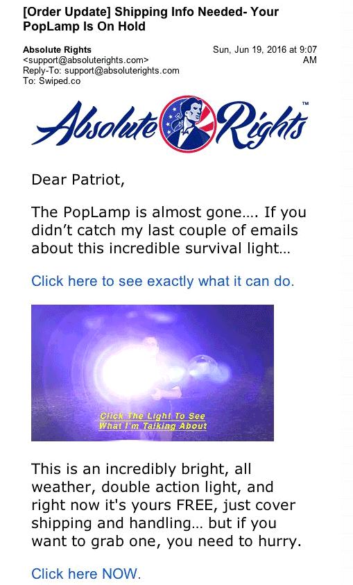
There are two major calls to action above the fold of the email.
The first is “Click here to see exactly what it can do.” which pertains to the survival flashlight he is selling.
“Click here NOW.” follows the email’s urgent sales copy.
One lesson we can take away from this example is to align calls to action with context.
If Ryan’s first CTA was simply “Click here,” it probably wouldn’t have made as big of an impact. Rather, explaining that they will learn more about the product by clicking adds context.
Similarly, creating a sense of urgency and then aligning the second CTA with that maximizes click-throughs.
Call to action phrases
Now that you’ve seen enough call to action examples to last you a decade, let’s take a look at the best call to action phrases you can integrate into your business.
- Limited edition
- Limited supply
- Hurry
- Now
- Today
- You
- Buy now
- Shop now
- Shop today
- Shop our sale
- Check out
- Add to cart
- Immediately
- Last chance
- Today only
- New
- Because
- Request an invitation
- Subscribe
- Join now
- Join today
- Get your consultation
- Contact us
- Send message
- Order
- Pre-order
- Share
- Sign up for free
- Sign up now
- Join free for a month
- Download
- Download your free X
- Get started
- Join us
- Check out our work
- Look at our portfolio
- Analyze
- Get results
- Claim free trial
- Get before X date
- Let’s work together
- Register
- Yes, please
- View
- Search
Summing up call to action statements
Thanks for swinging by today and reading this article on call to action marketing.
If you want to improve the click-through rate, conversion rate, and other metrics of pages, you need to learn how to use CTAs.
Here’s a summary of the main takeaways, so you can start reaping the benefits of using this key marketing strategy.
- A call to action is a statement that tells users what to do. It prevents them from wondering what the next step is in a sales funnel, and improves the user experience.
- Remember the F pattern layout when designing landing pages and implementing CTAs. You want calls to action to be placed where the eyes will always wonder, which happens in the shape of the letter F.
- Include several calls to action on a single page to maximize the chance of users taking action.
- Split test the copy used for a CTA to discover which phrases perform the best.
- Ask questions before ending with a call to action like we saw with the example of Neil Patel.
Reach out to me today if you need copywriting services.


