Struggling to write effective emails and get results?
You’re not alone. Writing emails to see low open rates and conversions can be time-consuming and stressful.
That’s why it’s wise to learn from successful businesses to improve your writing and marketing skills.
I’ve put together 5+ email copywriting examples I will break down today.
Webflow Summer Newsletter
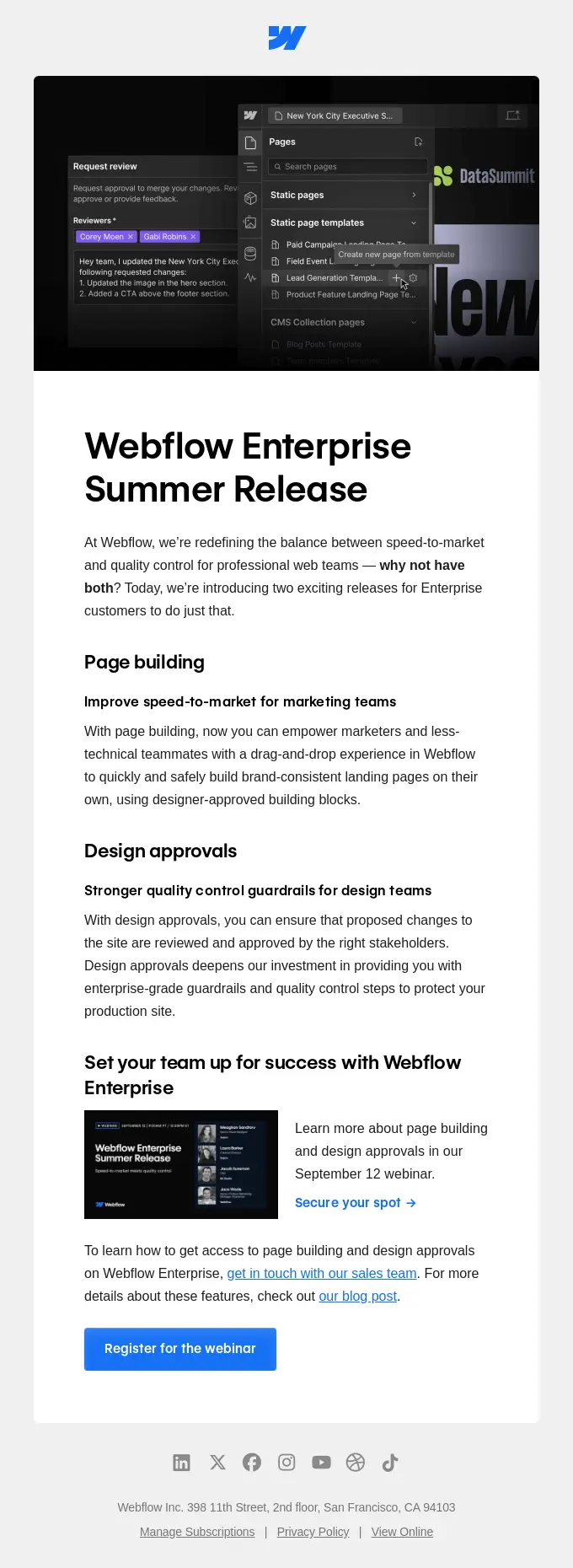
This Webflow email is a fantastic case study in B2B email marketing, leveraging a clean design, clear messaging, and strategic calls-to-action. Let’s break down the strategies used and the lessons you can apply to your campaigns.
1. Strong Header Image and Visual Hierarchy
The email kicks off with a strong visual at the top, featuring the Webflow logo and a dark-themed screenshot of the product interface. This immediately grabs attention. The image is carefully chosen to resonate with the target audience (web and design professionals) by showcasing features they’d care about, like the “Pages” and “Request Review” tools.
Lesson: Use a relevant header image that highlights core product features or benefits. It should reinforce the message of your email and be visually engaging. Your goal is to pull readers in with visuals before they even start reading the text.
2. Clear, Benefit-Driven Headline
The headline reads, “Webflow Enterprise Summer Release.” This is followed by a subheading that tackles a specific pain point: balancing speed-to-market with quality control. Right after, they pose a rhetorical question—“Why not have both?” This effectively frames the release as a solution that doesn’t require compromise, which is a powerful value proposition for enterprise customers.
Lesson: Your headline should immediately communicate what the email is about while touching on a core benefit. Follow it up with a short sentence that reinforces the value. If you’re addressing a specific audience (like enterprise teams), mention it to make the content feel more personalized.
3. Detailed Benefits Broken Down into Sections
The email dives into two key features—Page Building and Design Approvals—each with its own subheading and benefit-oriented copy. For Page Building, they focus on the speed-to-market benefit, explaining how it allows non-technical team members to create pages with ease. For Design Approvals, they focus on quality control, emphasizing the ease of managing brand standards across teams.
Lesson: Break down your product or service into specific features, but always lead with the benefit to the reader. Avoid just listing features; instead, explain what each feature helps the customer achieve. This method turns dry product details into tangible value propositions.
4. Strategic Use of CTA Buttons
They’ve included multiple CTA buttons throughout the email, but the primary action is “Register for the Webinar.” It’s repeated in different parts, with variations like “Secure your spot” and “Register for the webinar” in visually distinct buttons. Each CTA is clear and consistent, making it easy for the reader to know what action to take.
Lesson: Repetition of CTAs throughout the email increases the chances of engagement without feeling pushy. Use buttons with distinct colors that stand out against the email’s background, and make sure each one leads to the same action, reinforcing your primary goal.
5. Addressing Pain Points
The email specifically addresses two challenges: the need for speed in page-building and maintaining quality control. By highlighting how these new features solve these pain points, Webflow taps directly into the concerns of their target audience. This is especially effective because it shows Webflow understands the real struggles of enterprise teams.
Lesson: Address specific pain points in your email copy. Understand the common frustrations of your audience and position your product as the answer to those issues. Empathy goes a long way in connecting with readers and makes your email feel more personalized.
6. Social Proof and Trust Elements
Webflow doesn’t just talk about the features—they back it up with trust signals. The mention of “Webflow Enterprise” in the headline itself and throughout the email implies that these tools are designed for serious, large-scale applications, which is a subtle but powerful form of social proof. Plus, offering a free webinar shows they’re investing in educating their audience, another trust builder.
Lesson: Even without testimonials or stats, you can build trust through your brand’s tone, the professional presentation of the email, and by positioning your product as a solution for specific customer segments (like enterprise clients).
7. Secondary CTAs and Additional Content
Besides the main CTA to “Register for the Webinar,” there are secondary options to “get in touch with our sales team” and “check out our blog post.” This approach respects the fact that not everyone will be ready to sign up for a webinar right away. Some readers might prefer to do further research, and Webflow facilitates that by linking to other resources.
Lesson: Always provide secondary actions for readers who aren’t yet ready to take the primary CTA. Some might want to learn more before committing, and giving them additional resources keeps them engaged with your brand rather than closing the email.
The footer includes links to social media, legal info, and a subscription management option. It’s subtle but essential. Giving readers easy ways to manage their subscription respects their autonomy and keeps your brand compliant with email regulations.
Lesson: Don’t ignore the footer. It’s often overlooked, but it’s an opportunity to keep things professional, offer transparency, and build trust by letting subscribers manage their preferences.
Final Takeaway
This Webflow email is a masterclass in B2B email marketing for SaaS. It combines visual appeal with a clear, benefit-driven message that directly addresses audience pain points. The CTA strategy is focused yet varied enough to accommodate different reader types.
Most importantly, every element—from headlines to CTAs—is aligned with the needs and challenges of enterprise customers, making the email not just promotional but genuinely helpful.
Native Instruments Music Software
This email from Native Instruments does a lot of things right in terms of copywriting, and it’s packed with actionable lessons for anyone trying to craft high-converting emails. Here’s a breakdown of the copywriting strategies that stand out and how you can apply them to your own email campaigns.
1. Clear Headline to Grab Attention
The email opens with the headline: “Introducing Komplete 15.” It’s straight to the point, leaving no ambiguity about what’s being promoted. When you’re crafting email headlines, think clarity first.
A clear, direct headline outperforms clever wordplay because the reader instantly knows what they’re getting. Here, Native Instruments doesn’t waste time—users know right away that there’s a new version of Komplete.
Takeaway: Always lead with a clear headline that communicates the core of your message. If you’re promoting a new product or feature, make it the focal point of your subject line or email headline to get people interested right from the start.
2. Value Proposition: “Get iZotope Neutron 4 for Free”
This email leans heavily into its value proposition by offering iZotope’s Neutron 4—a valuable mixing suite—for free with a pre-order. This gives the customer an added incentive to take action now instead of waiting. The phrase “worth $269.00 for free” is critical because it quantifies the value, making the offer feel substantial.
Takeaway: Adding value doesn’t always mean discounting your product. Consider what bonuses or add-ons you can include to make your offer more enticing. When possible, quantify the value of these extras to help readers grasp what they’re getting.
3. Compelling Visuals and Product Previews
The visuals at the top of the email showcase the different products included in Komplete 15. Each product has its own mini-section with an image, title, and brief description, making it easy for the reader to scan and understand what’s in the bundle. High-quality visuals are crucial in B2C emails—people want to see what they’re getting.
Takeaway: Don’t skimp on visuals. If you’re selling a bundle or a feature-rich product, provide high-quality images that show what’s included. Visual hierarchy also matters—showcase the main product at the top and use smaller images for additional items to guide the reader’s focus.
4. Bullet Points for Quick Scanning
In each mini-section for the products, Native Instruments uses bullet points to quickly describe what each product does. Bullet points make it easy to consume information fast, which is essential for readers who just skim.
Takeaway: When listing product features or benefits, use bullet points to break up text and make it easy to scan. People often skim through emails, and bullet points help key information stand out.
5. Social Proof and Trust Builders
Toward the bottom of the email, they feature a list of brands that use Native Instruments, like Accenture and Reuters. This kind of social proof reinforces credibility. If big brands trust Native Instruments, the logic goes, then their products must be worth it.
Takeaway: Always add social proof to your emails when you can. If you have notable clients or high-profile testimonials, include them prominently. Even a simple “trusted by 50,000+ users” line can build trust.
6. Urgency and Time-Sensitive Offer
By including an expiration date—September 30 for the iZotope offer—Native Instruments is leveraging urgency to prompt immediate action. This encourages people not to procrastinate on the pre-order.
Takeaway: Creating a time-limited offer is a proven way to drive faster conversions. Just make sure the deadline is clear and don’t overuse urgency, or it could feel manipulative.
7. Strong Call-to-Action (CTA)
The CTA here is simple and clear: “Pre-order now.” It’s repeated multiple times in the email to encourage action. The button is prominently displayed, making it easy for readers to click and follow through.
Takeaway: When crafting your CTA, don’t get too creative—clarity is key. “Pre-order now,” “Shop now,” or “Get started” work because they’re direct. And make sure the CTA button stands out visually; it should be impossible to miss.
8. Breakdown of What’s New in Komplete 15
The “What’s new in Komplete 15?” section is well-structured, breaking down each new product with a short description. It’s a smart way to educate readers on the specific components of the offer. Instead of expecting users to understand the whole bundle, Native Instruments highlights each part, making it easy for users to grasp the value.
Takeaway: When you’re promoting a product with multiple features or components, break it down for the reader. Explain the benefits of each feature in digestible chunks, so they can see the full scope of what you’re offering without feeling overwhelmed.
9. Cross-Promotion of Other Platforms
At the very bottom, they include social media links to platforms like Instagram, TikTok, and YouTube. It’s a subtle way to keep users engaged with the brand across different channels, potentially turning one-time buyers into long-term fans.
Takeaway: Make it easy for your audience to connect with you on other platforms. Include social media links or invite readers to check out your blog or YouTube channel. The more touchpoints, the better your chances of keeping them engaged.
Final Thoughts
This email from Native Instruments is a masterclass in balancing clarity, value, and urgency. It grabs attention with a bold headline, makes the offer compelling with a valuable bonus, and guides the reader with strong CTAs. Plus, they’ve done a great job breaking down product features and benefits in an easy-to-skim format.
If you want to drive higher engagement and conversions with your emails, study these tactics. Remember to lead with clarity, use bullet points for readability, add urgency where possible, and always provide a clear, actionable CTA. Effective email copywriting isn’t just about fancy words; it’s about presenting the right information in the right way to get results.
3. The Prospa Mobile App
The Prospa email you’ve shared is an excellent example of email copywriting that balances concise messaging with strong feature benefits and a clear call to action. Let’s break down the copywriting strategies that make this email effective and actionable for readers who want to replicate similar results.
1. Headline: Straightforward and Benefit-Driven
- “Manage cash flow on the go” – This headline gets right to the point. It’s straightforward and immediately tells the reader what they’ll gain by downloading the Prospa app: cash flow management on the go.
- Takeaway: When crafting your email’s main headline, think about the single biggest benefit your product or service offers. In just a few words, it should tell readers what they stand to gain and why they should keep reading.
2. Subheadline for Further Clarification
- Following up the headline with “Introducing the new Prospa App” is clever. For any reader who doesn’t already know what Prospa does, this line clarifies that the email is about a new app launch, adding value for both existing and new users.
- Takeaway: If your product or service needs a bit more context, follow the main headline with a subheadline to provide extra clarity without losing momentum. The subheadline should support, not replace, the main benefit-focused headline.
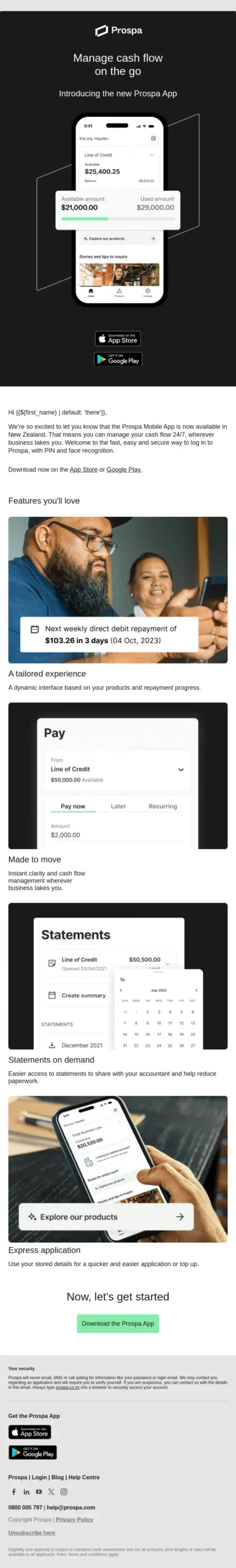
3. Visual Context for Quick Understanding
- The email starts with a high-quality image of the app interface showing clear numbers for account balances and credit availability. This isn’t just about aesthetics; it’s strategic. Numbers and visuals reinforce credibility and show the app’s value at a glance.
- Takeaway: Images should do more than look good. Use visuals that show your product in action, especially if you’re marketing an app or software. This builds trust, especially when users can immediately see how it might look on their device.
4. Benefits-Oriented Copy (“Features You’ll Love”)
- Prospa doesn’t just list features; they lead with benefits. Each feature is framed as something the user will love, making the content feel more relatable. For example, they don’t just say, “You get a line of credit”; they show how it fits into managing cash flow effectively.
- Takeaway: When discussing features, focus on how these translate into benefits for the user. List features under a benefits-driven header, like “Why You’ll Love…” or “How This Helps You…” to make it clear why it matters to the reader.
5. Feature-by-Feature Breakdown
- The email breaks down the app’s features into concise, bite-sized sections with headers like “Pay,” “Statements,” and “Express application.” Each one is followed by a short, benefits-oriented sentence explaining how the feature will simplify financial management.
- Takeaway: For complex products, use headers and bullet points to break down each core feature. Keep explanations short but packed with value. Readers should be able to skim each feature and understand its benefit immediately.
6. Strong Call to Action (CTA)
- The “Download the Prospa App” CTA button stands out in green, making it easy for readers to find and click. Prospa uses an action-oriented CTA that tells readers exactly what to do next, removing any friction from the decision-making process.
- Takeaway: Your CTA should be a straightforward command that matches the desired action, like “Download the App” or “Start Your Free Trial.” Keep the language clear and action-oriented, and make sure the button stands out visually against the background.
7. Multiple CTAs Without Overwhelming the Reader
- This email includes several links and CTAs, like “Explore our products” and “Download on the App Store or Google Play”. While there are multiple CTAs, they all serve the same purpose: guiding users towards downloading the app or exploring its features.
- Takeaway: It’s fine to have multiple CTAs in your email, as long as they serve the same goal. If the main goal is app downloads, don’t distract users with unrelated CTAs. Each button or link should ultimately lead toward the primary conversion goal.
8. Reinforcing Security and Trust
- The email includes a small section emphasizing “Your security”, reassuring the user about Prospa’s commitment to data security and privacy. For financial apps, this is essential to build trust.
- Takeaway: If your product involves sensitive data, always reinforce security. Include a quick mention of privacy and data protection, especially when asking users to download an app or enter personal information.
- The footer is clean and provides essential links, like app store download buttons and contact information. This minimalistic approach keeps the email from feeling cluttered, while still providing relevant links for readers who may want more info.
- Takeaway: Don’t overwhelm your footer with too much text. Keep it to the essentials—contact information, social links, or app download options. The goal is to guide the reader to the main CTA without unnecessary distraction.
Final Thoughts:
- Prospa’s email is a great example of how to structure a promotional email for a mobile app launch. It’s a mix of clear benefits, strategic visuals, and concise copywriting that guides the reader toward taking action without overwhelming them. Every line, image, and CTA is purpose-driven, focused on getting the user to download the app.
For readers crafting their own emails, Prospa’s email is a reminder that clarity and focus are everything. Start with the main benefit, make your features relatable, and guide the reader to take a clear action.
And don’t forget the details that build trust, like emphasizing security and showing product visuals in context. With these strategies, your emails will be more persuasive, actionable, and ready to convert.
4. Google’s Home Automation
This email from Google promotes its Home app’s automation capabilities, and it uses smart copywriting strategies to appeal to users’ desire for convenience, customization, and control over their environment. Let’s break down the tactics at play and see how you can use them to enhance your own campaigns.
Headline: Unlock the Full Power of Home Automation
The headline is direct and aspirational. It promises a transformation in the user’s life through automation. This “unlocking” language taps into FOMO (fear of missing out)—suggesting that by not using these new automation features, readers are limiting themselves.
In your own copy, use similar powerful phrases that imply an elevated experience or exclusive benefit. Words like “unlock,” “revolutionize,” or “take control” can add excitement and urgency, driving readers to learn more.
Call-to-Action (CTA): Get Started
The CTA is simple and action-oriented. “Get Started” works here because it suggests an easy, commitment-free entry into a more automated lifestyle. This CTA is particularly effective because it minimizes friction; it’s not pushing the user to “Buy Now” but rather to start exploring at their own pace.
When designing CTAs for your email campaigns, think about where your reader is in the buyer journey. For early-stage awareness campaigns, phrases like “Learn More” or “Get Started” are great for inviting curiosity without heavy pressure.
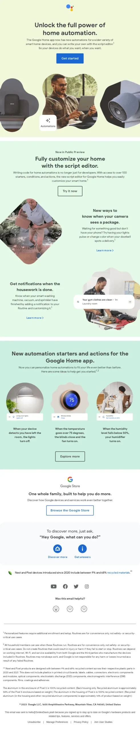
Visuals and Features Section
Each feature is broken down with clear imagery and small snippets of copy, making it visually easy to scan. The images are relatable, showing everyday moments rather than generic product shots.
The “Features you’ll love” and “New automation starters and actions” sections show real-life applications of automation, like getting notifications when laundry is done or controlling room temperature. This helps users imagine how these features fit into their own routines.
For your campaigns, use visuals that put your product in a relatable context. Instead of purely technical images, show how real people would engage with your product or service. And make sure each image or feature is supported by just enough copy to make the benefit clear. Avoid tech-heavy jargon; focus on how each feature makes life easier or better.
The Power of Specific Examples
The copy includes very specific examples, such as “get notifications when the laundry is done” and “automatically adjust lights based on room activity.” These specifics help paint a vivid picture of what’s possible and answer the question, “Why would I need this?” Specificity makes the product feel more tangible and directly applicable to the reader’s life.
In your own copywriting, don’t just list product features. Show examples of those features in action. If you’re marketing a tool, instead of saying it “saves time,” show exactly how it could save someone 30 minutes a day, and what they could do with that time instead. Specific examples make the product’s impact feel real.
Social Proof with “One Whole Family”
The line “One whole family, built to help you do more” subtly implies that all Google devices work better together, a form of ecosystem-based social proof. It also appeals to people who want a seamless experience across devices. This messaging reassures potential buyers that Google products are compatible with each other, encouraging those with one Google device to invest in others.
Use ecosystem messaging if your product can be integrated with others. For example, if your service works well with popular apps or platforms, mention it. This reinforces compatibility and makes it easier for prospects to envision using your product alongside what they already have.
Lastly, there’s a small, powerful note about sustainability in the footer: “Nest and Pixel devices introduced since 2020 include between 9% and 65% recycled materials.” This appeals to environmentally conscious consumers without making the whole email about sustainability. It’s a gentle reminder that Google cares about the environment, which can positively influence the brand’s perception.
For your campaigns, include small but meaningful details about your brand’s values. If your product supports a cause or has eco-friendly features, mention it subtly in the footer or a side note. It’s a soft way of building brand affinity without making it the main focus.
Conclusion
Google’s email campaign for its Home app is a masterclass in relatable, benefit-driven copy. It combines simple language, relatable examples, visual storytelling, and subtle value statements to communicate the advantages of its product in a way that feels accessible and inviting.
As you craft your own email campaigns, focus on clarity, relatability, and specific, actionable examples that let users see exactly how your product can improve their lives. And don’t forget to match the CTA and language to where your audience is in their journey—whether they’re just discovering your product or ready to take the next step.
5. Apple’s Mac Studio
This email from Apple promoting the Mac Studio and Mac Pro models is a great example of B2B copywriting that leverages clear value propositions, powerful visual structure, and compelling product details to target professional users.
Here’s a breakdown of the strategies they use and how you can apply them to your own campaigns:
1. Clear and Specific Headline
The headline “For the ultimate pro” immediately sets the tone. It speaks directly to a high-level professional audience, emphasizing that this isn’t a device for casual users—it’s built for the “ultimate pro.” Using a direct and bold headline clarifies the target audience and filters in readers who value high performance.
Takeaway for Your Campaigns: Use your headline to specify who the product is for and what its unique appeal is. Think of it as a gatekeeper; it should immediately capture attention and speak to the exact type of user who will benefit the most from your product.
2. Subheadings and Concise Product Descriptions
Under each product, Apple uses concise, direct language to highlight key features. For example, under the Mac Studio, they write, “A true powerhouse.” Then they list bullet points like “Supercharged by M2 Max and M2 Ultra,” “Twelve high-performance ports,” and “Stunningly compact.” Each line communicates a high-value feature without extra fluff, letting the product’s strengths speak for themselves.
Takeaway for Your Campaigns: In your copy, focus on specific features that set your product apart. Avoid generic descriptors. Use specific phrases that convey a concrete benefit, as they are more persuasive and make it easier for potential buyers to visualize the product’s strengths.
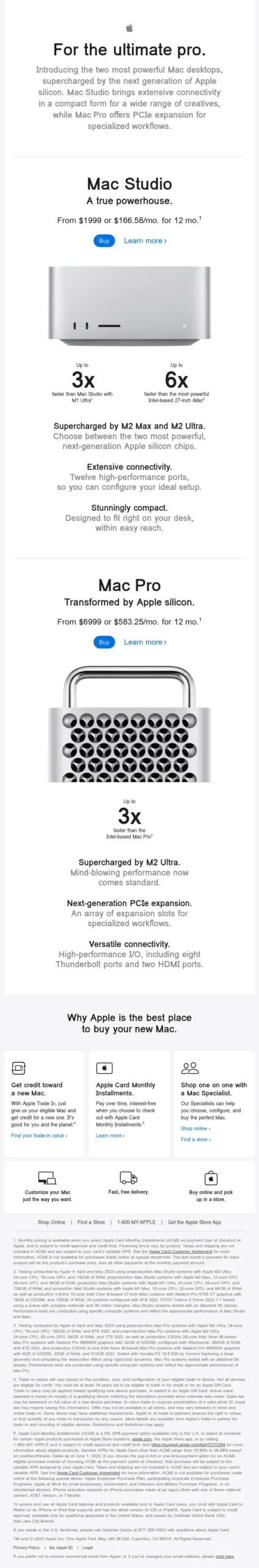
3. Visual Structure: Emphasis on Key Specs
Apple uses bold text for core specs like “3x faster” and “6x faster,” making it easy for readers to scan and immediately notice the performance gains. For professionals seeking top-of-the-line equipment, these performance indicators are critical decision points.
Takeaway for Your Campaigns: Highlight numerical data, percentages, or other quantitative details. For B2B or tech-focused products, measurable improvements are powerful motivators. Use bold text or separate elements for performance metrics so they stand out visually and add instant credibility.
4. Feature Comparison: Mac Studio vs. Mac Pro
By presenting both the Mac Studio and the Mac Pro side by side, Apple allows customers to quickly understand the differences. This side-by-side layout lets Apple target different types of users within the same email: those who need an “all-in-one” solution (Mac Studio) and those who require specialized workflows (Mac Pro).
Takeaway for Your Campaigns: When offering multiple products, show them in a way that highlights their unique strengths without overwhelming the user with choices. Positioning products side-by-side with key differentiators makes it easier for customers to decide which product best suits their needs.
5. Strong Calls-to-Action (CTAs) with Monthly Pricing Options
Instead of a simple “Buy Now” button, Apple integrates flexible financing options: “From $1999 or $166.58/mo.” This approach reduces the sticker shock by providing a more accessible monthly payment option, especially relevant for B2B users who may have budgetary constraints.
Takeaway for Your Campaigns: Use financing or pricing options in your CTAs, particularly if your product has a high price point. Adding a monthly payment option can make a costly product seem more attainable and encourage conversions from customers who may otherwise hesitate.
6. Supporting Product Benefits
At the bottom, Apple includes icons with additional benefits like “Get credit toward a new Mac,” “Apple Card Monthly Installments,” and “Shop one on one with a Mac Specialist.” This is a reminder that the product purchase experience is seamless and has added perks that enhance value.
Takeaway for Your Campaigns: Add supporting benefits to your product pitch, especially those related to the purchase experience. List out additional perks—like financing options, consultation, or trade-in value—to give customers a reason to choose your brand beyond just the product itself.
7. Social Proof and Brand Credibility
Apple doesn’t need testimonials or trust badges; their brand name is enough. For other brands, however, it can help to add client logos, ratings, or testimonials as part of your credibility strategy.
Takeaway for Your Campaigns: If your brand is well-known, leverage that authority. If not, incorporate elements of social proof to boost confidence. Add trust badges, user testimonials, or customer logos to reassure potential buyers that others have already chosen your product.
Wrapping Up These Email Copywriting Examples
In the end, the secret to effective email copy is a combination of clear benefits, strong CTAs, and understanding your audience’s specific needs. Remember, your goal is to make the decision-making process as easy as possible for the reader. By applying these principles—whether you’re selling software, hardware, or services—you can transform your email campaigns into powerful conversion machines.
Schedule a free consultation to learn more about my marketing services that will help your business drive more revenue.