Good sales copy can make or break a business. It’s what gets your customers’ attention and persuades them to take action.
However, writing great copy isn’t easy. In fact, it’s quite difficult.
This especially applies to the B2B space. Your audience is savvy and does their research. They know their options. You must be able to communicate your product’s value or they’ll click the back button.
That’s why we are looking at B2B copywriting examples in this article. I’ll break down the elements they use so you can write more effective copy.
Let’s get into it!
1. Stripe B2B Email Copywriting Example
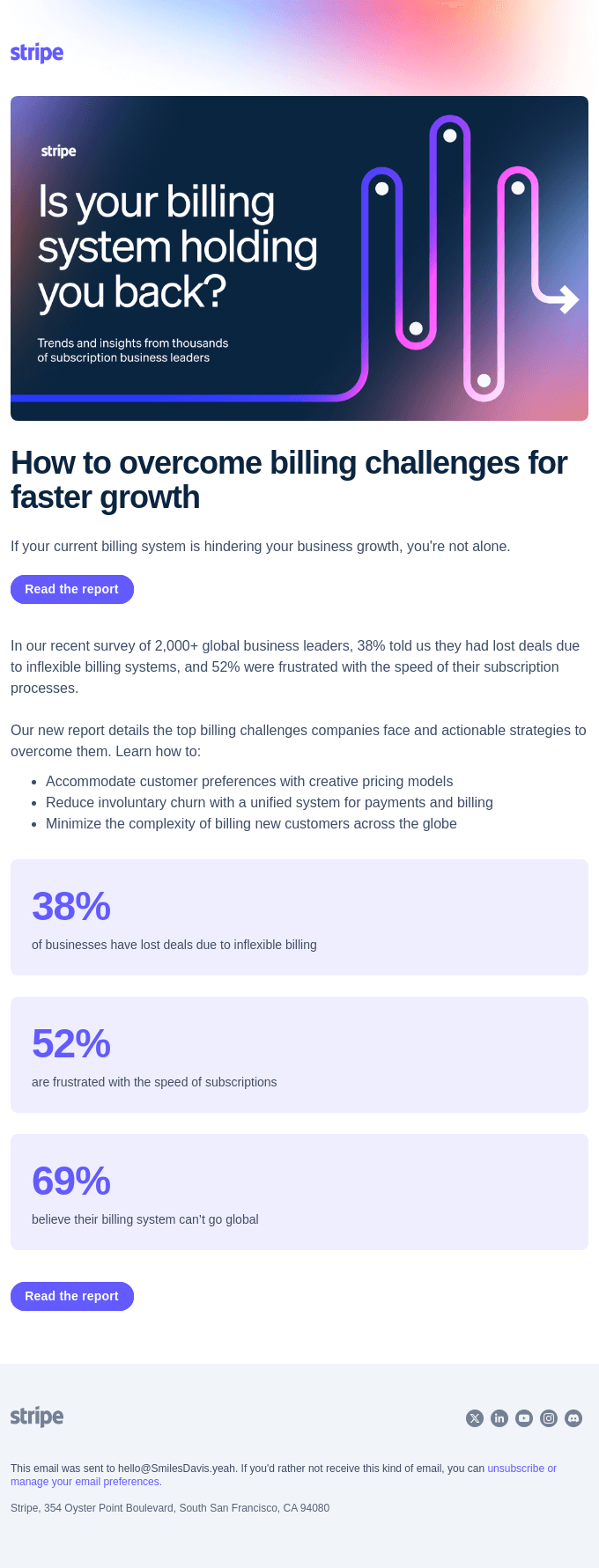
Stripe is one of the biggest payment processors in the world and writes incredible B2B sales copy. Let’s break down this email and see why:
1. Strong Hook in the Subject Line and Headline The first thing that stands out is the headline: “Is your billing system holding you back?” This is a direct, emotionally charged question that hits a major pain point for the target audience—business leaders struggling with inefficient billing systems.
By asking this question, Stripe immediately taps into a potential frustration and compels readers to continue. This aligns with the psychology of problem-awareness marketing, making the reader recognize an issue they might not have fully identified yet.
2. Pain-Point Focused Copy The email doesn’t waste time diving into irrelevant details. It immediately addresses the core pain points with statements like “38% told us they had lost deals due to inflexible billing systems.” This stat gives readers tangible evidence that this problem is widespread, using social proof to build credibility and emphasize the severity of the issue.
3. Use of Data to Build Trust Notice how the copy integrates data points like “38% of businesses have lost deals” and “52% were frustrated.” These aren’t arbitrary numbers—they’re designed to build trust by showing that
Stripe has done the homework through its survey of “2,000+ global business leaders.” Real data points create authority and show Stripe as an expert that understands the industry’s challenges.
4. Action-Oriented CTA The call-to-action is simple and clear: “Read the report.” It’s positioned as a next step to solving the billing issue introduced at the beginning. There’s no hard sell here, just a logical flow from problem identification to solution exploration.
Stripe uses the CTA to nurture leads rather than pushing them directly into a sales funnel. That’s smart B2B marketing—providing value first to build rapport.
5. Emotional Appeal Combined with Pragmatic Solutions Another key aspect is how the copy blends emotion with practicality. Words like “frustrated” and “lost deals” strike a chord emotionally, but the copy also offers actionable strategies to alleviate these frustrations.
It outlines solutions like “Accommodate customer preferences” and “Reduce involuntary churn,” which appeal to both the emotional need to fix a broken process and the business-oriented need to improve growth metrics.
6. Visual Contrast and Simple Design Even though this is about copywriting, we can’t ignore the design’s role. The email has a clean, uncluttered layout with a bold color contrast that draws attention. Each statistic is separated into purple boxes, making the data easy to digest at a glance. This isn’t just about aesthetics—it enhances readability and boosts engagement.
7. Highlighting the Complexity of the Problem The copy smartly introduces the complexity of billing across different markets by stating, “Minimize the complexity of billing new customers across the globe.” This adds a layer of difficulty to the reader’s perception of their problem, making Stripe’s expertise seem more critical.
By implying that the reader’s current solution might not be scalable, Stripe subtly positions itself as a global solution to complex billing challenges.
Key Takeaways for Your Own B2B Copy:
- Lead with a Pain Point: Your headline and opener should address the problem your reader is already feeling. Use direct, impactful language to stir up urgency.
- Use Data for Credibility: Integrate stats and proof to build trust. Numbers create authority and help potential buyers see you as a credible solution.
- Solve, Don’t Sell: Rather than immediately pushing for a sale, offer insights and value that lead naturally to your solution.
- Visual Simplicity: Ensure your message is easy to read with clear formatting, contrasting colors, and simple, readable fonts.
- Focus on Emotion and Practicality: Marry emotional appeal with clear, actionable steps that show readers how you can solve their pain points.
This Stripe email combines emotional triggers, credibility through data, and actionable solutions to lead prospects toward deeper engagement. By following these principles, you can write B2B copy that connects, builds trust, and ultimately converts.
2. Convertkit B2B Homepage Copywriting
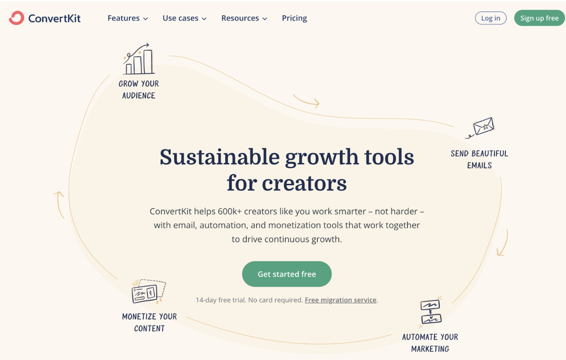
Let’s break down the copywriting in this ConvertKit web page:
Headline: “Sustainable growth tools for creators”
It’s clear, direct, and immediately speaks to the target audience: creators. The word “sustainable” adds a long-term value appeal, something creators aim for. Read my headline copywriting guide to learn more.
Subheadline: “ConvertKit helps 600k+ creators like you work smarter – not harder”
This leverages social proof with a huge number of users while emphasizing the ease and efficiency of the tool. It’s all about doing more with less effort, a huge selling point for time-strapped creators.
Key Benefits Highlighted:
- Grow your audience
- Send beautiful emails
- Monetize your content
- Automate your marketing
This addresses common pain points creators face: growth, content monetization, and automation. Instead of feature-heavy descriptions, it focuses on outcomes and benefits.
Call to Action: “Get started free”
It’s low-friction, offering a free trial with no credit card required. That reduces the perceived risk and increases conversion chances.
Visual Layout
The visual hierarchy is on point. Benefits surround the central message in a visually cohesive flow, guiding the user to the CTA effortlessly.
Psychology of Urgency and Convenience
A free migration service is offered—a subtle nudge reducing friction for those hesitant about switching platforms.
Takeaways:
- Speak to benefits, not features. This entire page is framed around what the user will gain, not the technical specs.
- Leverage social proof. Mentioning “600k+ creators” builds trust and authority.
- Clear, easy CTA. Free trials or no-risk entry points reduce resistance and increase conversions.
- Problem-solving focus. Address specific pain points: growth, monetization, automation.
Marketers can apply these principles by focusing on customer pain points and outcomes in their messaging, reducing barriers to entry with free trials, and strategically placing social proof to boost credibility.
3. Retention.com B2B Website Copywriting

Let’s break down the B2B copywriting strategies used on Retention.com. Here’s how it’s structured and why it’s effective:
1. Headline: “Turn anonymous shoppers into revenue.”
This headline does one thing right—hits the core problem of e-commerce businesses: anonymous traffic. It addresses the pain point directly, without fluff. It doesn’t just grab attention but highlights the desired outcome (more revenue).
Takeaway: Your headline must speak to the specific problem your audience has, and show the benefit immediately.
2. Social Proof: “11.5x ROI in 12 months.”
Case studies are placed directly below the headline to establish credibility. Numbers speak louder than words here, showing clear, measurable results. These case studies are diverse and cover different brands, adding authenticity and reach.
Takeaway: Use quantifiable social proof close to your headline to validate your claims right away.
3. Value Proposition Breakdown:
- “Lower acquisition costs”
- “More customers”
- “Boost revenue” These three phrases target the trifecta of business desires—cost efficiency, customer growth, and higher revenue. This value proposition is not complicated. It simplifies what every business wants, and Retention.com frames itself as the tool to make it happen.
Takeaway: Keep your value prop straightforward and aligned with what your target audience deeply cares about.
4. Problem-Solution Focused Copy:
The copy doesn’t waste time talking about vague benefits. It jumps into problems like abandoned revenue and growing email lists. The message emphasizes solving high-impact issues, e.g., how 98% of shoppers are anonymous, how Apple updates affect revenue, etc. Then it immediately provides solutions.
Takeaway: Highlight your audience’s challenges, but provide concrete solutions that tie directly into your product’s features.
5. CTA Buttons Everywhere:
The CTAs are spread throughout the page, and all with action-oriented phrasing: “Get Retention,” “Get a demo,” “Try It Out.” It doesn’t just tell the user what to do next, it makes it easy for them to take that step, and each button is tailored to the section it’s in.
Takeaway: Don’t just have a single CTA. Sprinkle them around strategically, and tailor them to the moment.
6. Visual Design Aligning with Copy:
The visual elements on this page work alongside the copy. Graphs, icons, and customer logos make the page feel more dynamic and keep the reader engaged. It’s broken up nicely so that each section is skimmable, making it easy to read.
Takeaway: Break up long text with visuals that reinforce your message. This makes content digestible.
7. Risk Mitigation & Trust:
The page wraps up with success stories, which bolster trust by showing actual client results, like Dr. Squatch achieving $1M in recovered revenue. It also lists well-known brands at the bottom, which lends credibility. Plus, there’s a 14-day free trial—giving users a no-risk way to try it.
Takeaway: End your copy with social proof, case studies, and a risk-free offer to push hesitant buyers over the edge.
Retention.com’s B2B page is a masterclass in speaking directly to the needs of e-commerce businesses. It removes friction, showcases results, and drives home the problem-solving value of its solution.
Keep your copy sharp, solution-driven, and supported by numbers or case studies to build credibility quickly.
This approach should inspire you to apply similar strategies to your B2B pages. Stay focused on user pain points, keep your CTAs actionable, and use trust-building tactics to back up your claims.
4. Synthesia B2B Copywriting
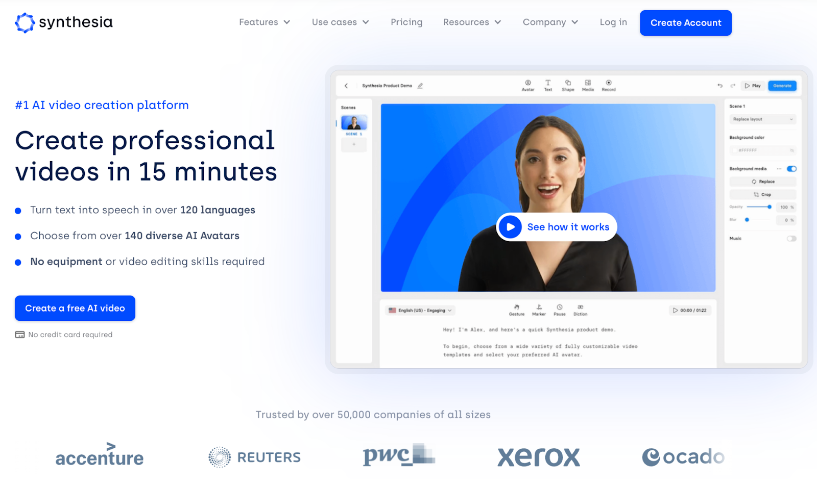
Let’s dive into this Synthesia B2B copywriting example. It’s smart, simple, and to the point—exactly what you want for B2B.
Headline Breakdown:
“Create professional videos in 15 minutes” is clear and specific. Synthesia knows its target audience wants speed and ease when creating videos. The headline promises exactly that.
Always lead with a strong value proposition that highlights the solution you offer, not the features. People care about what they gain, not what your tool does.
Takeaway: Lead with a promise that connects directly to a pain point or desired outcome.
Supporting Points:
- “Turn text into speech in over 120 languages” speaks to the pain of language barriers, showing how it can be solved.
- “Choose from over 140 diverse AI Avatars”: Here’s where they mention features, but it’s backed by the benefit of diversity and choice. It shows flexibility in how a user can present their content.
- “No equipment or video editing skills required” hits hard on simplicity—this removes objections about complexity.
Takeaway: Features must connect to benefits that alleviate specific concerns or pain points.
Visual Hierarchy:
The visuals are carefully chosen. You see a video frame with a human-like avatar—this shows the user the final output without needing explanation. The “See how it works” button is a great call to action because it leads curious prospects to explore more, nudging them down the funnel.
The placement of logos from major companies like Accenture and PwC builds instant credibility.
Takeaway: Visuals should show—not tell—how the product works. Reinforce trust with logos or testimonials from reputable brands.
Trust Signals and Simplicity:
Trusted by over 50,000 companies – this figure immediately lends credibility. For B2B, trust signals are everything. Social proof like this minimizes skepticism and increases conversion rates.
The CTA “Create a free AI video” is clear and focused on action. They’ve eliminated barriers (no credit card required), which makes it easier for someone to get started.
Takeaway: Remove friction from your CTA. Make it easy and immediate for your audience to take the next step.
Conclusion:
This page does a great job of laying out the offer, highlighting the key benefits, and minimizing any potential barriers to entry. Synthesia focuses heavily on simplicity and speed, which resonates with busy professionals who need high-quality results without complications.
5. Truebill B2B Landing Page
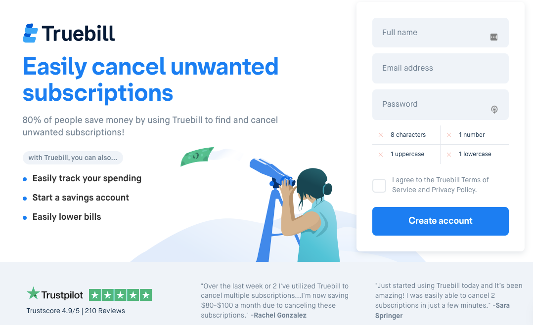
This Truebill landing page offers a powerful example of customer-focused B2B copywriting. Here’s the breakdown:
- Headline Clarity: “Easily cancel unwanted subscriptions” speaks directly to the problem and the solution. The word “easily” emphasizes simplicity, appealing to busy customers who want fast results. Truebill knows their audience wants hassle-free solutions.
- Benefit-Driven Subheadline: “80% of people save money by using Truebill…” Social proof builds credibility immediately. It’s not about what the product does but how it directly benefits the user, financially, and that is communicated upfront.
- Feature List: The copy strategically lists features that speak to what the target audience values — tracking spending, saving, and lowering bills. Notice how they avoid technical jargon. Instead, they focus on how Truebill simplifies complex tasks.
- Visual Cues for Simplicity: The illustration of a user looking through a telescope adds to the message of ease and visibility. It’s another visual nudge that tells users they can “see” their spending better using Truebill.
- Social Proof (Trustpilot and Testimonials): The Trustpilot score, along with user testimonials, strengthens the credibility of the product. Testimonials offer real-world validation, which encourages users to take the next step.
- Call to Action: “Create account” is action-oriented and clear. The simplicity of the form keeps users from feeling overwhelmed.
- Design Complements the Copy: The design is clean, with plenty of white space, which reflects the easy-to-use nature of the service. It reinforces the message that Truebill makes life simpler.
The takeaway? Keep your message simple, speak directly to the pain points, and build credibility through social proof. Use concise, benefit-driven language that answers “What’s in it for me?” instantly. This copy focuses on ease, savings, and real user validation—key elements that make the product desirable.
Main B2B Copywriting Takeaways
Wrapping up, I hope the examples I analyzed gave you insights into effective B2B copywriting strategies. Whether it’s Truebill’s simplicity, Synthesia’s authority-building, or Retention.com’s focus on problem-solving, the key takeaway is always the same:
- Address your audience’s pain points directly.
- Keep your messaging clear, actionable, and focused on benefits rather than features.
- Use social proof to establish credibility and ensure your call to action is straightforward.
- The goal is not just to inform but to guide your audience toward taking action, all while building trust.
Schedule a free consultation to learn more about my marketing services that will help your business drive more revenue.


