Have you ever searched for something on Google, click a result, and immediately went back to find another site?
You’re not alone.
In fact, 79% of people who don’t find what they want on one site will leave quickly to another.
The same can be said about mobile apps, software, and other channels.
If your user experience sucks, you can’t expect people to stick around!

While most marketers think of design being the most important element of UX, they often forget about their copy.
Can words affect the user experience, making it more or less enjoyable? Absolutely.
Yet, many businesses neglect this aspect of the UX and suffer poor performance because of it.
That’s why I’ve put together this UX writing checklist that will help you improve your UX copy and speed up the entire writing process.
Enjoy the results 🙂
UX writing checklist
The following are ten of my top points that together create the ultimate user experience writing checklist.
Reference these every time you are going to begin a UX writing project and I guarantee that you’ll notice better results and a workflow smooth as silk.
1. Write clearly and simply
Writing to optimize a user’s experience implies that the copy needs to be simple and concise. You’re writing text they will see when logging into an app, receiving an error, or anything in between.
That means it needs to be understandable. Otherwise, they will struggle to use your product and ultimately enjoy it to become a lifelong customer.
Speaking in NASA-level jargon will confuse users and have them running for the hills with that being said.
Always strive to make your UX copy easy to understand with a simple vocabulary and step-by-step instructions.
Sony’s manuals for their cameras are great examples of this.
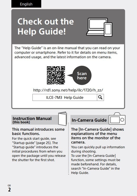
It begins with a call to action for users to check out their help guide via a QR code that is scannable with a smartphone. Note how the paragraph above the QR code isn’t complicated in the slightest.
Sony then introduces the manual and in-camera guide before displaying a table of contents to help users navigate the content.
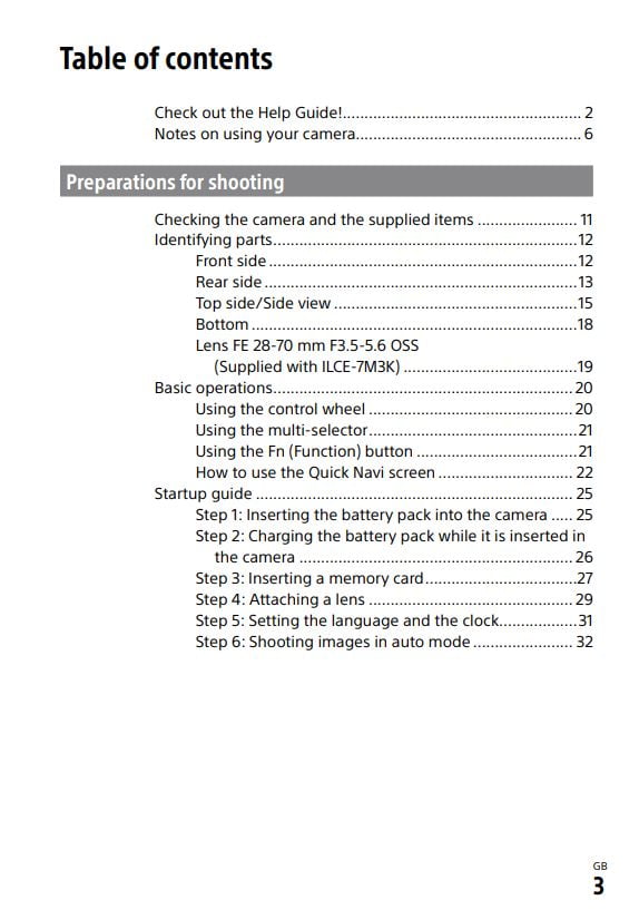
Notice that Sony uses clear explanations and images together to help readers understand what to do, as well.
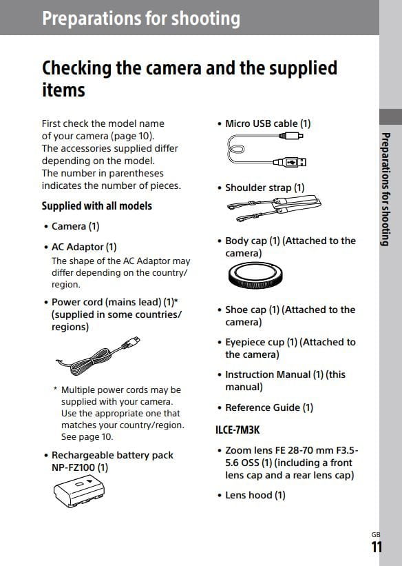
Supplies to achieve the desired outcome, shooting a camera properly in this case, are listed before.
This ensures that the customer is able to easily get to the end result without needing to scramble to find these items later.
You could hand this manual to a child and they can probably figure out what to do. That’s effective UX writing.
2. Shorten your copy as much as possible
There’s a time and place for everything and short copy shines its brightest in the UX world.
This is because you want to sum up information and steps in the fastest way possible to — as you could guess — improve the user experience.
Imagine a customer hits a roadblock in their journey. Perhaps it’s an error. They see something like this:

What do you think their reaction would be? Probably not good.
On the flip side, if they received something like this, it’d be no big deal:

That’s why I suggest UX writers shorten their copy when it makes sense. If you can explain an instruction, error, or message in one sentence versus a paragraph, it’s always better to do so.
You want your users to have as little objections, questions, or obstacles while going through the product as possible and short copy achieves this.
3. Use calls to action
You’re the wizard when it comes to the product you’re writing for. Whether you created it or not, you should know it inside and out. The user doesn’t.
They purchased it from your company and need to be instructed on how to use it.
That’s why calls to actions are so important. Even if it seems obvious what to do next, always include a CTA for guiding users in the right direction.
The less they have to think, the better. That’s less potential for complaining or getting frustrated.
For example, look at how Canva uses heaps of calls to action on their dashboard:
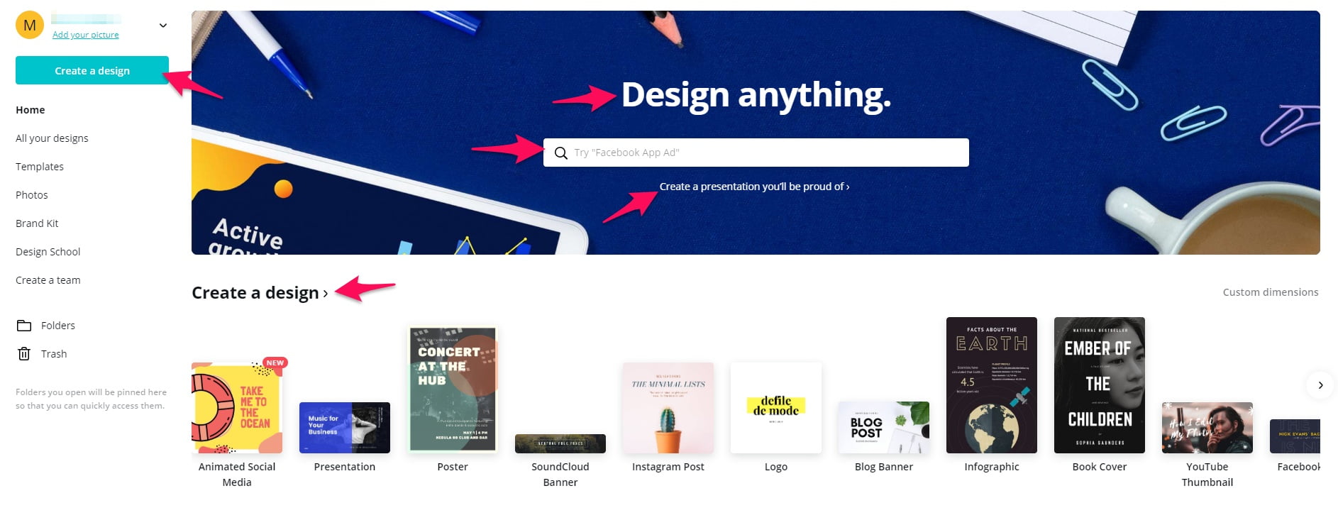
You don’t have to scratch your head and think “What do I do next?” because it’s clearly laid out in front of you.
Make sure to read my guide to calls to action to learn more.
4. Keep a consistent tone for branding
Nobody has your brand voice but you. Sure, competitors can create similar products and copy, but one bulletproof way to stand out is through branding.
That’s why writing UX copy with a focus on your brand’s tone is key to success. This keeps content all across your channels and products consistent, helping customers will feel at home
Look at Apple. Here’s the home page for their iPhone user guide:
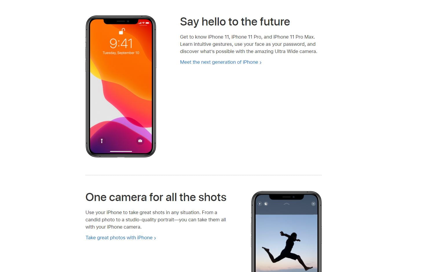
Then if you look at a deeper page within the guide, it uses the exact same style of writing:
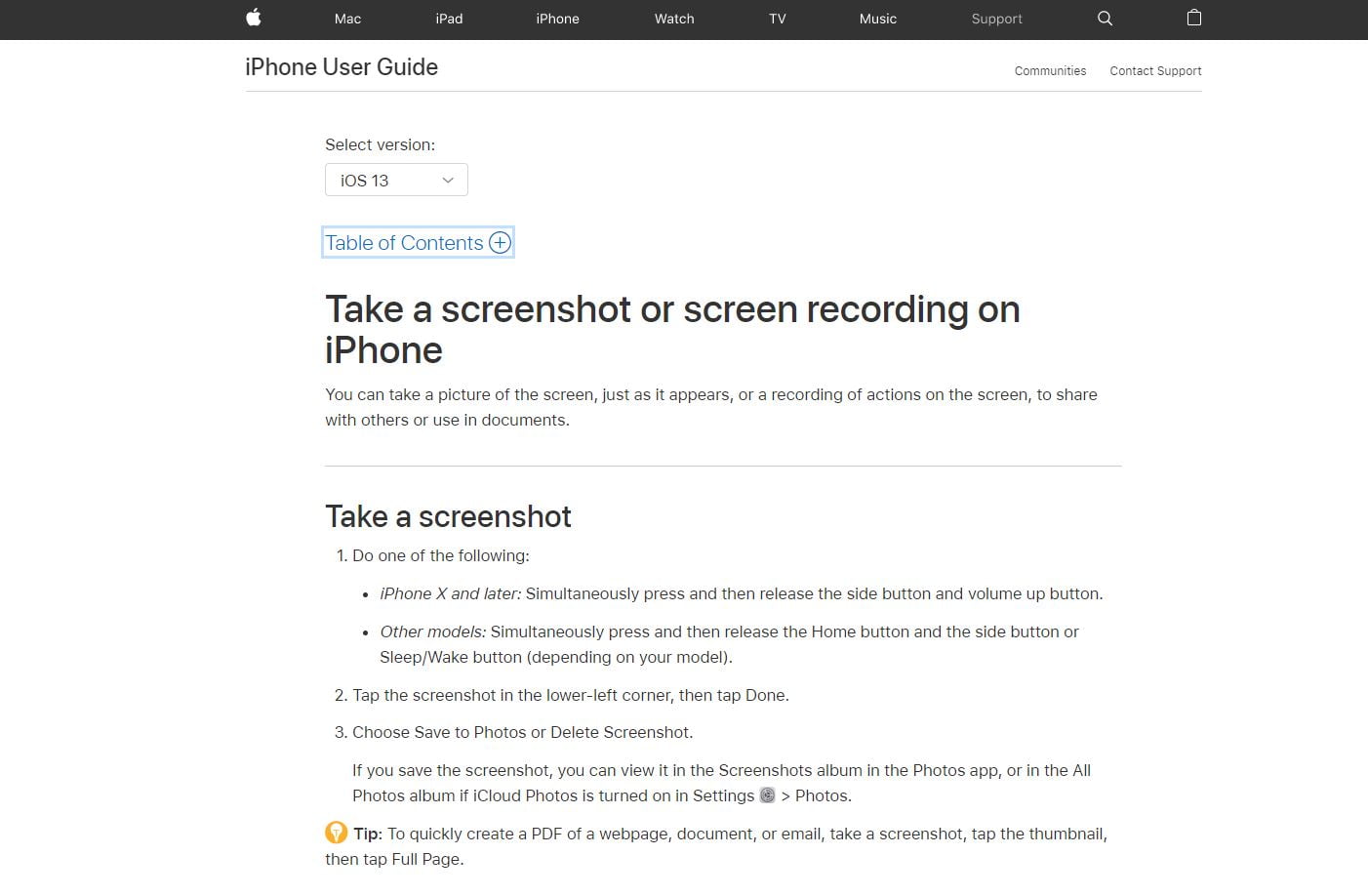
You don’t feel like you’re in the wrong place or reading something different. It feels like it continued where you left off.
The first step to achieve this is by documenting your brand’s voice and tone. This can be referenced and shared with everyone in your company to ensure every department from the UX writer to social media marketers use the same tonality.
You will want to include the following rules in a branding guideline:
- Voice and tone: Is it friendly and casual or professional and serious? Use power words and a good description so all team members are on the same page.
- Negative words: What words or phrases shouldn’t be used? These are normally cursed words or anything inappropriate. However, some businesses like to cut through the static by being a bit edgier and doing the opposite. What would your customers appreciate?
- Styling: Is there specific typography, font size, and line spacing your business wishes to use? Keep in mind that larger font sizes and flat fonts are easier to read and highly recommended.
That brings me to my next point.
5. Make it practical
The ultimate goal of UX writing is to help the user, right?
Well, let me ask you another question.
Have you ever read an instructional manual or similar material and had no clue what to do? It probably looked like Japanese to you.
Yep, I’ve been there many times, as well.
Always strive to do the exact opposite with your UX copy. It needs to be practical while clearly telling users what to do.
This plays back into the strategies of making copy simple, concise, and using CTAs. All together they should produce copy that is actionable in the sense users know exactly what to do next and how to do it.
A good example of this is the website Zapier. They allow you to connect different apps together for chains of function, so it can get quite complicated.
However, their UX writer was worth their weight and did an amazing job.

The dashboard contains no-nonsense copy.
From the navigation to buttons and fields, everything is simple to understand while serving a purpose.
Creating a “Zap” is also straightforward.
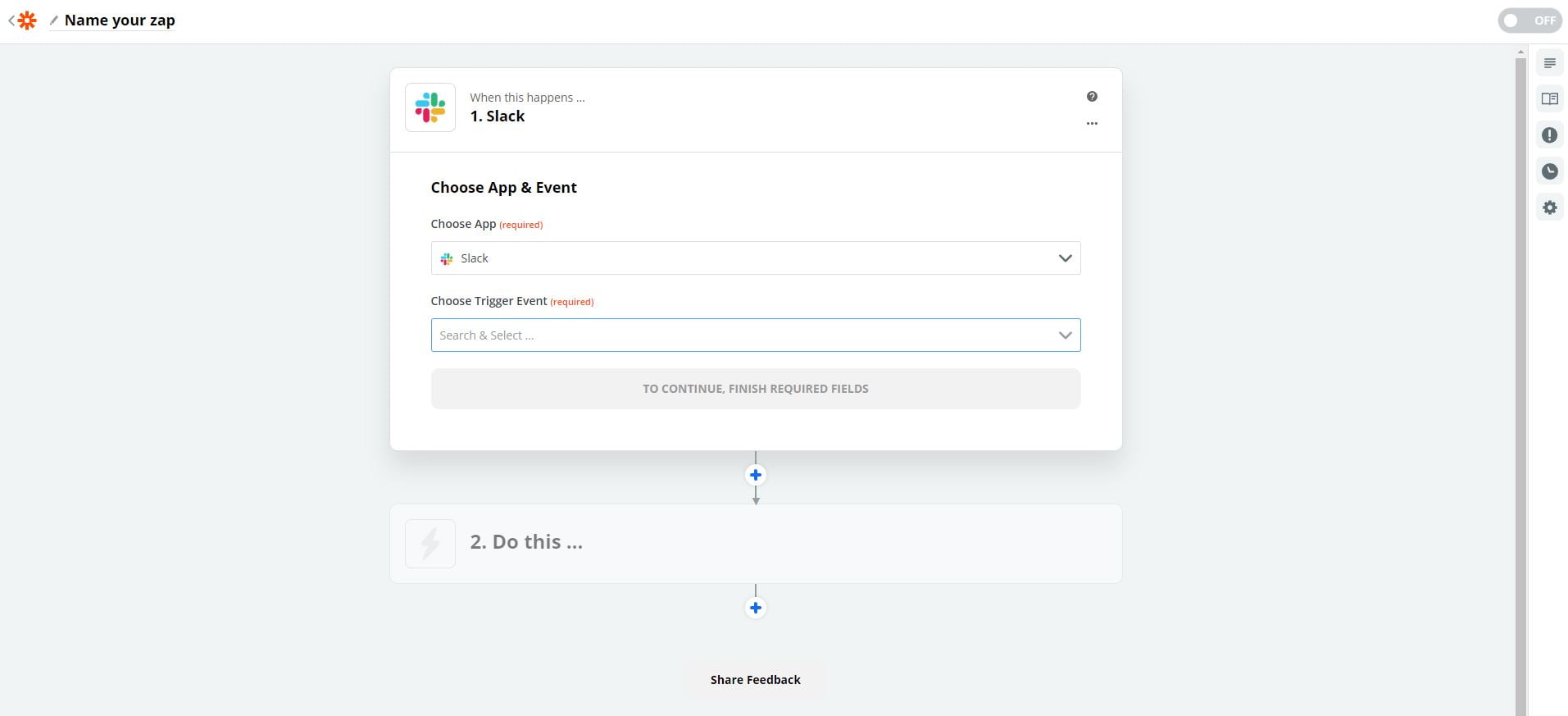
The copy quickly and effortlessly guides you through everything you need to do to get the job done.
6. A/B split test everything
Once you publish your copy, test it!
Once it’s tested, test it again!
A/B split testing is one of the keys to successful UX writing because small changes can make a mountain of a difference.
You may find that certain words, phrases, CTAs, or other elements improve conversion rates, CTR, and various important metrics.
The customer support company Groove redesigned one of their landings pages while changing the copy and increased conversions by 100%.
Here’s the original landing page:

And here’s the new one:
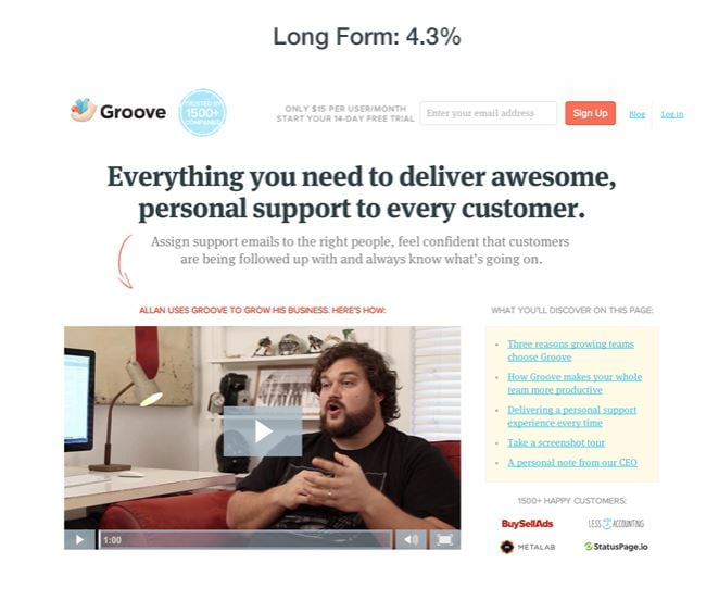
Groove is one of thousands of examples where a business changed their copy and drastically improved campaign performance.
Whether it’s a headline or an entire chapter of a user manual, split test crucial areas of your copy to see how it affects UX and feedback.
7. Make an outline of the copy before writing
If there’s one thing I wish I would’ve learned in the early days of becoming a copywriter is to plan out everything I’m writing.
How many times have you tried writing copy, only to sit there pulling your hair out with no ideas?
Me, too.
I knew something had to change and that’s why I began creating outlines for every copywriting project. Suddenly I was writing faster, knocking projects out quicker, and felt like Superman.

That’s the power of organization and planning.
You need to be creating an outline, even a brief one, for your UX writing. It can look something like this:
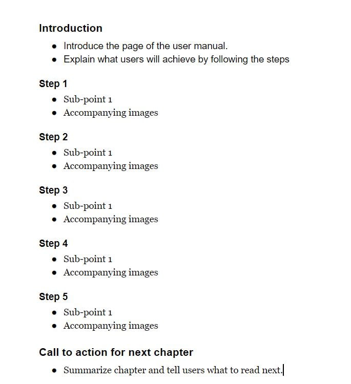
The idea is that the major points and sub-points are already mapped out ahead of time which helps you strongarm writer’s block and keep a consistent workflow.
Feel free to go more in-depth with outlines, jotting idea extra ideas, notes, and resources.
8. Kill distractions before they kill your productivity
Smartphones, social media, televisions, your wife. There’s no shortage of things to distract you.
If you’re constantly having your attention taken away from writing, you will slow down, not get as much done, and ultimately produce poor copy.
Imagine all of the hours you’ve wasted getting distracted by your phone, Instagram, or Netflix. Probably too many, right?
As a matter of fact, we check our phones 58 times per day on average alone.
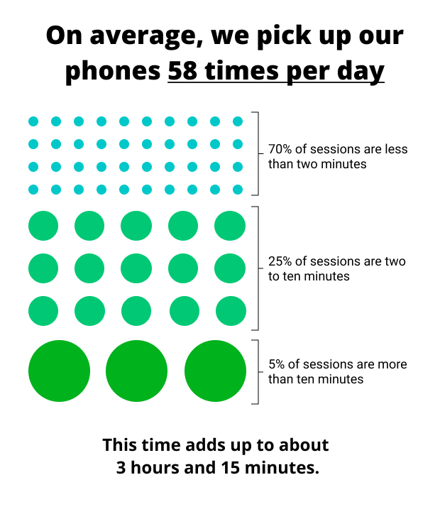
All you need to do is simply acknowledge what’s distracting you and put those things away while working.
If it’s your phone, turn it off. Don’t worry, the world doesn’t end when people can’t reach you for a couple of hours.
If it’s your television, Brad Pitt won’t get angry.
If it’s your wife… I don’t know what to tell you!
But, you get the point.
Since you’ll be most likely writing from your computer and not a typewriter, websites and social networks can be a big distraction.
Try using the free Google Chrome extension Site blocker that enables you to block websites until you tell it otherwise.
Once it’s installed, click the extension icon on the top right of your browser.
Enter the URLs of any websites you wish to block via the “Add” button and click “Save changes”.

When you visit them you’ll see a blank white page, saving you countless hours from scrolling through news feeds 😉
9. Run your copy by team members
Two minds are better than one.
Hence why showing your copy to other people, especially those in your business, is incredible for brainstorming improvements.
Furthermore, you’re the writer. Not the product lead, UX designer, etc. Getting their expert advice will help you produce the best possible UX copy.

Ask questions like:
- What improvements do you think I could make in the copy?
- What sections of the copy are perfect? (Reference these areas)
- Does this clearly explain how to use the product?
- Does this copy align with our branding guidelines?
- Do you have any new information about the product I can implement?
That brings me to the following and last idea in my UX copywriting checklist.
10. Collect as many resources as possible before writing
Just like when you’re creating an outline for the copy, you need resources and documents to help you write the copy.
This will serve as inspiration and data to play with as you write content.
I recommend collecting information, such as:
- Internal documents and memos
- Market and industry reports
- Product blueprints
- Branding guidelines
- Case studies
- Whitepapers
- Blog posts
All of these sources will give you the knowledge to write copy that aligns with the product and its usability.
It will help you understand consumer behavior, how the product works, and everything else in between.
Many of these can be collected internally in your company while others will require some research.
Wrapping up this user experience writing checklist
The user experience is perhaps the most important element of any website, app, or product. Yet, many companies still neglect optimizing it down to a science.
It’s critical to run your UX writing through a repeatable checklist like the one I’ve given you today to improve workflow and results.
Here are the main takeaways:
- Focus on producing UX copy that is simple and concise. It needs to clearly state what and how to complete steps.
- Shortening copy can be better in many situations as it makes things easier to understand. Try trimming the fat in sections of your UX writing.
- Leverage calls to action for helping users take full advantage of a product and get through the funnel.
- Create branding guidelines and reference them while writing to keep a consistent voice.
- Make all of your copy as practical as possible. This means adding instructions that help the user complete every step of using a product.
- A/B split test your copy to find winning combinations of words, phrases, and calls to action.
- Make an outline of the copy you’re writing to improve workflow while surpassing writers block.
- Figure out what’s distracting you the most during the workday and block it.
- Share your writing with team members and other entrepreneurs to find ways to improve it.
- Collect resources and references before you begin writing to improve the depth and usefulness of copy.
Need a UX copywriter? Reach out to me today and I’ll handle all of your technical writing.


