In the world of digital marketing and communication, one skill stands out as an absolute game-changer: copywriting.
Now, if you’re a student, you might be wondering, ‘What does copywriting have to do with me?’ Well, a lot more than you think.
Copywriting isn’t just about selling products or crafting catchy slogans; it’s an art that helps you communicate more effectively, persuade convincingly, and stand out in a sea of information.
Whether you’re aiming for a career in marketing, looking to enhance your academic writing, or just wanting to improve your online presence, mastering copywriting can open doors to countless opportunities.
In this guide, I’m diving deep into some of the most compelling copywriting examples tailored for students like you.
We’ll explore how these techniques can not only sharpen your writing skills but also give you a competitive edge in almost any field.
Let’s check them out!
1. ConvertKit’s Website

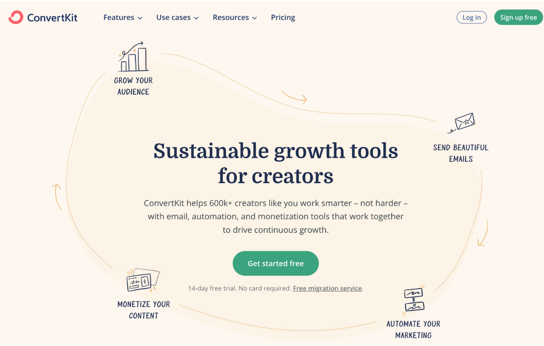
ConvertKit is a marketing automation software used by hundreds of thousands of users. Analyzing ConvertKit’s webpage, there are several key copywriting strategies in play:
1. Clarity and Conciseness: The copy is straightforward and gets to the point quickly. “Sustainable growth tools for creators” clearly defines the product’s purpose and target audience without any fluff.
2. Benefit-Driven Copy: The headline focuses on the benefits rather than the features. It doesn’t just say “email marketing” or “automation tools”; it emphasizes “sustainable growth,” which speaks directly to the end goal that the target audience, creators, is seeking.
3. Inclusive Language: The phrase “creators like you” is inclusive and personal. It makes the reader feel part of a community and suggests that ConvertKit understands and caters to their specific needs.
4. Simplicity in Design and Language: The design is clean, and the copy uses simple language that is easy to understand. This reduces cognitive load and helps keep the user focused on the message.
5. Action-Oriented Language: “Grow your audience,” “Send beautiful emails,” and “Monetize your content” are all action-driven statements. They imply a sense of empowerment and active engagement with the product.
6. Using Numbers for Credibility: Mentioning “600k+ creators” provides social proof, implying that a large number of people trust and use ConvertKit, which can encourage new users to sign up.
7. Offering a Risk-Free Trial: The “14-day free trial” and “Free migration service” offer a no-risk way to try the service, lowering the barrier to entry for potential customers.
8. Strategic Call-to-Action (CTA): The “Get started free” CTA button is clear, direct, and positioned as the logical next step after reading the copy. The color of the button stands out against the background, drawing attention.
9. Emphasizing Ease of Use: The copy makes a point of saying, “Work smarter – not harder,” which suggests that the tool is easy to use and effective, addressing a common pain point for creators who might want software that’s simple to use.
2. Truebill’s Home Page

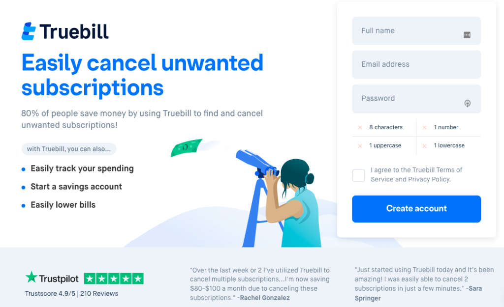
Truebill (now RocketMoney) is a software that helps you cancel unwanted subscriptions and save money. They are a great copywriting example for students because they deploy staple techniques, including the following:
1. Direct and Compelling Headline: “Easily cancel unwanted subscriptions” is a straightforward headline that instantly communicates the primary benefit and service offered by Truebill. It addresses a common pain point directly, promising an easy solution.
2. Use of Statistics: The statement “80% of people save money by using Truebill to find and cancel unwanted subscriptions!” leverages social proof and the power of statistics to build credibility and trust. Such data implies that the user is likely to experience similar positive results.
3. Clarity of Benefits: The bulleted list (“Easily track your spending, Start a savings account, Easily lower bills“) breaks down additional benefits in a clear, easy-to-read format, outlining multiple value propositions without overwhelming the user.
4. Trust Signals: The Trustpilot rating (“Trustscore 4.9/5 | 210 Reviews“) acts as a strong trust signal, suggesting reliability and customer satisfaction. This element is designed to reduce anxiety about trying a new service.
5. Visual Engagement: The graphic of a person using a telescope conveys searching or keeping an eye on something, which metaphorically represents the user’s ability to monitor their subscriptions through Truebill.
6. Social Proof Through Testimonials: The testimonials included on the page serve as social proof, providing real-world examples of how the service has helped others. This strategy helps potential customers envision the benefits they could receive.
7. Action-Oriented CTA: The call-to-action button “Create account” is prominent and clear. The design uses color contrast to make it stand out, and the action word “Create” encourages the user to take the step to sign up.
8. Simplified Sign-Up Process: The sign-up form is visible on the landing page itself, reducing the number of steps required to get started. The form fields are accompanied by validation requirements, which guide the user through the process.
9. Assurance and Transparency: By stating, “I agree to the Truebill Terms of Service and Privacy Policy,” the company provides transparency and sets clear expectations, which are important for building trust.
10. Minimalist Design: The page’s design is clean and focused, with plenty of white space around the elements, which helps avoid distraction and directs the user’s attention to the most important parts—the benefits and the sign-up form.
3. Method Dish Soap Product Description

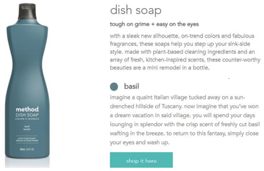
Next up is a product description for a dish soap from the brand Method. Here are some copywriting strategies I pulled from their page:
1. Sensory Appeal: The description “with a sleek new silhouette, on-trend colors, and fabulous fragrances” appeals directly to the senses, painting a picture of the product that is both visually and olfactorily appealing.
2. Lifestyle Association: By inviting the reader to “imagine a quaint Italian village tucked away on a sun-drenched hillside of Tuscany,” the copy connects the product to a desirable lifestyle, suggesting that using this dish soap is akin to experiencing a piece of that idyllic life.
3. Problem and Solution: The phrase “tough on grime + easy on the eyes” presents a common problem (tough grime) and immediately offers a solution (the product’s effectiveness), while also highlighting its aesthetically pleasing design.
4. Emotional Imagery: The description evokes an emotional response by using imagery like “you will spend your days lounging in splendor with the crisp scent of freshly cut basil wafting in the breeze.” It’s not just about the product’s practical use but the experience it promises.
5. Product Features Highlighted: The copy emphasizes features such as “plant-based cleaning ingredients” and “kitchen-inspired scents,” appealing to environmentally conscious consumers and those who appreciate culinary themes.
6. Value Proposition: Describing the soaps as “these counter-worthy beauties are a mini remodel in a bottle” suggests that the product offers additional value beyond its cleaning capabilities—it enhances the look of one’s kitchen.
7. Call-to-Action (CTA): The subtle “shop it here” is a clear, straightforward CTA that invites immediate action without being too aggressive or pushy.
8. Branding Consistency: The copy maintains Method’s brand voice, which is known for being playful and quirky, helping to differentiate its products from more traditional, utility-focused cleaning supplies.
4. Door Refinishing Advertisement

This is a physical advertisement for a door refinishing service from the company Sturdy Doors. Let’s see what we can learn about copywriting from their ad.
1. Direct Headline: The bold statement, “Don’t Replace. Refinish.” is a strong, direct command that contrasts the two options available to the customer, emphasizing the simplicity and logic of choosing to refinish over replacing.
2. Solution-Oriented Approach: “Bring your weathered doors back to life!” offers a solution to a specific problem (weathered doors) that the target audience is likely facing, promising a rejuvenated look.
3. Before-and-After Imagery: The use of before-and-after images serves as visual proof of the service’s effectiveness, showcasing the transformation and thereby reducing skepticism.
4. Clear Pricing and Offers: Presenting the price upfront with “Door Refinish $349” alongside the “TheHomeMag Special” creates a sense of transparency and immediacy, encouraging the reader to take advantage of a limited-time offer.
5. Detailed Service Description: By specifying the service applies to “Exterior Side, standard 6’8” door” and listing applicable door materials, the ad ensures that customers know exactly what the offer includes, which helps in qualifying the lead.
6. Value Propositions: The bullet points highlight the unique selling propositions of the service, such as “Best Quality Finish,” “Best Price Guarantee,” and “On-Site Service,” which are all compelling selling points for the consumer.
7. Call-to-Action (CTA): “CALL & TEXT A PICTURE OF YOUR DOOR TO REQUEST A QUOTE” is a clear and action-oriented CTA that also outlines the simple steps a potential customer should take to engage with the service.
8. Trust Signals: The inclusion of Yelp, Angi, and Google badges alongside a phone number adds legitimacy to the service and provides multiple avenues for the customer to verify the company’s credibility.
9. Contact Information: The prominent display of the phone number and website address ensures that the reader knows exactly how to take the next step.
10. Time-Sensitive Call-to-Action: Mentioning the discount expires on a specific date creates a sense of urgency, prompting the customer to act quickly to take advantage of the deal.
Final Thoughts on Today’s Copywriting Examples For Students
Analyzing great advertisements is very helpful if you’re working on an assignment or project or need to learn more about copywriting as a student.
It allows you to learn the techniques and strategies businesses deploy to get customer’s attention and drive sales.
These are the main takeaways from the advertisements we saw in this article:
- Keep your advertisements free of fluff and as clear and concise as possible.
- Leverage social proof and trust signals to build authority.
- Use action-oriented language and calls to action that help push the reader to purchase.
- Add a sense of scarcity of urgency to your advertisement to drive more sales.
- What makes your product unique? Explain to the reader how it’s better and different than competitors.
- Include contact information or a website URL so readers have everything they need to buy.
- Keep branding and messaging consistent throughout the ad and other marketing material.
- Make the imagery and sales copy emotionally appealing.
Want to learn more about copywriting? Explore my free and paid online courses.


