Apple is worth $3.46 trillion. Yes, you heard that right. You don’t get to that size without incredible marketing and advertising.
They are a great example of how marketing can be used to reach a target audience, tap into their emotions, and persuade them to take action.
That’s why in this blog post, I’m going to cover Apple marketing examples that will inspire you as a marketer yourself.
You can use these to improve your own projects or grow a business. Enjoy!
1. Think Different
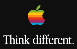
Let’s break down Apple’s famous “Think Different” ad and the marketing strategies behind it.
Simplicity and Minimalism
Notice how there’s almost nothing on the ad except for two elements: the rainbow-colored Apple logo and the words “Think different.” Apple is known for its minimalist approach, both in product design and advertising. The simplicity of this ad draws immediate attention to the core message without distractions.
Takeaway for Your Business:
When you’re creating marketing materials, less is more. Don’t clutter your ads with too much text, images, or information. Focus on the core message you want to convey. Minimalism creates elegance, and elegance often translates to premium branding.
Emotional Appeal: “Think Different”
This phrase is more than a tagline—it’s a philosophy. It resonates with the idea of innovation, creativity, and breaking from the norm. Apple’s entire brand is built on the idea of being unconventional, and this ad appeals directly to people who see themselves as creative thinkers or trailblazers.
Psychology Behind It:
Apple is leveraging identity marketing. By saying “Think Different,” they are appealing to those who see themselves as rebels, creatives, and innovators. This is a classic example of self-concept theory in marketing. When your brand message aligns with how your audience sees themselves or aspires to be, it creates a powerful emotional connection.
Takeaway for Your Business:
Position your brand in a way that speaks to your audience’s identity. Appeal to who they are or who they want to become. If you can create a connection between your brand and your audience’s self-concept, you’ll have a far more impactful marketing strategy.
Colors and Branding
The rainbow-colored Apple logo was a key part of Apple’s branding at the time. The colors represent creativity, diversity, and innovation—all of which align perfectly with the “Think Different” slogan. The black background makes the logo pop, drawing attention directly to it.
Takeaway for Your Business:
Brand consistency matters. Apple’s logo, colors, and fonts are recognizable everywhere. Make sure your brand’s visuals are aligned with your message and consistent across all platforms. Whether it’s color schemes, fonts, or logos, they need to reflect your brand’s identity.
Typography
The font is clean, classic, and bold. There’s nothing flashy about it, but that’s the point—it’s not trying too hard. The contrast between the white text and the black background is sharp, ensuring that the slogan stands out immediately. It’s simple but authoritative.
Takeaway for Your Business:
Typography matters. The typeface you use should align with the tone of your brand. In this case, the font is professional and confident. It’s important to make sure the typography you choose supports your message without overpowering it.
Positioning: A Call to Creativity
Apple isn’t selling a product with this ad—they’re selling an idea. The genius of this ad is that it’s positioning Apple not just as a tech company but as a leader in creativity and innovation. They’re inviting customers to align themselves with that mindset. This elevates Apple’s status from being just another company selling products to a brand that represents a lifestyle and a set of values.
Takeaway for Your Business:
Don’t just sell products—sell an idea or a lifestyle. Apple doesn’t talk about the specs of their computers or phones here. They focus on how using their products makes you feel and what they represent. Think about the bigger picture when marketing your product. What lifestyle or mindset does your brand promote?
Conclusion: How to Apply These Lessons
- Keep it simple. Use minimalist designs that focus on your core message.
- Appeal to identity. Align your messaging with how your audience sees themselves or aspires to be.
- Be consistent with branding. Make sure your logos, colors, and fonts reinforce your brand’s identity.
- Sell more than products. Build a connection between your brand and a larger idea, value, or lifestyle.
This ad is a masterclass in emotional branding and identity marketing—two things any business can replicate, even without Apple’s massive budget. Keep your messaging clear, emotionally charged, and aligned with your audience’s aspirations.
Related reading: Apple Copywriting Examples
2. The Silhouette Ad

Let’s break down Apple’s iPod Silhouette Ad and analyze the marketing strategy behind it, so you can apply the same tactics to your business.
Visual Simplicity with Focus on the Product
The first thing that stands out in this ad is the bold use of color. The background is a solid, vibrant yellow, while the person is rendered as a black silhouette. This puts all the emphasis on one thing—the iPod and its signature white earbuds. Your eyes are naturally drawn to the product.
Takeaway for Your Business:
Use visual hierarchy to direct attention exactly where you want it. Apple uses contrast to make the iPod pop against the silhouette and the colorful background. When creating ads, think about how to use contrast, color, and simplicity to put the focus on your product. Don’t clutter your visuals with too much detail—keep the product front and center.
The Power of Identity Marketing
The person in the ad is dancing, giving off a carefree, fun, and energetic vibe. However, the individual’s identity is completely hidden, represented as a simple silhouette. This is intentional—Apple is letting viewers project themselves into the ad. By removing specific features like gender, race, or age, Apple speaks to everyone.
Psychology Behind It:
Apple is tapping into aspirational marketing here. The ad invites viewers to imagine themselves in the shoes (or silhouette) of the person having fun with their iPod. The product becomes a tool to achieve that lifestyle—cool, free, and full of energy. The message isn’t “buy this iPod,” it’s “buy into this lifestyle.”
Takeaway for Your Business:
People don’t just buy products—they buy the identity and lifestyle associated with them. Apple uses identity-neutral imagery so that anyone can see themselves using the product. Think about how your marketing can position your product as something that helps people achieve an aspirational identity.
Using Movement and Energy
The pose of the silhouette is dynamic. This isn’t a static ad—there’s energy, rhythm, and a sense of movement that makes the viewer feel like the product is an experience, not just a piece of tech. The body language communicates excitement, fun, and freedom—all emotions tied to music.
Takeaway for Your Business:
Use body language and imagery that evoke emotions tied to your product. Whether your product helps people feel empowered, relaxed, or energized, convey that feeling visually. Don’t just sell a product; sell the experience that comes with using it.
Bold Use of Color
The bright yellow background is an unexpected choice, but it works. Apple often uses bold, contrasting colors in these silhouette ads. This reinforces the vibrancy and excitement of the iPod brand while grabbing attention immediately.
Takeaway for Your Business:
Don’t be afraid to use bold colors that stand out from the crowd. Bold color schemes can help differentiate your brand and catch attention quickly. Consider your brand’s tone and personality when choosing colors. In this case, the bright yellow screams energy, joy, and fun—emotions Apple wants to associate with their product.
Product as the Hero
Notice how the actual product—the iPod and the white earbuds—are the only visible objects besides the silhouette. This reinforces the idea that the iPod is the hero of the ad, the object that transforms the experience. Even without words, you know exactly what this ad is selling: the iPod as a lifestyle product.
Takeaway for Your Business:
Make your product the focal point. Apple doesn’t even need text to tell you what this ad is about. The product is clear, front and center, and immediately associated with the energetic, aspirational lifestyle. If you can, make your product or service the centerpiece of your marketing visuals.
Minimal Text: Letting the Visuals Speak
There’s no tagline, no detailed copy, nothing but a visual. This is a bold move, but Apple knows the power of visuals and brand recognition. The imagery itself is so iconic that it doesn’t require explanation. This is a masterclass in brand confidence.
Takeaway for Your Business:
Sometimes, less is more. You don’t always need long-winded explanations or detailed product specs. A powerful image or message can convey more than a paragraph ever could. If you’ve built strong brand recognition, let the visuals do the talking.
Conclusion: How to Apply These Lessons
- Focus on the product—Make it the hero of your ad, and use contrast to draw attention to it.
- Appeal to lifestyle—Use aspirational marketing that lets your audience see themselves using the product.
- Use bold, contrasting colors—Don’t be afraid to stand out with vibrant backgrounds that convey the energy and personality of your brand.
- Minimalism works—Don’t clutter your ad. Sometimes, a single strong visual is more powerful than pages of copy.
Apple’s iPod silhouette campaign is iconic because it merges minimalism, lifestyle marketing, and product focus. It doesn’t just sell an iPod; it sells the feeling you get when you use it. This kind of emotional connection is what transforms buyers into loyal customers—something every business should aim for.
3. Get a Mac

Ironically I’m writing this from a MacBook. Let’s look at Apple’s famous “Get a Mac” ad and the marketing strategies behind it, so you can apply the same tactics to your business.
Contrast in Characters: The Power of Relatability
This image is part of Apple’s iconic “Get a Mac” campaign, where two characters represent Mac (the younger, casual guy) and PC (the older, more formal guy).
The visual contrast between the two speaks volumes: Mac is portrayed as laid-back, cool, and relatable, while PC is stiff, formal, and outdated. This creates an immediate emotional appeal for the audience, positioning Mac as the “fun” choice and PC as the “boring” option.
Psychology Behind It:
Apple is using personification to make the Mac feel more approachable. By giving Mac a human identity that’s relatable and cool, they tap into the viewer’s desire to be part of that culture. PC, on the other hand, is portrayed as out-of-touch, making it easy for viewers to align themselves with the “Mac lifestyle.”
Takeaway for Your Business:
Think about how you can personify your brand or product to appeal to your target audience’s identity. Can you position your product as the “fun” or “cool” option compared to the competition? Create a story where your brand represents what your audience aspires to be. Relatability sells.
Humor as a Marketing Strategy
Apple uses humor throughout the “Get a Mac” series. The contrast between the characters creates a comedic effect, but the humor doesn’t just entertain—it subtly reinforces Apple’s key messaging. PC’s awkward, clunky behavior is exaggerated to show the flaws in Microsoft-based systems, while Mac’s easygoing nature highlights the product’s simplicity and user-friendliness.
Takeaway for Your Business:
Humor is a powerful marketing tool, especially if it reinforces your brand’s core message. Apple’s humor works because it aligns with their brand identity: cool, creative, and easy to use. Think about how you can use humor to make your messaging more memorable, but always make sure it’s strategic humor—it should underscore your product’s benefits, not distract from them.
Visual Storytelling Without Technical Jargon
There’s no technical language or complicated specs in this ad. Instead, Apple uses a simple metaphor—two men in boxes—that clearly conveys the differences between the two brands. The message? Mac is sleek and modern, while PC is old-fashioned and constrained. The ad doesn’t bombard viewers with information; it uses visual storytelling to make a point.
Takeaway for Your Business:
Don’t overcomplicate your message with industry jargon or technical details. Apple mastered the art of simplifying complex ideas into relatable, visual stories. When crafting your marketing, ask yourself: “How can I show, rather than tell?” The more visual and straightforward your message, the easier it will be for your audience to connect with and understand your product’s benefits.
Us vs. Them: Clever Brand Positioning
This ad sets up a clear “us vs. them” dynamic, positioning Mac as the forward-thinking, user-friendly brand and PC as the outdated, cumbersome alternative. Apple doesn’t explicitly say that Mac is better—they show it through the juxtaposition of the two characters. This indirect comparison works well because it allows viewers to draw their own conclusions, making the messaging feel more authentic.
Takeaway for Your Business:
Positioning your brand against a competitor can be effective, but it’s all about subtlety. Apple never directly criticizes PC in these ads—they simply let the differences speak for themselves. If you choose to use this strategy, focus on highlighting what makes your brand different and better without outright bashing the competition.
The Boxes: Symbolism in Design
The two boxes are key visual elements in this ad. The Mac box is sleek, white, and modern, while the PC box is brown and clunky—immediately reinforcing the difference in design philosophy between the two products. Apple uses these props to symbolize innovation versus stagnation. It’s a subtle, yet powerful way of communicating the superiority of Mac’s design.
Takeaway for Your Business:
Use symbolic elements in your advertising that reflect your brand’s values. Apple doesn’t need to explain the differences in product design—the visual contrast between the boxes says it all. Think about how you can use simple visuals or props to tell a story about your brand without needing lengthy explanations.
Emotional Appeal: Breaking Free from the Norm
The Mac character’s relaxed, easygoing attitude represents a departure from the traditional, buttoned-up world of PCs. This appeals to consumers who see themselves as rebels, creatives, or those who value freedom of expression. Apple isn’t just selling a computer—they’re selling a lifestyle that breaks free from convention.
Takeaway for Your Business:
Appeal to the emotional desires of your target audience. What do they want to feel when using your product? Apple’s ad appeals to the desire to be free, creative, and modern. Whatever emotional connection your product offers, make sure your marketing speaks directly to that.
Conclusion: Applying Apple’s “Get a Mac” Lessons to Your Marketing
- Relatability sells. Personify your brand or product to connect with your audience emotionally.
- Use humor strategically. Keep it aligned with your brand message and core values.
- Simplify your messaging. Let visuals tell the story, rather than overwhelming your audience with technical details.
- Position your brand subtly against competitors. Highlight your strengths without directly bashing the competition.
- Incorporate symbolic elements. Use visuals that represent your brand values and instantly communicate key differences.
Apple’s “Get a Mac” campaign is iconic because it’s not just an ad—it’s a lesson in branding, visual storytelling, and emotional marketing. Take these strategies and apply them to your own campaigns to make your brand stand out and resonate with your audience.
4. 1949 Superbowl Ad
This is one of the most famous commercials in advertising history. Follow me along to explore the marketing strategies and psychology behind it.
The Storyline: A Dystopian World
The ad is set in a dystopian, Orwellian future where an authoritarian regime (symbolizing IBM and other PC manufacturers) controls people’s thoughts and actions.
The world is portrayed as bleak, with robotic-like people sitting in rows, watching a massive screen where Big Brother gives a speech. Then, a lone woman, wearing a vibrant red and white outfit (symbolizing freedom, individuality, and rebellion), bursts onto the scene and destroys the screen with a sledgehammer.
This ad represents Apple as the “rebel” company breaking through the conformity of the tech world. It’s not about the product specs—it’s about positioning Apple as a symbol of liberation from the traditional, boring world of computing.
Takeaway for Your Business:
Tell a bigger story. This ad isn’t just about selling a computer; it’s about positioning Apple as a brand that empowers creativity and freedom. Think about the larger narrative your brand can tap into. What’s the bigger mission or purpose behind your product or service? Don’t just sell features—sell the story of what your product represents in the grander scheme of things.
The Hero: The Woman in Red
The woman, representing Apple, is vibrant, energetic, and defiant—everything the oppressive regime is not. She’s running toward the screen with a sledgehammer, ready to break down the barriers of conformity. The contrast between her vibrant appearance and the dull, robotic people around her highlights her as a hero, bringing change and freedom.
Psychology Behind It:
This taps into the hero’s journey narrative, a classic storytelling framework where the hero fights against the odds and brings transformation. Apple places itself in the role of the hero, and the audience (the viewer) is meant to identify with this figure of rebellion and freedom.
Takeaway for Your Business:
Position your brand or product as a hero that challenges the status quo. People love rooting for the underdog or the rebel, especially if your brand can help them feel empowered in some way. Create an emotional connection by showing how your brand disrupts the norm and helps your customers break free from their own “Big Brother.”
The Symbolism: Destroying the Status Quo
When the woman throws the hammer and smashes the screen, it’s symbolic of Apple destroying the traditional, boring, conformist tech industry that IBM dominated at the time. The explosion represents innovation, creativity, and freedom—all things Apple wanted to be associated with.
Takeaway for Your Business:
Use visual metaphors to drive home your brand’s core values. Apple didn’t need to spell out “IBM is the enemy” or list out product specs—by smashing the screen, they created a powerful visual that did all the talking. Think about how you can use symbolism to communicate your brand’s disruption or transformation within your industry.
Evoking Emotions: Freedom vs. Conformity
The 1984 ad is built on emotional contrasts. The gray, controlled world represents conformity, while the woman’s rebellious act of smashing the screen represents freedom and individuality. Apple knew that their target audience—creatives, free-thinkers, and innovators—would resonate deeply with this message. The emotional impact of the ad is what made it so memorable.
Takeaway for Your Business:
Tap into emotional contrasts in your marketing. Apple juxtaposed freedom against oppression, which made the message powerful. When crafting your marketing campaigns, think about the emotional states your product or service brings: are you offering peace of mind in a stressful world? Creativity in a rigid industry? Play on those emotional contrasts.
No Product Shown: Selling a Vision, Not a Computer
The brilliance of this ad is that you don’t see a Mac computer anywhere in the ad. There are no product shots or technical details. In fact, the word “Apple” isn’t even mentioned until the very end, when the narrator says, “On January 24th, Apple Computer will introduce Macintosh. And you’ll see why 1984 won’t be like ‘1984.’” The focus is not on the product—it’s on the vision behind the product.
Takeaway for Your Business:
Don’t always focus on the literal product. Sometimes, selling a vision or an idea is more powerful. Apple wasn’t selling hardware; they were selling freedom, creativity, and rebellion. Think about the deeper vision behind your brand and how you can build a campaign around that rather than focusing solely on the product itself.
Creating a Cultural Moment
The ad aired during the Super Bowl in 1984, one of the largest TV events of the year. This wasn’t just an ad—it was a cultural moment. People weren’t used to seeing commercials like this, so it grabbed their attention and created a massive amount of buzz. The ad didn’t just launch a product—it redefined Apple’s entire brand.
Takeaway for Your Business:
Look for opportunities to create a cultural moment. Timing matters. Whether it’s a product launch, a holiday, or a big industry event, figure out how to make your marketing align with something bigger. Launching during key moments can maximize your brand’s exposure and create a lasting impression.
The Ending: A Call to Action That Stays With You
The final line of the ad, “And you’ll see why 1984 won’t be like ‘1984,’” ties everything together. Apple was positioning the Macintosh as the tool that would bring freedom in a world that felt controlled by conformity. It’s subtle but powerful—Apple isn’t just introducing a new computer; they’re introducing a new era.
Takeaway for Your Business:
End with a strong call to action that ties back to your story. Apple’s call to action wasn’t just “Buy our product,” it was “Join us in changing the world.” When creating your own calls to action, consider how you can link it to the broader vision or mission your brand represents.
Conclusion: Applying Apple’s “1984” Ad Lessons to Your Marketing
- Tell a bigger story. Don’t just focus on product features—focus on what your brand represents in the larger context of your industry.
- Be the hero. Position your product or brand as a disruptor or liberator that helps customers break free from the status quo.
- Use symbolism. Visual metaphors are incredibly powerful and can help communicate your brand’s mission without relying on words.
- Create an emotional contrast. Highlight how your product or service delivers emotional value, like freedom, creativity, or empowerment.
- Sell the vision. Sometimes, selling an idea or a lifestyle is more powerful than showcasing the product itself.
Apple’s 1984 ad wasn’t just an ad—it was a cultural moment that shifted how people saw computers and technology. The ad took risks, told a compelling story, and positioned Apple as a brand that wasn’t just about selling products, but about changing the world. These are principles that any business can adopt to make their marketing more impactful and memorable.
6. iPhone 16 Sales Page
At the time of this article, the iPhone 16 had just been released! We’re going to take a look at the sales page to see what we can learn about Apple’s marketing strategy.
1. Focus on Innovation & Personalization
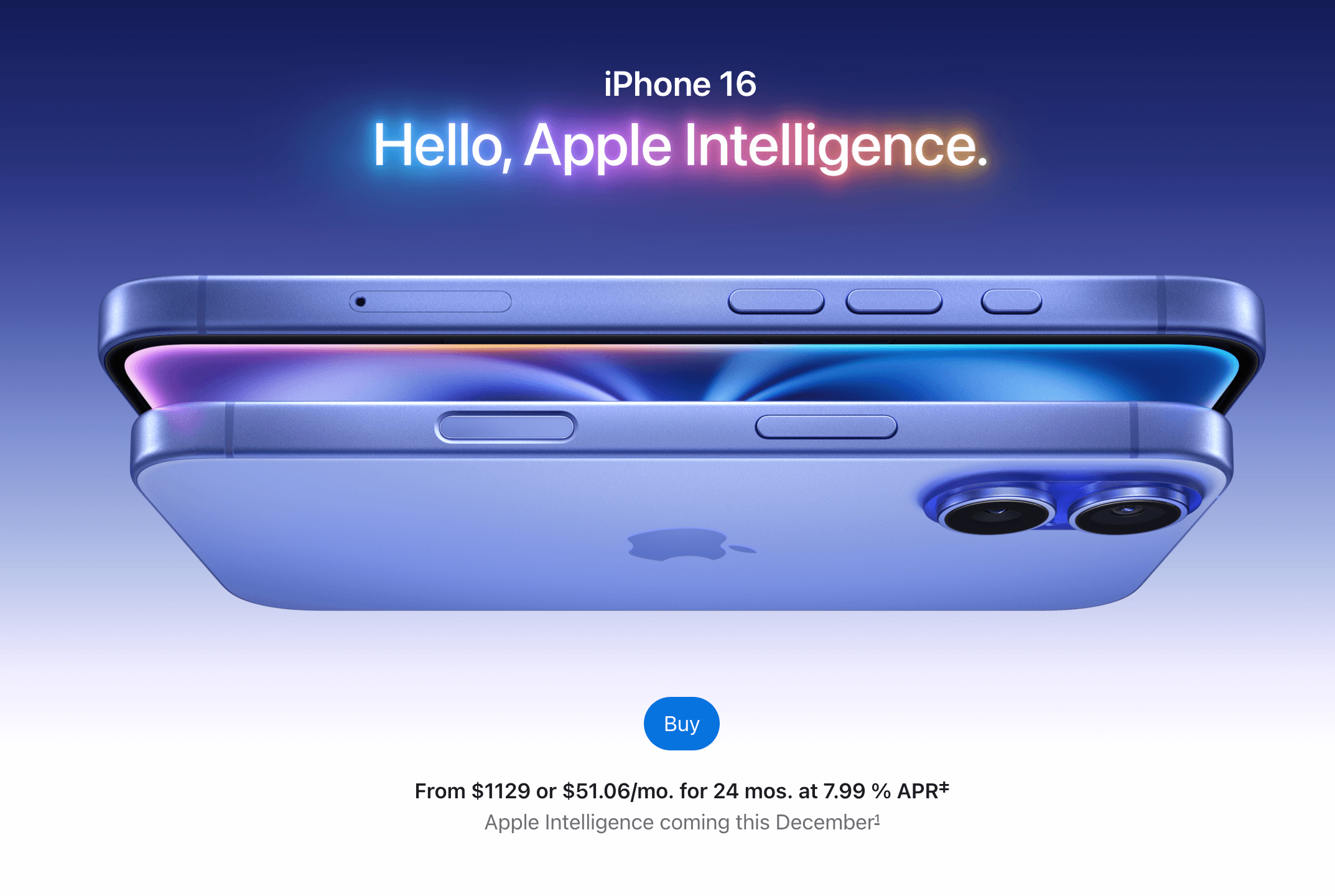
- The introduction of Apple Intelligence emphasizes personalized, AI-driven experiences, which showcases the evolution of tech tailored to individual needs. This is a powerful tactic because it resonates with consumers seeking more control over their devices and data privacy.
2. Visual Storytelling & Minimalism
- Apple consistently uses minimalistic visuals with a sleek design, letting the product and its features speak for themselves. This approach keeps users focused on the product and its benefits without overwhelming them with information. It creates a premium feel, where less is more.
3. User-Centric Messaging
- Each feature—be it the improved battery life, camera system, or AI-powered productivity tools—is framed in terms of benefits to the user’s life. Apple is excellent at using user-centric messaging that doesn’t just describe what the phone can do but focuses on how it makes the user’s life better.
4. Emotional Appeal & Exclusivity
- The use of phrases like “A new era for Siri” and “Camera control with a touch” taps into the emotional side of ownership, making users feel like they are part of an exclusive club by using Apple’s latest technology.
5. Privacy as a Selling Point
- Privacy is a major focus, with Apple Intelligence emphasizing on-device processing and private cloud computing. Apple cleverly taps into the growing consumer concern for data privacy, reinforcing trust by positioning itself as the most secure option compared to competitors.
6. Features That Solve Real Problems
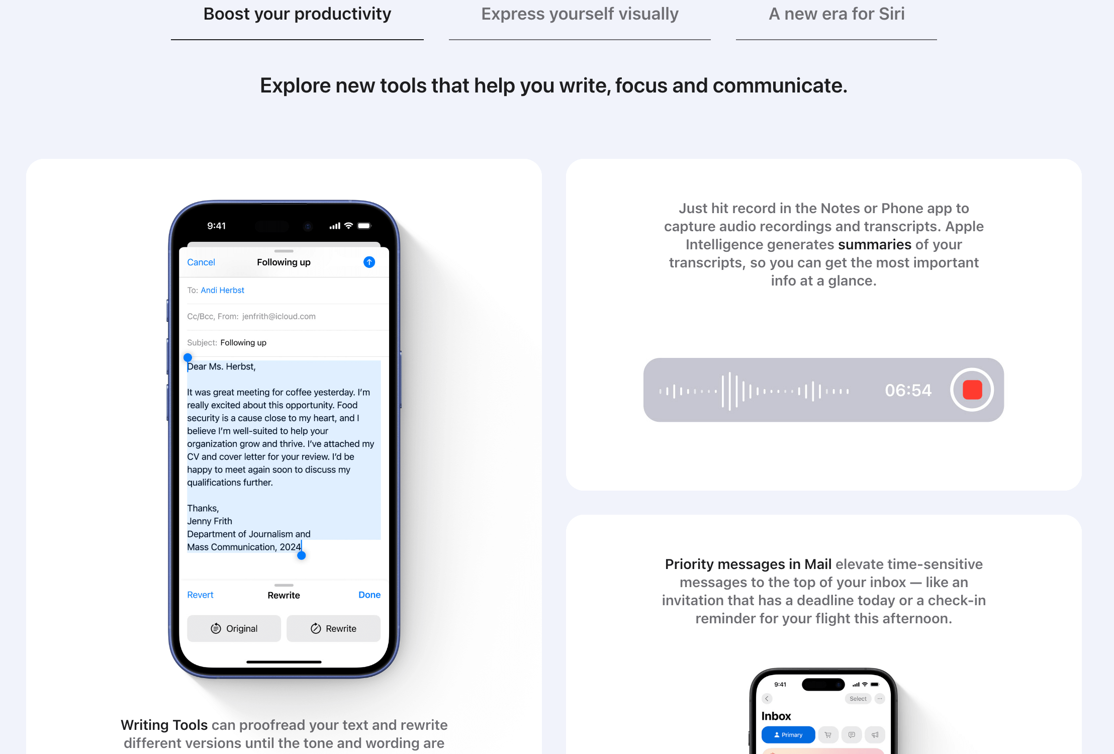
- Features like the Action Button and Camera Control solve real pain points, making navigation quicker, and improving user experience. This approach enhances usability, appealing to both tech enthusiasts and average users who value simplicity.
7. Creating Urgency
- By teasing features coming in December and using future-oriented language, Apple creates a sense of anticipation and exclusivity, encouraging early adoption.
Takeaways:
- Position your product as a solution to specific problems or desires your audience has.
- Focus on user benefits, not just features. Explain how the features will make their lives easier, more efficient, or more enjoyable.
- Use emotional triggers like exclusivity, personalization, or innovation to draw in consumers.
Wrapping Up Apple Marketing Examples
To wrap up, Apple’s marketing consistently demonstrates how to position a product as a lifestyle choice rather than just a gadget. From minimalism to emotional storytelling, Apple’s focus is always on the user experience and solving real-life problems.
Key lessons? Focus on the benefits your product offers, use bold visuals to emphasize innovation, and leverage emotional triggers like exclusivity and personalization. Remember, it’s not just about what your product does—it’s about how it makes your customer feel and the experience it offers.
Schedule a free consultation to learn more about my marketing services that will help your business drive more revenue.