Real estate is a tough market to break into.
It’s cut throat, and there are heaps of competition to beat.
But it doesn’t have to be that way.
By building a real estate landing page, you can funnel traffic towards it to begin generating more clients that put cash in your pocket.
There’s no shortage of people needing to buy homes or commercial buildings, which means there’s more money than ever for you to make.
Just look at what’s happening in the state of Georgia in recent years:
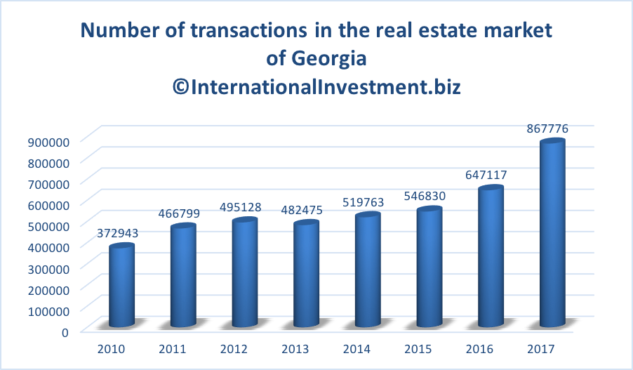
The number of transactions is increasing year over year and many other states are experiencing the exact same growth.
If you’re into a real estate, you may not know what a landing page is, how to build one, etc.
But that’s what I’m here for.
I have over seven years of digital marketing experience via building and growing online companies first-hand.
I’m going to teach you landing page best practices that when used will attract more real estate leads than you can handle.
Sounds good? Then let’s get into it!
What is a real estate landing page?
Before we get into the meat and potatoes of the article, let’s define what a landing page is.
Landing pages are one page websites designed to collect information on leads or sell a product.
It’s as simple as that.
A user “lands” on the website, and it’s designed to funnel them through very precise steps in order to get them to swipe their credit card.
In fact, companies like Dell have seen conversion rates jump 300% by using landing pages versus traditional home pages.

A real estate landing page can be used to collect leads, acquire new clients, or sell a product.
There are many different tools available that will build landing pages on your behalf or provide templates to customize.
You don’t need to hire a developer or know how to code yourself anymore.
The process is a lot easier than you might think.
However, just because you have a landing page up and running doesn’t mean it will convert.
It still requires the proper design elements, copywriting strategies, and best practices to maximize your ROI.
This brings me to my next point.
Real estate landing page design
A lot of businesses design landing pages, only for them to do essentially nothing.
Let’s avoid that by making a landing page that brings in more customers than a theme park on a hot summer day.
Below are some design principles for landing pages that will boost conversions and the results you generate.
Address the audience’s pain
Landing pages sell a product or service.
And what does a product or service do?
They solve problems.
That’s why it’s crucial for landing pages to clearly address the customer’s pain points.
Depending on your exactly real estate niche, problems may include:
- Not knowing how to buy a home.
- Not having enough money for a home or down payment.
- Difficulty with paperwork and steps in the home buying process.
- Trouble selling a home and finding interested buyers.
- Etc
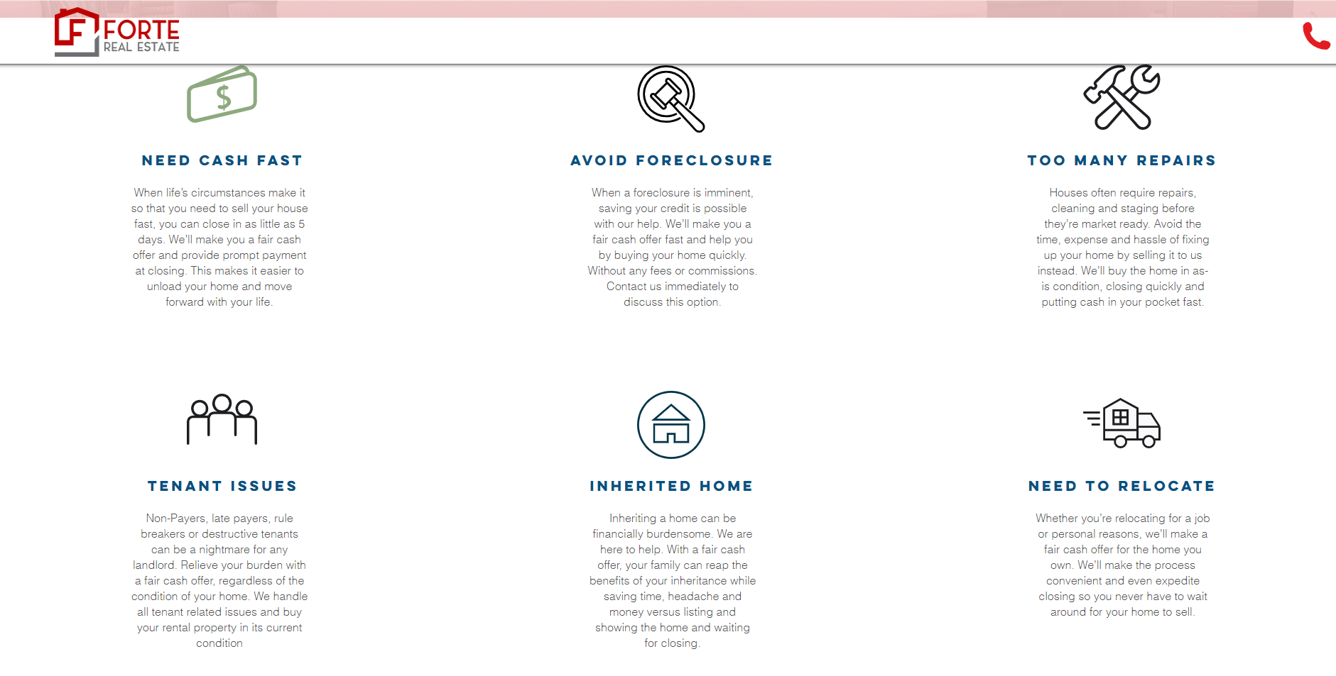
Look at this landing page for this real estate company that specializes in buying homes from existing owners.
As soon as you scroll down the page, they address all of the main issues their customers face, such as:
- Getting strapped for cash because of life circumstances, and needing to sell their home to get quick money.
- Avoiding foreclosure because they can no longer afford the property.
- Repairs and maintenance are becoming too hefty.
- Issues with tenants if they are renting the property.
- The property was inherited, and they wish to sell it.
- Relocation is needed because of lifestyle choices or work.
When you’re designing your landing page, ask yourself “What problems are my customers facing?” and focus it around these issues.
It will create an emotional response and grab their attention, funneling them further down the landing page until they take action.
Remove the navigation
As I’ll be mentioning at a later point, the best performing landing pages are often the most simple.
They don’t have fancy templates, effects, and styling.
Pages are kept minimal because it allows users to focus on learning about the product.
Look at MIT’s School of Architecture, for example.

Notice how there’s no top navigation like a regular website?
This means you can’t wander off to other pages, keeping all of the attention on what matters.
Limit the footer
The footer of a website typically contains links to other pages and policies.
Just like we want to minimize the top navigation, landing pages also need minimal footers to prevent users from navigating elsewhere.
Continuing off of the MIT example, note how the footer of their landing page only includes a copyright notice, privacy policy, phone number, and email.
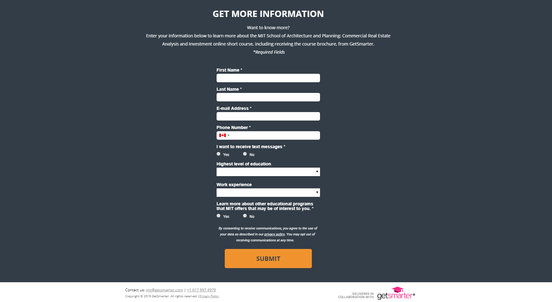
The form to collect leads is the most important element of this funnel, so it’s made larger and attention grabbing on purpose relative to the tiny footer.
Make it look like it’s from 1999
Huh?
Make my website look like it’s from the era of denim jackets and Crystal Pepsi?
Just listen.
If you look at all of the best landing pages of all time, there are two characteristics they share…
They’re simple and ugly.
Do you know why?
Because simple sells. Never forget that.
You can have all of the fancy website templates, effects, etc, but making a simple landing page that focuses on your product and service trumps everything.
The more things you have on a landing page that doesn’t SELL is distracting users from becoming your real estate client.
Take a look at this landing page for a real estate course on foreclosure investing:
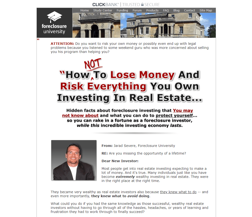
Does it look like they invested six figures into the most state of the art design and website?
Nope!
It looks like it was built in 2001, and the webmaster forgot to click the “Update WordPress” button ever since.
Jokes aside, landing pages are made like this on purpose.
The copywriting, which is perhaps the most important element, pops from the page and it’s all the reader can focus on.
The white background contrasts perfectly with the black and red text, making it easy on the eyes, as well.
Check out the graphics on this bad boy:
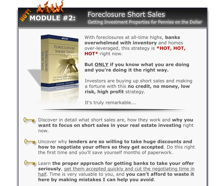
It goes to show that you don’t need to be the Bill Gates of graphic design, either.
Remember that images are sales people in themselves.
They should support the product or point you are making.
Overall, you can make landing pages more simple by:
- Removing or reducing navigation.
- Removing or reducing the footer.
- Using a white background.
- Using contrasting colors, bold phrases, italicized words, and headers.
- Adding images that help sell the product or service better.
- Excluding CSS, Javascript, and other effects that distract and slow down pages.
With that being said, let’s touch on how to write better landing page copy.
Real estate landing page copywriting
Copywriting is a real art form, and there are staple strategies you need to understand for maximizing landing page ROI.
Applying the following copy tactics together will easily improve the results you see from your new landing page.
Features with a side order of benefits
There are two components of a product description:
- Features: These are factual pieces of information, such as price, size, color, etc. They need to be stated, but often should be kept at a minimum.
- Benefits: The emotional and experiential outcome of using your product or service.
Most entrepreneurs make the mistake of only stating the features, which boring and vague.
Your pockets will be emptier than a bowl of candy on Halloween after a pack of 2nd graders got to it if you do the same.
Benefits are what your customers are truly after.
In the real estate market, this might be finally achieving independence, hitting the milestone of buying their first home, or feeling like they’ve entered adulthood.
Yeah, homes offer function, but ask yourself why customers are coming to you.
Do they want a three bedroom townhouse in a nice area?
Sure. But, they also want to impress people, have a certain image, gain privacy, and other deeper reasons.
Those are the benefits of purchasing a certain property, for example.
Tell them what to do
We think we’re fancy with clothing, technology, and money, but really humans are just advanced cavemen.
That’s why building landing pages relies heavily on psychology, and one MUST HAVE element is the call to action.
Calls to action are just that: calling the user to take an action.
It can be to sign up for an email newsletter to collect their information, call you for a free consultation, or another step towards the final sale.
Some call to action examples are:
- Call now
- Buy now
- Sign up
- Sign today
- Hurry
- Don’t miss out
- Don’t wait
- Register
- Get your free X
Look at how this real estate seminar business uses calls to action to get interested audience members to buy tickets.
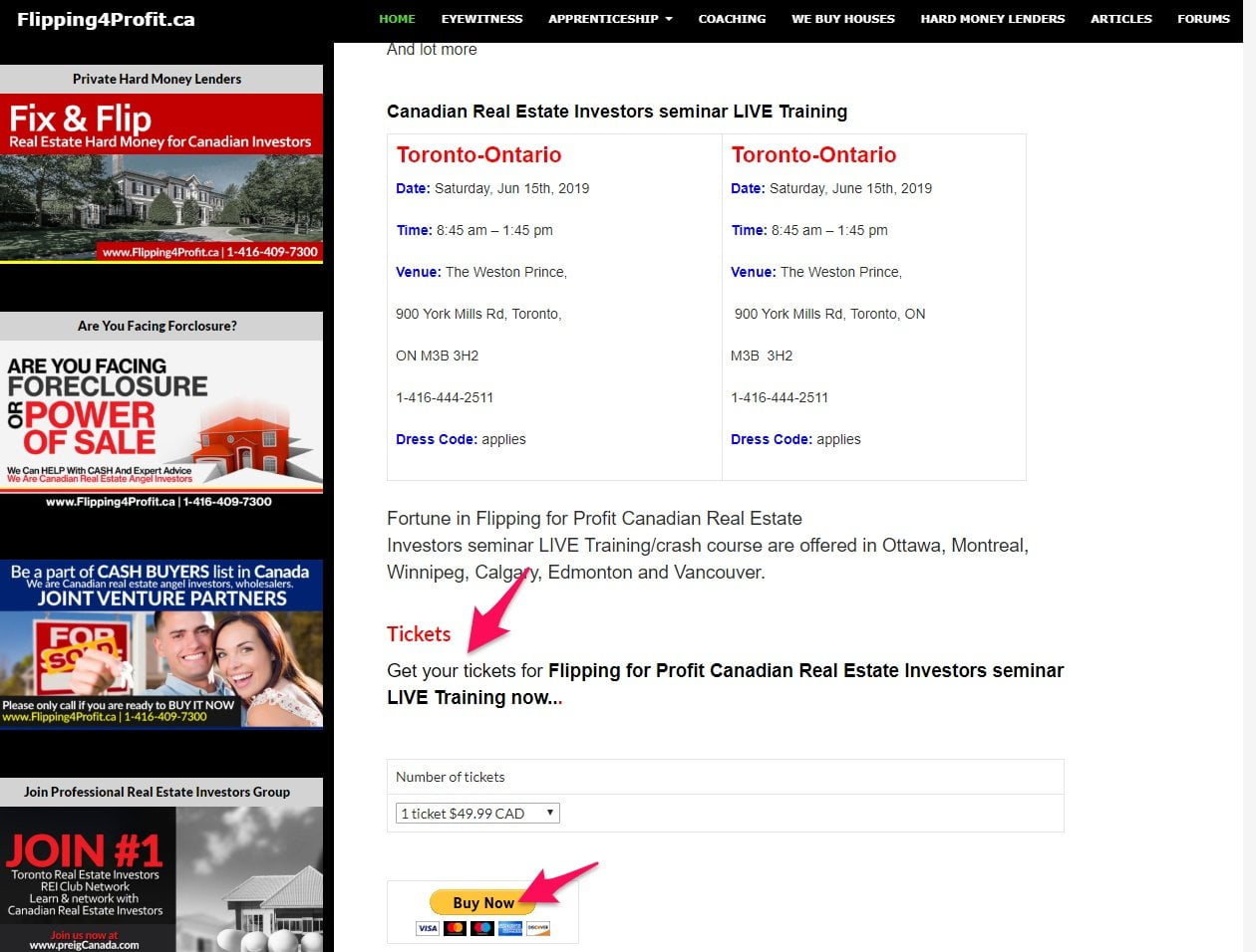
CTAs work so well because humans want to be told what to do deep down.
It makes our lives easier if we don’t have to think or weigh any options.
While it might seem like an obvious step in the buying process to order a seminar ticket for example, sometimes customers need a little push in the right direction, too.
Use the power of storytelling
Going back hundreds of thousands of years, humans used stories to communicate.
Whether it was in the form of cave art, paintings, or written text, a story is one of the most emotionally impactful mediums to reach people.
That’s why landing pages always feature the testimonials of previous customers.
But reflect on what a testimonial is for a second.
It’s a story.
A story of how the customer faced an issue and used a certain product to overcome that hurdle.
Testimonials can be very simple like this:
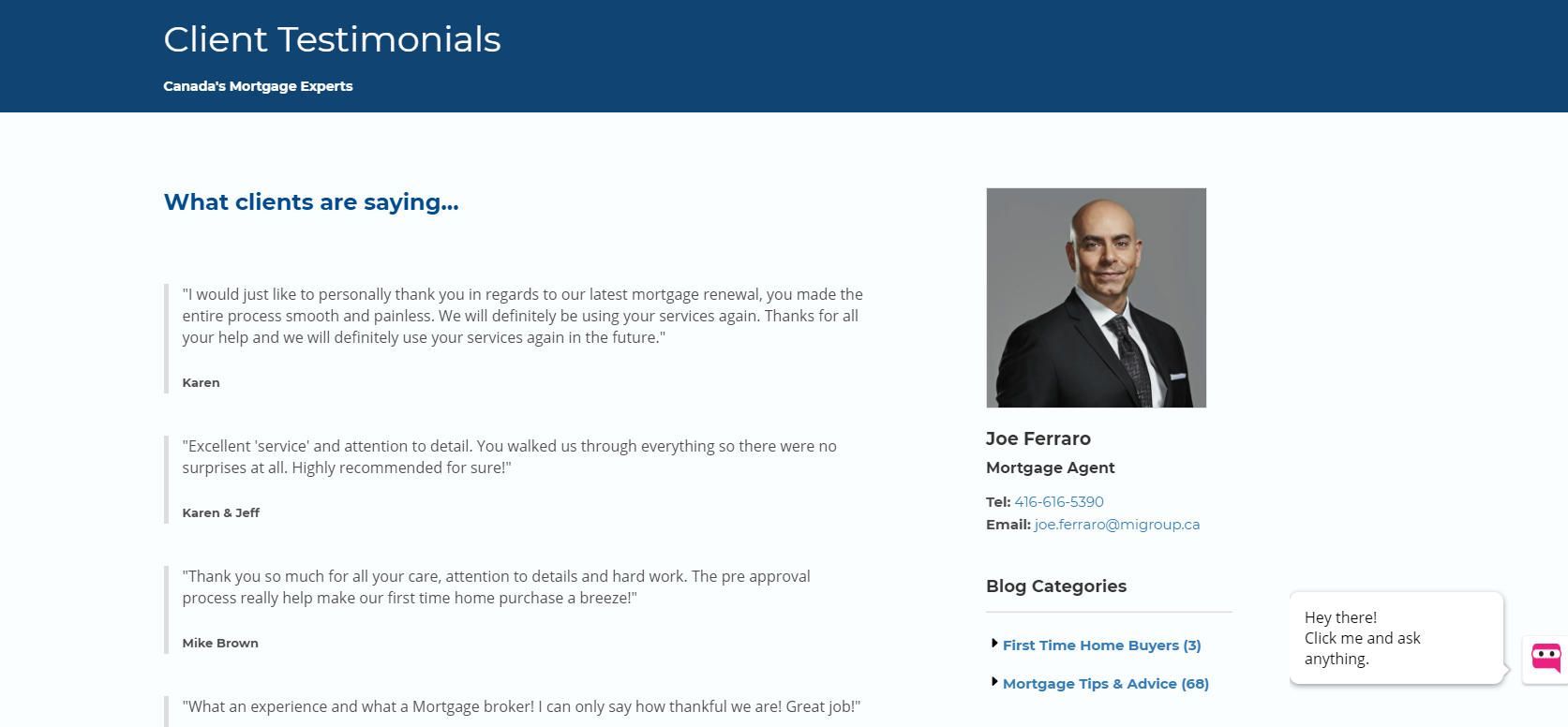
Seeing as 95% of consumers will look at reviews before making a purchase, it’s better to have some than none at all.
However, if you can ask a client to provide an in-depth testimonial, it can double as an incredible story that future customers can relate to.
Look at this one, for example:
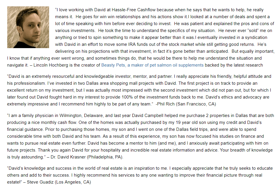
This customer of a real estate investing program speaks about his career, family, and start-to-end experience with the service.
Now that’s a story. Not just a review.
Wrapping up real estate landing pages
I know that can be a lot to take in, so I’ve put together the main takeaways of today’s article below for your convenience.
- Address the audience’s pain points to create an emotional response and gain their attention.
- Remove the navigation to prevent users wandering off of the landing page.
- Limit the footer to make the landing page less distracting and making the product the focal point.
- Simple and ugly sells. Don’t try creating overly fancy landing page, but rather take inspiration from the best performing ones like we looked at today.
- Use the power of testimonials and storytelling to increase conversion rates.
- Include calls to action to push users down the sales funnel.


